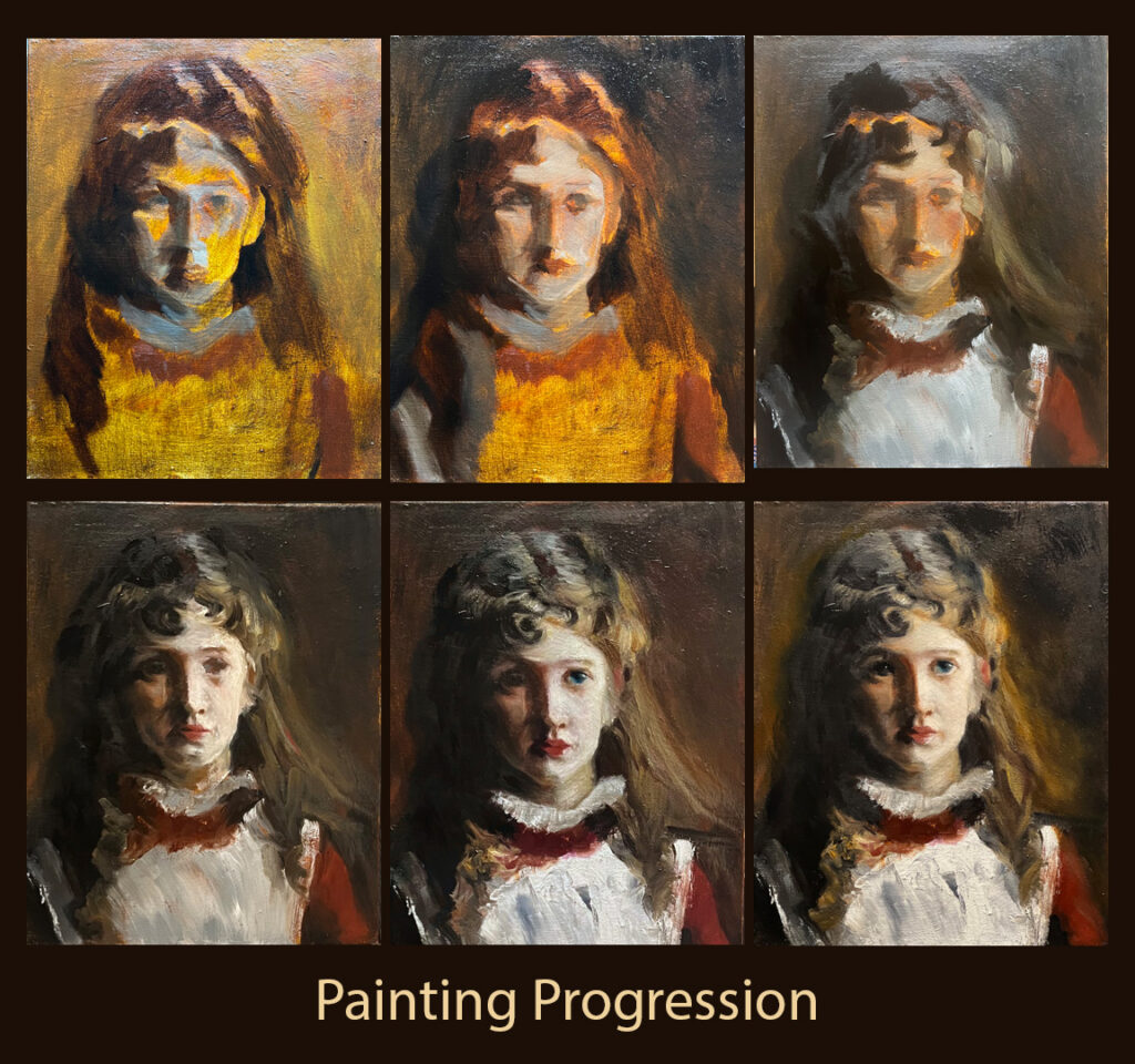
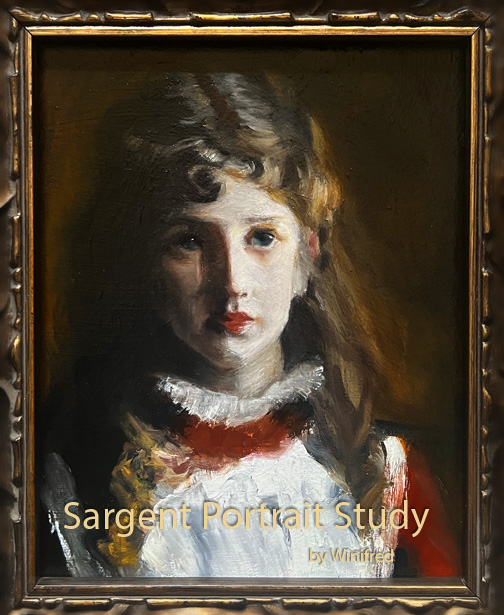
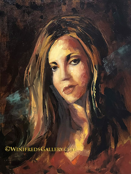
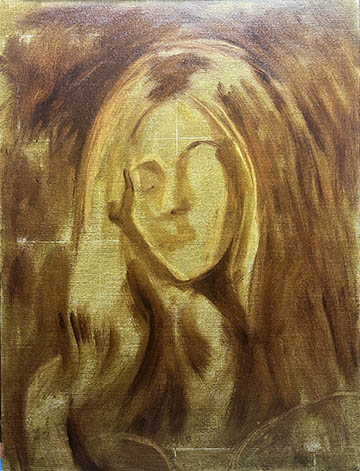
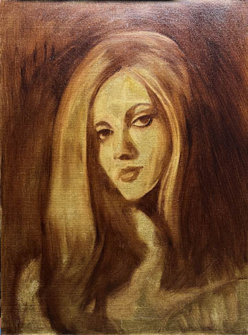
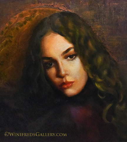
This painting was challenging and enjoyable. I couldn’t think of a good or clever name for it. This is the same young lady with all the curls I painted and posted a couple weeks ago. In the end I cropped my painting because I had an issue with her hand which was not right in the reference photo and I just couldn’t correct it. That’s fine – as paintings get cropped all the time. Not a lot to talk about today – probably a good thing. Have a great weekend. Winifred
Category Archives: Portrait Oil Paintings
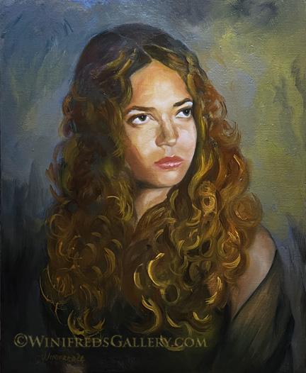
Cinnamon Curls
I took a break from painting portraits the past few weeks to paint still lifes. I’m so glad I did. It made this stylistic shift in my portrait painting much easier. I looked at the original version of this painting this morning – fresh eyes. It had a solid blue background with a deep shadow on the left.These attributes were reflected in the reference photo I took recently – but it wasn’t working. Her name is Cinnamon. She’s a pretty girl with beautiful cinnamon curls. But overall the entire painting was just normal – quite boring I thought. The only thing I was happy about was her face. I had avoided over blending her face – it was painterly, but I needed to do more. I made paint mixtures of orange/gold and burnt sienna and started creating big, loose swirls of curls, alternating the colors and moving all over her head. Can you imagine my fear! However, I liked the effect right away. Energy was emerging. Then I envisioned adding green and gold as background colors rather than just blue. I mottled in the new colors. The painting was transformed. I enhanced the highlights of the face and it was basically done – for now. Abstracting portrait elements for some reason is scary for me but it’s my intention to move beyond my fear. As days go by I will likely make more changes. That’s what usually happens. Thank you for looking. Winifred
Related Images:
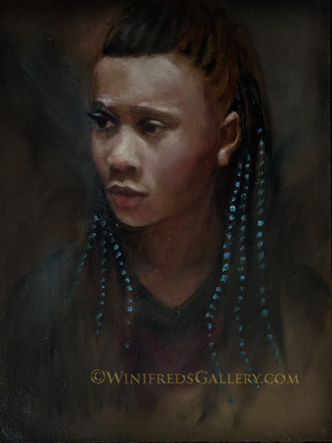
Beads in her Hair
My painting this week was influenced a little by the Rembrandt study I posted last week, though the beads in her hair give it a pop of modernity. I like it. I enjoy the portrait look of the Old Masters which continues to influence many modern painters. The poses, the lighting, and even the expressions have a certain look. The reference image for this p ainting was a young girl about 10 years old, wearing a very colorful sundress sitting in a swing on a playground in bright sun. This is why she is lit from above. I subdued the lighting atop of her head to keep the focus on her face. I also subdued her expression, making it a little more serious. I wanted to add a pop of color and decided on turquoise which is a nice compliment to the gold and orange colors on her face. So far, I haven’t wanted to change the painting but I make no promises.
The painting is showing up in this post a bit darker than I see it but I know it will vary on every device anyway. There’s nothing I can do about that. Enjoy your day. Winifred
Related Images:
When More is Not Better
This past week, I set out to improve upon the more loosely and unfinished painting I posted last week – the one below. I decided I could improve upon its loose and unfinished look – something I’m still trying to develop a greater appreciation for. I took it back to the easel. I spent hours and hours this week, making the painting “more correct” and more traditional. WHEN WILL I EVER LEARN! Finally today, I photographed the latest version of the painting and looked at the two versions side by side. Yes, the latest version is “more correct and more finished” but it’s energy and freshness is lost lost. I definitely prefer the version below. No one would care about a paintings correctness. They do care about color, energy and freshness. I’ll miss that painting. I’ve never painted a portrait in quite the style as the first version before – and now it’s gone. This was a good lesson for me. Previous painting is below for a quick comparison. What a difference. Happy Spring! Winifred
Related Images:
Kazakhstan Girl
She was a high school senior when this reference photo was taken. It was more than 15 years ago. I had the opportunity to know the entire family and their many challenges as they attempted to integrate into this society and with no mom – who was dead. I found it interesting that this family came from the same country, Kazakhstan, as the actor/director/comedian Borat. Remember him? … a very funny guy. In creating this painting, I had some success in not over smoothing, not over blending and making some interesting brush marks from time to time.
Initially I attempted a floral painting. It’s so complicated that I put it down to paint this portrait. I think that’s funny. It was the chrysanthemums in the arrangement I couldn’t master, they have such a complex petal structure – but I’ll keep trying. Bye for now. Have a great week! Winifred
Related Images:
Total Cuteness!
It was 2010 or earlier, I think, I took this photo. I watched these baby swallows grow to bigger little swallows and then fly away. Other than very messy, it was wonderful to watch their mom flying back and forth to feed them. They were insatiable. This is yet another of those digital files I knew I had to paint – they are so adorable. I had to develop the confidence that I could paint soft feathers and a bird nest. It’s not too bad! I also loved the fact that there is a “stand out” little swallow which posed itself to create the perfect focal point. I couldn’t have planned it better. Have a great weekend. Winifred
Related Images:
Stopping to Smell
I took the photo seven or eight years ago. I was struck by it. I liked the naturalness of the pose the light, and of course loved the wildflower she held. In the reference image, she sat in a brightly sunlit grassy field of yellow and gold. Her jacket was turquoise. The content and composition was calming but overall the reference image was too bright and the jacket, though pretty, the turquoise was too distracting. I decided to see if I could make the reference image work as a painting. I sketched an outline of the face and jacket. instead of a sunlit yellow/gold field I painted the background a solid brown/black and the jacket a light gray green. I painted her face overall a golden brown. I now had a subdued block-in of shapes and colors I could work with. I then painted jacket details and a a few details in the background to reflect a grassy environment. Finally, I painted her face and the bright cool toned highlights, finally adding the little wildflower she held to her nose. Now, many years after the photo was taken this memory will remain alive in a form I can enjoy.
Related Images:
Mara’s Daughter
I can usually come up with a title which I consider relevant or at least okay, sometimes even clever – but not today. This painting is not quite finished. When thoroughly dry, I will sand it in some areas and make more to my liking. The problem I struggle with – as you know, is that I spent so many years smoothing and blending skin digitally, that anything less than smooth is difficult for me accept as good work. It’s interesting that the whole Impressionist movement was a rebellion against the artist training in the European academies requirement for the mastery of smooth blended skin in paintings – in fact smooth blended everything. I was just born in the wrong century.
So, this is it for today. I am now going to paint grapes perhaps grapes and tangerines. I have no propensity to smooth fruit! Hope all is well. Winifred
Related Images:
Ballerina
She’s a lovely ballerina – and I’m sure this painting will be appreciated. There were, however, many challenges in creating this painting. The reference image was photographed using a wide angle setting with a phone camera. That introduced substantial distortion and error in perspective. It was difficult to use as a painting reference. It’s pretty easy to correct perspective distortion in buildings but not so much in a posed ballerina with curves. I know because I tried.
In the reference photo, the ballerina wore black posed in front of very colorful and boldly graphic wall. It looked like a fun “Senior Photo”. The lighting was flat. I wanted something softer and wanted to introduce energy and movement. As always, as soon as I get a little distance from the painting, a few more changes will likely be made. This is my first attempt to paint a ballerina – I’m sure not the last. Have a wonderful weekend. Winifred
Related Images:
Blue Violet
Just scroll back 5 or 6 post back and you will see a different version this painting. This painting is from the same reference image as before – except previously, I painted faster and looser. You may recall she had red and yellow “butterflies” in her hair and a black background. I decided to make some changes. Initially the changes were intended to be minimal and I was only tidying up – which is not a good thing. (Someone once told me that finalizing a painting is not “house keeping” – you are not to “tidy up”, which usually results in overworking a painting and taking life from it). That sounds like something I would do. However, once I got started making things “more tidy” I became pretty obsessed and created a complete repainting and “over working” of the painting. My eternal struggle – I revert to a very realistic portrayal. At this point, I can’t determine if it’s better or worse – hopefully just different. Anyway, it’s gone.
In this version of the painting, the face and features are more realistic but I’ve also altered the entire color palette, which is not easy. In the reference photograph, she wore a black dress and had a red and black background. I used this for a workshop I hosted. When you have a red background, red will bounce all over – affecting her skin, her hair and attire. I didn’t want that super saturated red color throughout the image – not for this portrait. I wanted a color palette more neutral. I altered her skin tones, and then came the challenge of creating a background. Initially I painted the background a solid color – basically the same hue as her attire and the coolness of her skin tone. It was quite boring. What to do? Using some thickened paint. I painted the background more violet and then started to make some small dark”swirls” reminding me of brocade fabric. I thought that was okay, certainly better than the previous plain background – so I stayed with that. The repainting had come to an end. You may notice the two moles on her face. The rule is, that if a mark is going to be gone in 6 months, don’t put in in, If it’s going to be more permanent, include it. For sure, most moles are there to stay and they look just fine and don’t detract from her attractiveness. I’m happy to put this down – for good – hopefully.
I didn’t get to work on my floral painting which I abandoned last week but I’m really looking forward to doing so. I hope you’re having a good weekend. Winifred