My Beginning in Color Management
Since early in my photography career I have been aware of the need for color management and have used some system for calibrating my monitor for years. I have always loved printing as well, color management meant controlling the management of color from initial image capture through the printing process. Until now, I had stopped short of creating custom profiles seeking, with mixed success and great effort to obtain them from various print media companies for my specific printer. In the year 2000 I took a Fine Art Digital Printing class just after I took my first photography class. I paid $700.00 for the10 week class. I had an Epson Stylus Pro 2000 and wanted to print. I love printing. But my images were coming out horribly. I knew absolutely nothing. I can remember at the end of my first class thinking that that class alone was worth the $700.00. It had introduced us to “COLOR MANAGEMENT OFF” and the concept of profiles and custom profiles. My printing has improved progressively since that night.
The profiles I create are only as good as the data I feed the X-Rite devices. That means understand the drivers and settings of the device I am working on.
Moving Forward
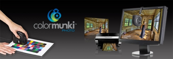
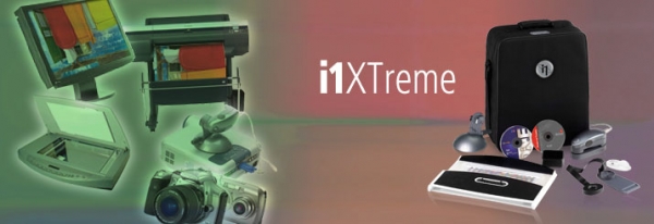
With my recent use of X-Rite’s ColorMunki Photo and the even more sophisticated i1XTreme, all of the sufficiency and control that I need to create accurate profiles and printer and display matched color is at hand. I am having success with this process.
The profiles I create are only as good as the data I feed the X -Rite devices. That means understand the drivers I? and settings of the device I am working on.
Calibrating the monitor using the default settings is a “piece of cake” and got me close to matching my monitor to my print within moments, without me having to make any adjustments to my monitor at all. While the color was beautiful, the prints were a bit too dark. That means my Monitor was too bright. I have a LaCie 324 Monitor with hood and work in a consistent light environment. I contacted X-Rite about my “brightness issue” and was told that this probably meant that my target luminance was too high. X-Rite suggested that I use the ColorMunki in its ADVANCE mode. This mode gave me the opportunity to measure ambient light and to create a target luminance level for the device to factor in, which adjusted my monitor brightness appropriately upon my new calibration. These X-Rite devices are amazing when fed the information they need.
To create a custom profile for my printer for a specific paper means creating color targets to scan with the ColorMunki Photo or i1XTreme. Again, the new profile will only be as good as the printer settings I select for my target print. I must say that I found creating printer settings for my Epson printers to be far easier than creating settings for my Canon printer. With Epson, there is the ability to choose printer “COLOR MANAGEMENT OFF” – and it’s done. With Canon, I felt that I had to learn their language for managing their drivers and found it was far less clear and even confusing in making some selections.I must say that persistence is one of my greater qualities. After sufficient trial and error I selected printer settings such that when the color targets were printed and scanned with the ColorMunki Photo, I am getting good monitor and print match.
I will describe my settings: In the initial PRINT dialog box my printer is selected. In the column to the right of this I have the choice of Color Management or Output. I selected Color Management – we don’t want Output Management. (I had hesitation there because in the Epson system you want to chose ‘NO Color Management”) But now there comes the choice for COLOR HANDLING. Choose Photoshop Manages Color as opposed to Printer Manages Color. I found the following a source of confusion. Just under the option to allow Photoshop to manage color there is a yellow warning sign which reads “Remember to disable the printer’s color management in the print settings dialog box.” this of course is exactly what I wanted to do but I never found such option in Print Settings and will welcome feedback from anyone who points out where this option resides. Under Rendering Intent, I chose Relative Colorimetric . I then went into the Print Settings. I chose a Media Type with characteristics closest to that which I will be printing on (in my case, when creating my initial profile, I chose Photo Paper Plus Semi Gloss because I was going to create a custom profile for a luster paper which I had 250 sheets of). It was recommended that my Print Quality remain at Standard. At some point I will experiment with “HIGH” , which creates slower ink dispersal on the paper for potentially finer detail – but the paper salesperson suggested that the “HIGH” setting might put down too much ink and should likely be left for a high gloss paper. I left all of the image enhancements options unchecked. I left Color/Intensity at AUTO. Confusing to me On the Page Setup Page were the options under PRINT OPTIONS – read them if you like but my experimentation suggest to leave the options unchecked, however, and this turns out to be the defaults. I saved these settings and named them a name which reflects the use of my intended paper. It is very important to do this because it is this set of settings which will be used to print the target and to print future images using this media.
I am in the midst of exploring the full capacity of i1XTreme. I decided to start by calibrating my monitor once again but using i1XTreme’s even more advance profiling capability. I decided to do this in the advanced mode right off the bat. Well, the question is “How great is my capability to move around and adjust my monitor settings to feed it the information it needs to do a refined calibration?” I have to work on that. Mean while when I did my ambient lighting reading with this device, I was given a range in which my ambient light levels and the color temperature should fall for best monitor and print viewing. I have to tell you that with respect to both I was not in the ball park – not remotely so. The ambient light in my workspace was far too low – did not even register at the low end of the ambient meter measurement scale, and the color temperature of my workspace was far too warm. The remedy for both was very easy. I purchased daylight bulbs and simply upped the amount of the light until both areas measured as adequate. I have far yet to go. I want to calibrate my monitor using i1XTreme’s most advanced features. I will also create new paper profiles.
Both ColorMunki Photo and i1XTreme will allow me to calibrate my projector which desperately needs to be done. I will be excited to have my presentation screen match my computer screen during my presentations to my clients or during workshops and training. I will do this in a relatively short time and let you know how it goes.
Related Images:

