Winifred Makes Portraits Paintings Sizzle

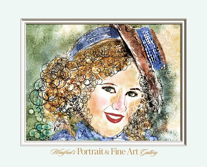
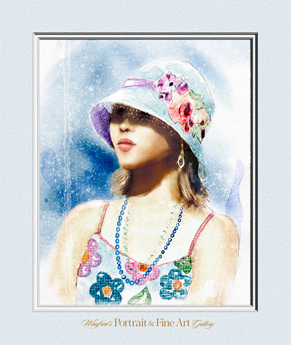
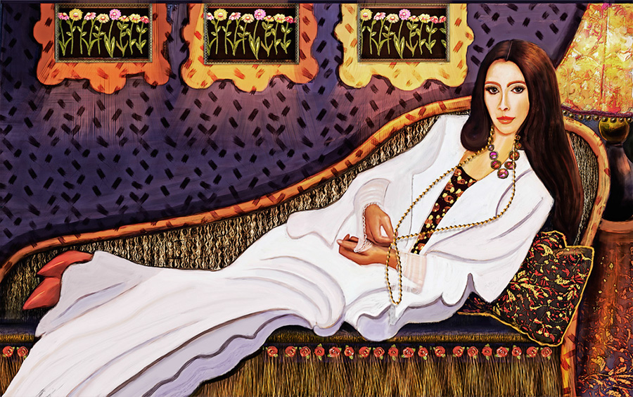
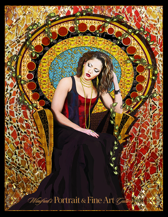
It is no secret that I love to paint and I am also considered a versatile painter.  I can create paintings in a variety of painting styles.  Some of  these images you will love, some you may not.  That is fine –  the idea is to create and personal paintings which you, your family or your clients will love in your personal style.

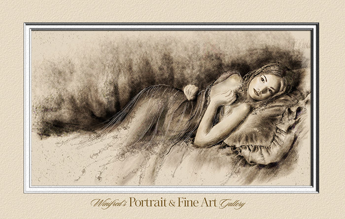
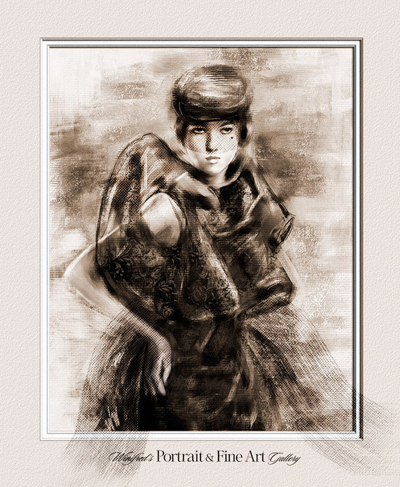
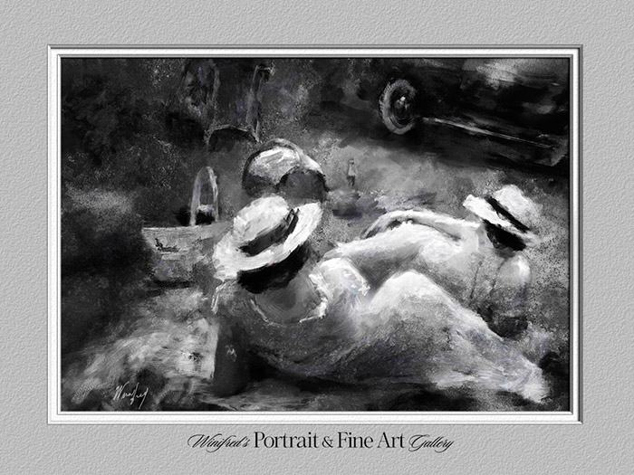
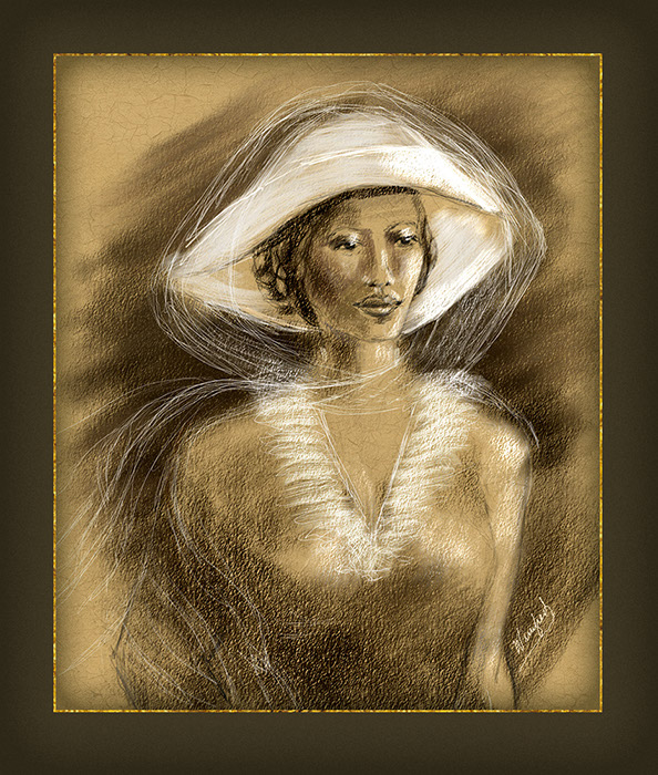
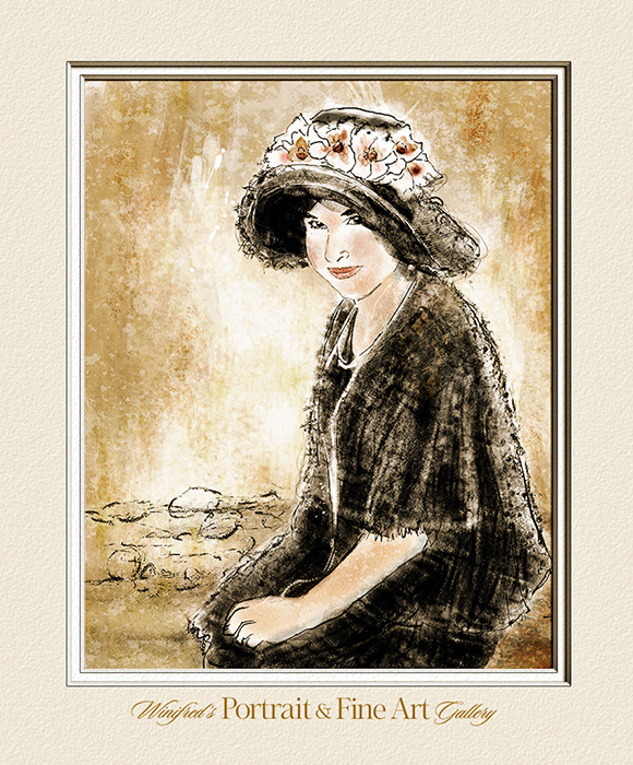
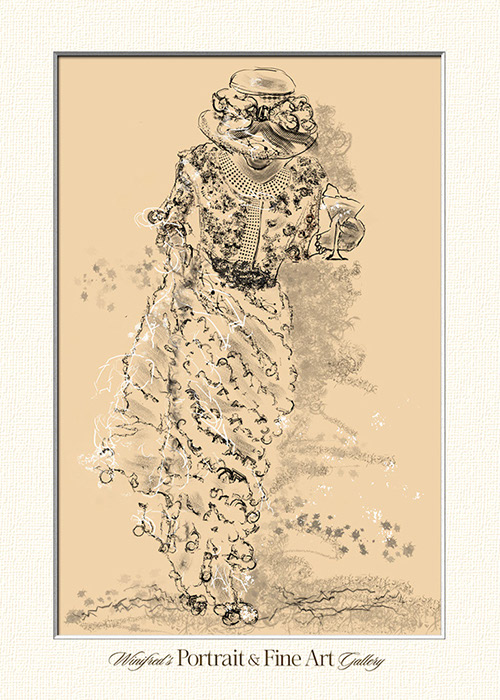
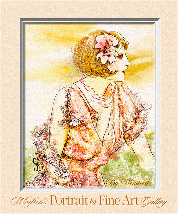
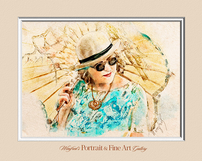
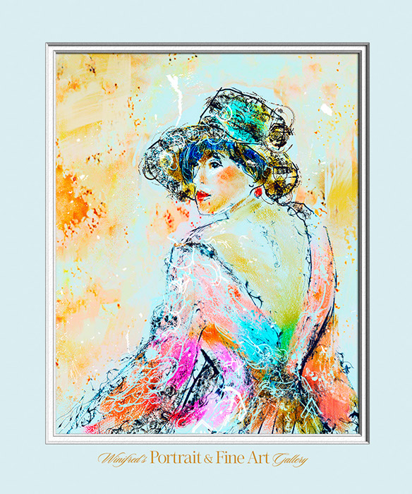
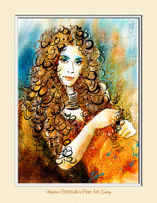
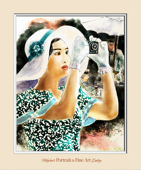
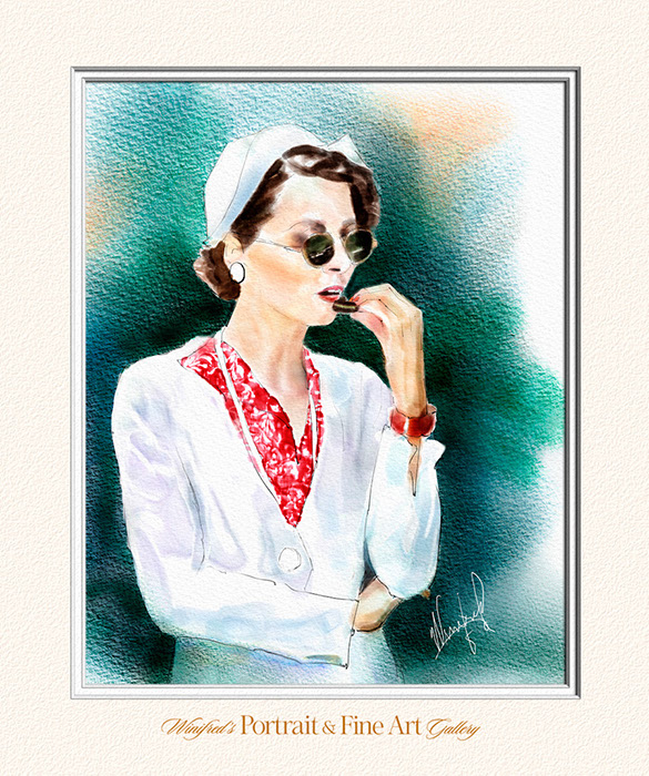
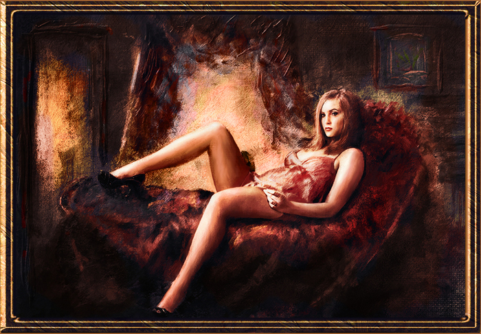
In several of my online galleries, you will see some beautiful but pretty traditional painting styles.  I have created this post to show you some ways I have ‘ramped’ it up a bit, including one painting from imagination and a couple of portrait paintings with patterns at the very bottom.  I can hardly believe how many “hats” I have painted.  I love to paint women in hats.  Even my painting from imagination included a hat. Alas, you might have guessed, I wear a sun hat everyday of the Summer if I am in the sun.

If you would like to increase your painting skills or if you are just starting as a beginner  one of my personalized training workshops, “Almost One to One” might be just what you are looking for. Please visit my Store to preview my Tutorials and take a look at my Personalized Training Workshops.

I hope you enjoy the images which follow.  Thank you.  Winifred Whitfield

Personalized Online Training – Almost One to One

Lady on a Pillow

Mysterious Lady with Veil

Friends

Lady of Gold – Painting from Imagination

Reposed

Don’t Spill the Martini

Flower in Her Hair

Lady with Umbrella

Her Back

Big Curls

The Picture Taker

Cookie

Girls Got to Have Fun

Yellow Hat

Flowers in Her Hat

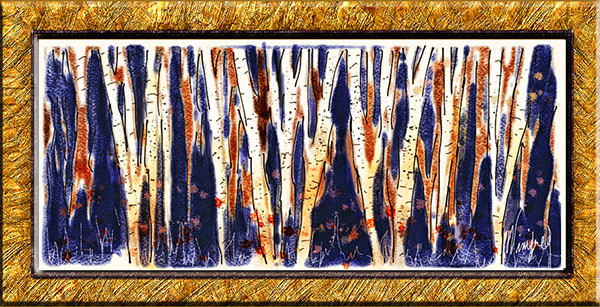
I also enjoy Making and painting with Patterns in Painter.  The following are a couple of examples.

Lady with Pearls

Exotic

Thank You! Winifred

Related Images:

Conceptualizing a Painting from a Photo

This painting was created in Photoshop CS6, but this post is not about how to paint or use mixer brushes in Photoshop. I will begin the create these tutorials soon. Equally important to how to paint is conceptualizing and developing the structure and content of a painting.

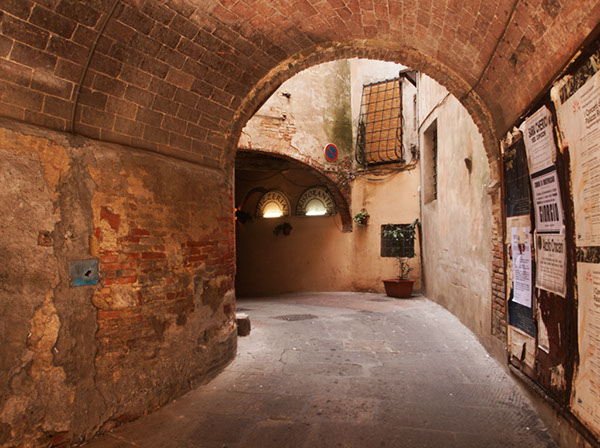
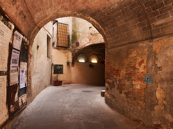
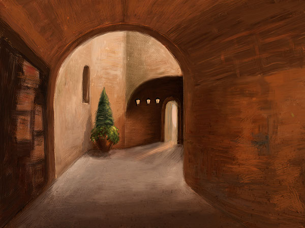
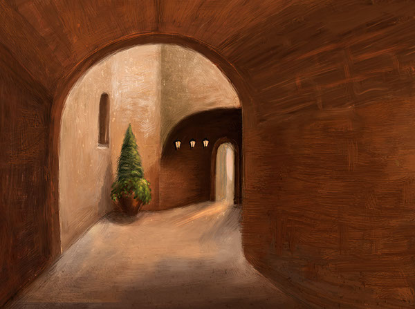
Recently, I painted an scene I photographed in Italy.  I chose it as  the inspiration of my painting because of it’s  depth, composition, and light. it was not important to me to  reflect the realism of the photo thought I would retain of it;s structure. The first thing I did was to flip the image horizontally a visual check I always perform  I preferred it.  I then eradicated most of the image detail before beginning to express my vision to be contained within the shape and  form.

The following reflect some of the stages of the painting – perhaps too many.

My first consideration was  lines and composition of the reference image.

I flipped the image. The composition was strong in both directions, however, I felt this flipped version read a  little stronger. This  would be the version of the image I would work with.

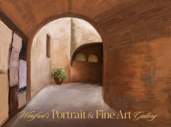
I  reduced and simplified the elements on my canvas. I liked the complete simplicity of this form.


I  began to add in elements. I painted a pot and planter in the corner.  This seemed to work.

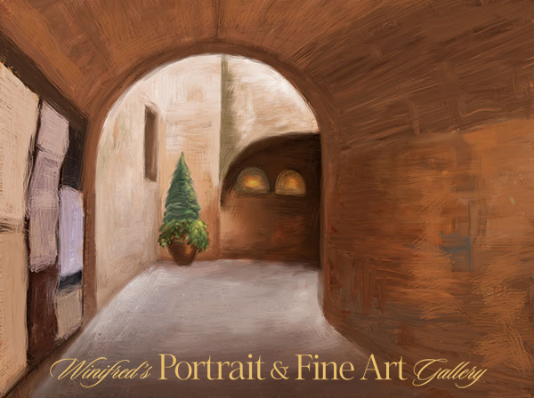
I decided a taller more structural plant would be a better choice.  I thought of the Italian Cypress.  The large light forms, earlier Pizzeria lights shapes were not working,

Below, I removed all light from the wall.

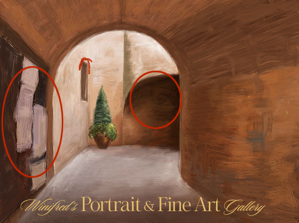
I simplified the “message board” on the near left, I thought this high contrast area still called too much attention to itself. It held my focus, rather than allowing my focus to  easily move beyond it.

Once visually within the space and the light, the darker area, just off center, stopped the flow too abruptly. This would need to be resolved.

I painted out part of the signage elements front left, attempting to lessen the  visual impact of this area.

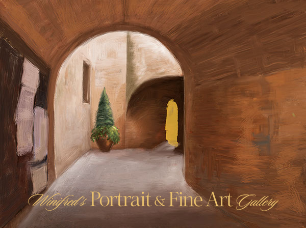
I  “cut” an opening into the far dark wall to create a doorway. It created more light, focus and depth.


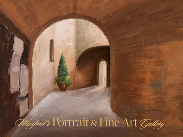
Extending  a light beam from the open door brought that area to life. The rectangular window shape was changed to an arch.


I darkened and subdued the signage further ( front left). I like the look of it and shadows were painted behind the planter.

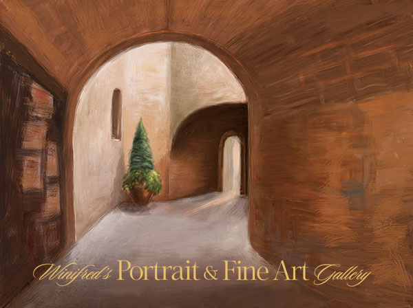
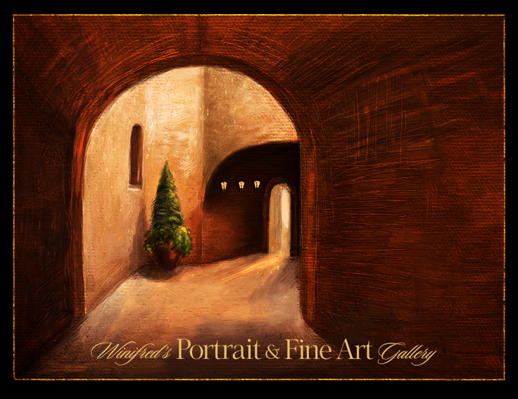
I painted small lanterns on the wall, darkened and warmed the light tones of the light in the room. I actually like this version quite a lot. (Above) Ultimately, I painted away all of the signage,  and cropped part of the left side of the painting. I painted in additional light on the floor reflecting  light spill.  I was torn  about doing this – and I like this version as well. The cropped version is simple and quiet.Using the overlay blend mode, to deepened the tones and contrast, I applied a canvas texture and painted it in selectively using a layer mask. I added additional brushstrokes using a bevel and emboss layer style.  It is complete – for the moment, Thank you

To view a collection of my paintings created in Photoshop – CLICK HERE

Related Images:

Corel Painter 12.1 GRADIENTS

http://www.youtube.com/watch?v=q9TWV2cMGew&feature=plcp

All About Gradients

This week, I posted a video about ways to create and use Gradients in Corel Painter 12.1.  I often use gradients in painter.  Filling  a canvas with a gradient or using it as an overlay  is a good way to quickly get some color on your canvas and often sparks the next creative idea.

In this video, you will learn how to create a two-point gradient and how to save it, how to create a custom color gradient from a strip, (1000 pixels wide by 50 pixels deep), save it and capture the icon, and how to create your own gradient library.  To add additional gradient  collections to your libraries, please to to Corel Painters “extra content” page or click on the direct link  to the extra content on my RESOURCES blog page. I hope you enjoy this video. Winifred.

Related Images:

Corel Painter 12.1 – Painting Dancers

http://www.youtube.com/watch?v=AVXC5ayw6DU&context=C4feb606ADvjVQa1PpcFNIlyZgKwjGo4YqwuvZJZBjLHixQyG1s9E=

Painting Dancers

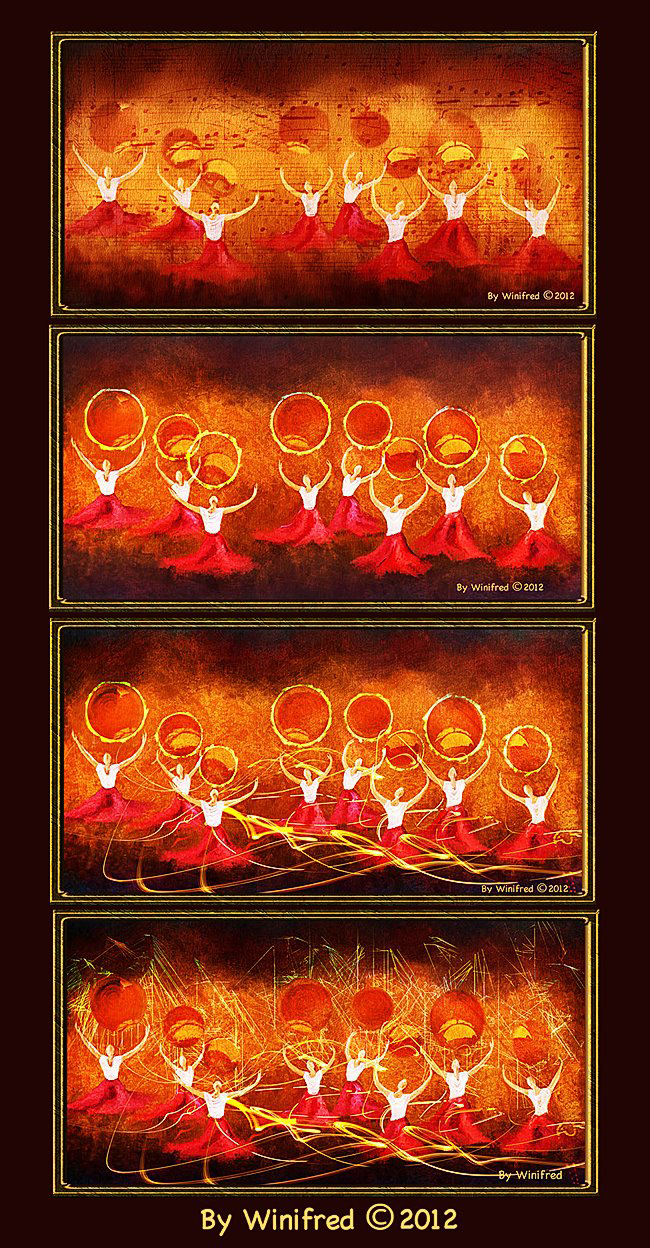
I love painting dancers though I have not created many such paintings.  I am changing this. I enjoyed painting the variations below in Corel Painter 12.1.

Watch the video to see how I create the four variations of this painting. Unfortunately, there is not enough time in the 15 minutes to demonstrate the initial painting.

Related Images:

From Photo to Painting

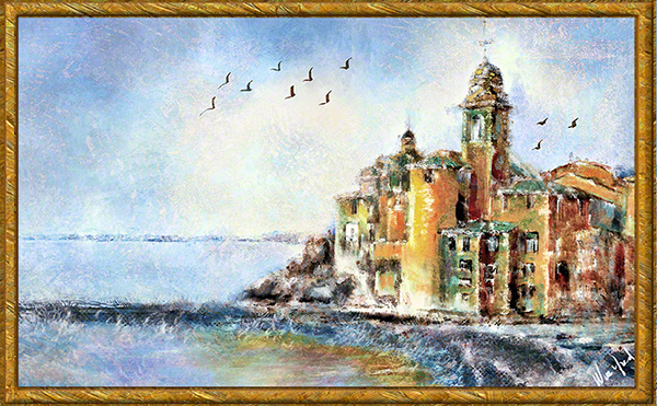
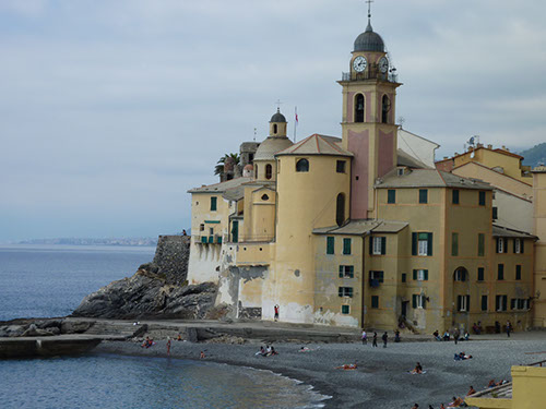
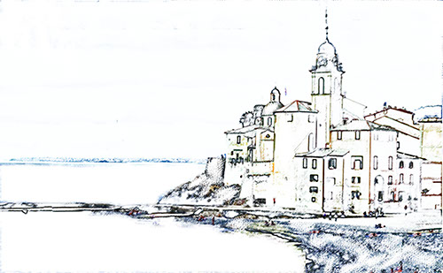
As you know, I  derive great pleasure in taking a photo which appeals to me and making it a painting.  To the extent you can visual the  final Painting – or at least come close, you are all the better for it. Your workflow and process will go more smoothly.  I was fascinated by this architecture. I decided that I wanted to give the image more space so I enlarged the canvas area and extended the sky and water.  From that, I could make a sketch and begin to paint adding and removing elements,  and adjusting colors as the painting evolved.

Original Photo

A Sketch  Can be Made in Painter or Photoshop

Final Painting with Additional Texture Layer Applied


Related Images:

Corel Painter 12.1 Tutorial – Sampling Multiple Colors

http://www.youtube.com/watch?v=NKFndL2xnmk&context=C4feb606ADvjVQa1PpcFNIlyZgKwjGo4YqwuvZJZBjLHixQyG1s9E=

Sometimes magic occurs in our paintings when we least expect it. I love that

By Winifred
There are times I want to talk about a painting.  Not in this case. This painting tells its own story very well.


Related Images:

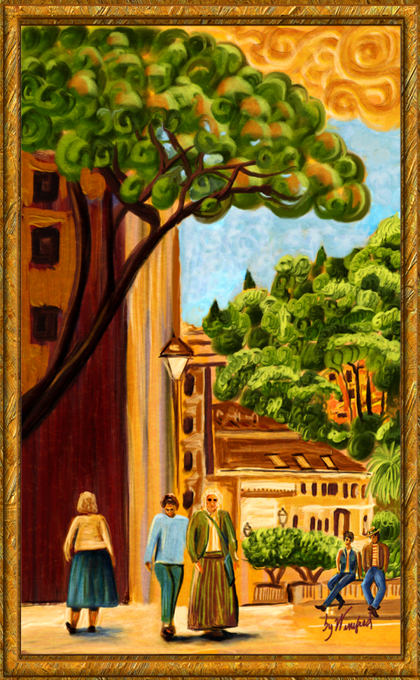
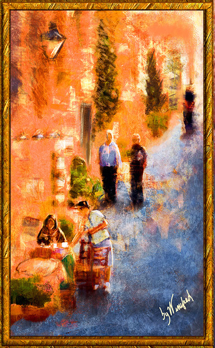
Painting Italian Street Scenes 2

Focusing  on Perspective

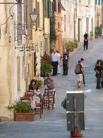
I chose this image to paint. It has strong leading lines and a lovely outdoor cafe.

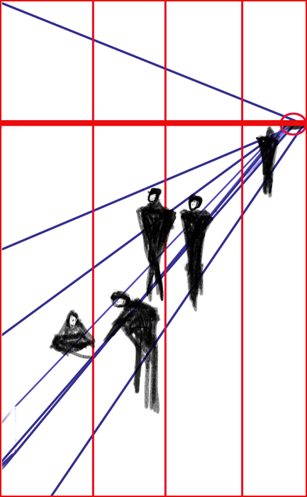
I simplified the structure as shown in the diagram below.

Determining the horizon line is not scientific but one was chosen along

A vanishing point was also identified.

This is the final painting.

Related Images:

Expressive Brush Strokes

I have been creating beautiful portrait paintings for  my clients for many years now.  However, I have been very conservative with my brushstrokes.  My clients have tended to want a more smooth look in their painting – or perhaps that was simply my projection.  I think I will begin to veer away from this from time to time. Skin will always be smooth but I can create greater expressions within other aspects of the painting.  The following is one such example.  The response to this painting has been very favorable.  Ultimately, I want to make my clients “thrilled” with their portrait and I will always stay with in their  comfort level.

Related Images:

My Watercolor Experience in Corel Painter 12

My Corel Painter 12 watercolor class is over. I have been studying with quite a wonderful and watercolor obsessed instructor who teaches at the Digital Art Academy – Skip Allen.  He is passionate about watercolor and brush making.  I thought it important for me to at least become familiar with this digital media – to understand it’s opportunities, challenges, and to understand the brush controls. I  also wanted to work with some of the concepts of traditional watercolor as we attempt to translate this into a digital medium.   The following video  will discuss the 3 types of Painter watercolor brushes.   I will show a few paintings I created. I will  demonstrate how some of the brushes work – you will be so amazed to see them.

http://www.youtube.com/watch?v=c75tCdzUiCY&context=C3dee137ADOEgsToPDskKjoyY7OK5cl4wSX7FTj7TT

Related Images:

Winifred Photographing High School Seniors
Photographing High School Seniors Naturally.

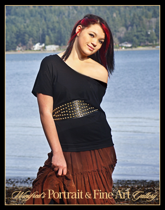
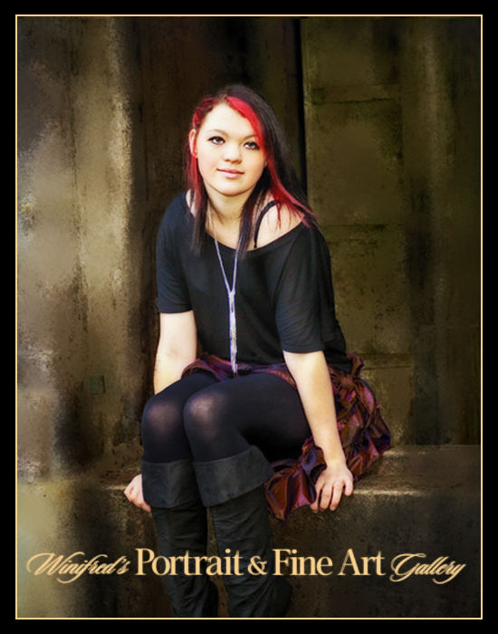
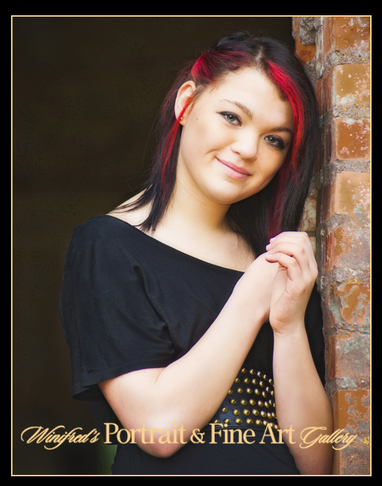
I don’t photograph lots of seniors but when I do I enjoy it. They are definitely fun to work with.  I like to keep things simple,  natural, and outdoors when possible using simple but complimentary settings.  I think long tern and don’t want to go wild with the possibilities which are available to us digitally.  I want to create timeless portrait. These are important portraits and mark for many a major turning point in life.  The following are recent images of  “Missy”.

My clients suggested the location and it was a great one.
There was such variety.

I also wanted natural and simplicity of background.
When it competed with the subject,

I softened it as I did above.

As with all portraiture, paying attention to quality and direction of light was essential.

Modest enhances were added to these images using Nik Software.

My monitor display is optimized using X-Rite  Color management solutions, in this instance, i1 Pro Photo.

Related Images: