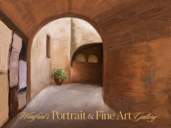
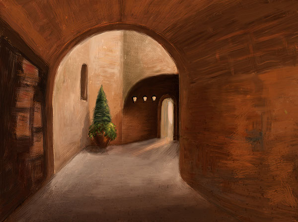
This painting was created in Photoshop CS6, but this post is not about how to paint or use mixer brushes in Photoshop. I will begin the create these tutorials soon. Equally important to how to paint is conceptualizing and developing the structure and content of a painting.
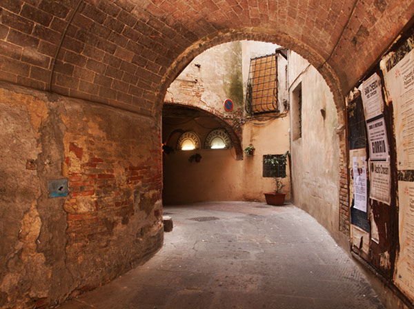
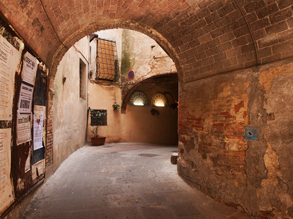
Recently, I painted an scene I photographed in Italy. I chose it as the inspiration of my painting because of it’s depth, composition, and light. it was not important to me to reflect the realism of the photo thought I would retain of it;s structure. The first thing I did was to flip the image horizontally a visual check I always perform I preferred it. I then eradicated most of the image detail before beginning to express my vision to be contained within the shape and form.
The following reflect some of the stages of the painting – perhaps too many.
My first consideration was lines and composition of the reference image.
I flipped the image. The composition was strong in both directions, however, I felt this flipped version read a little stronger. This would be the version of the image I would work with.
I reduced and simplified the elements on my canvas. I liked the complete simplicity of this form.
I began to add in elements. I painted a pot and planter in the corner. This seemed to work.
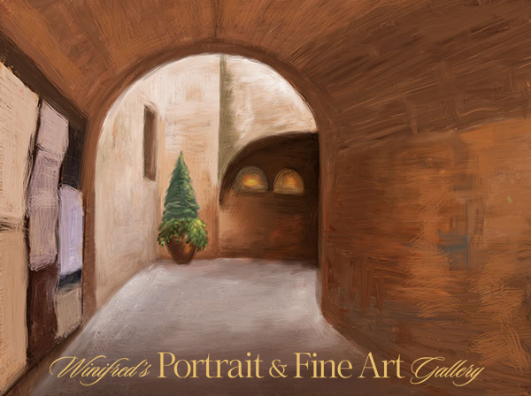
I decided a taller more structural plant would be a better choice. I thought of the Italian Cypress. The large light forms, earlier Pizzeria lights shapes were not working,
Below, I removed all light from the wall.
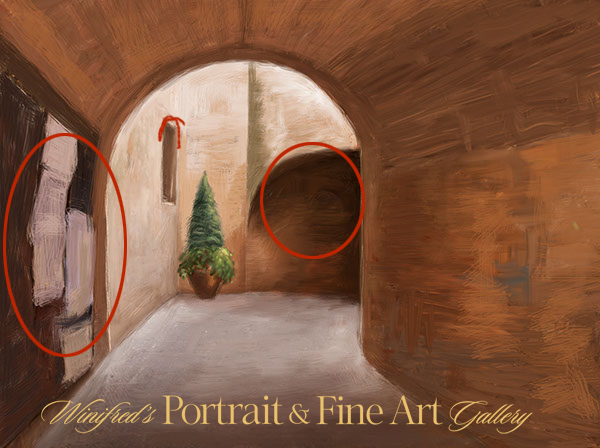
I simplified the “message board” on the near left, I thought this high contrast area still called too much attention to itself. It held my focus, rather than allowing my focus to easily move beyond it.
Once visually within the space and the light, the darker area, just off center, stopped the flow too abruptly. This would need to be resolved.
I painted out part of the signage elements front left, attempting to lessen the visual impact of this area.
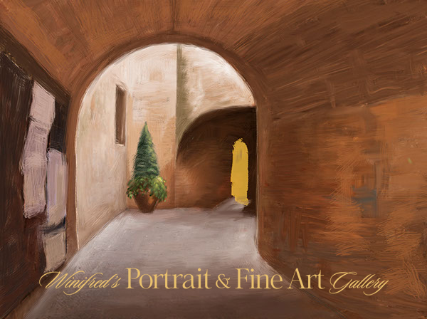
I “cut” an opening into the far dark wall to create a doorway. It created more light, focus and depth.
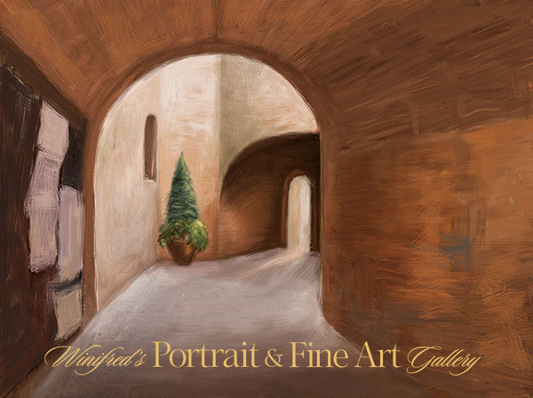
Extending a light beam from the open door brought that area to life. The rectangular window shape was changed to an arch.
I darkened and subdued the signage further ( front left). I like the look of it and shadows were painted behind the planter.
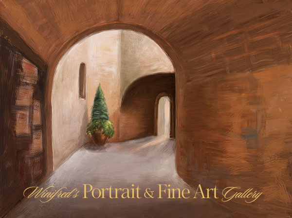
I painted small lanterns on the wall, darkened and warmed the light tones of the light in the room. I actually like this version quite a lot. (Above) 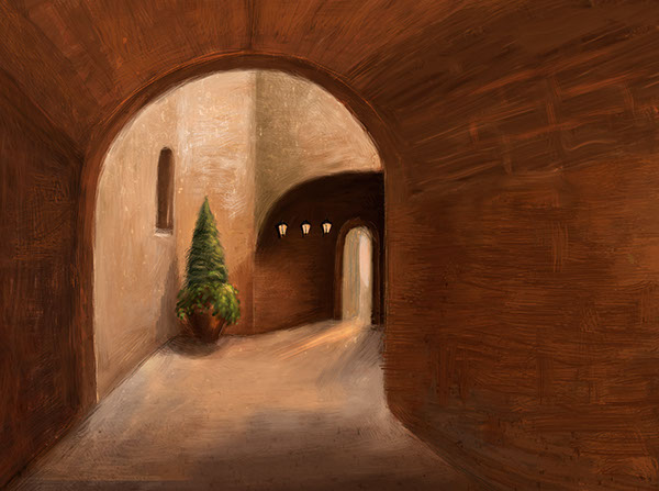 Ultimately, I painted away all of the signage, and cropped part of the left side of the painting. I painted in additional light on the floor reflecting light spill. I was torn about doing this – and I like this version as well. The cropped version is simple and quiet.
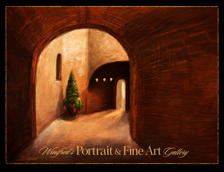 Using the overlay blend mode, to deepened the tones and contrast, I applied a canvas texture and painted it in selectively using a layer mask. I added additional brushstrokes using a bevel and emboss layer style. It is complete – for the moment, Thank you
To view a collection of my paintings created in Photoshop – CLICK HERE

