Merry Christmas and Happy Chanukah to all!!
I realize this post should lead with a pretty holiday themed painting – but alas! NO!! I think such paintings are pretty, but best left to others to paint. I’ve always been that way. I actually feel a little badly about it. However, I just wait out those guilty feelings and soon the holiday is over and all is well again.
In addition to the linen covered panels, I told you, Ive been making, I’ve now also made my own hand made oil paints. It’s pretty exciting to grind oil and pigment powder to make paint.
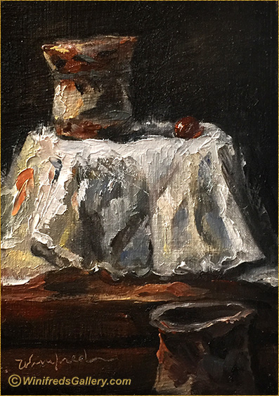
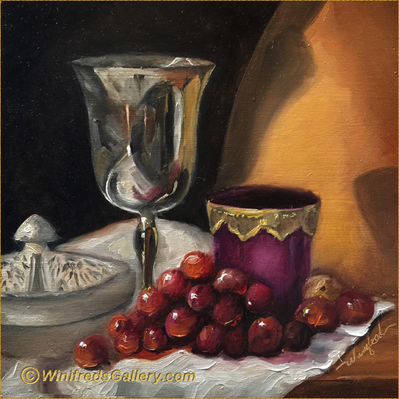
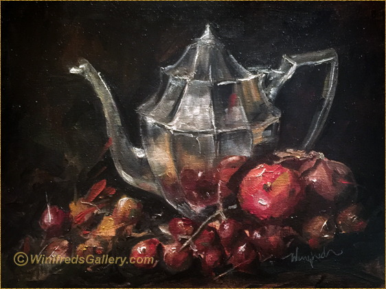
Still Life by Winifred Whitfield with First Handmade Oil Paints
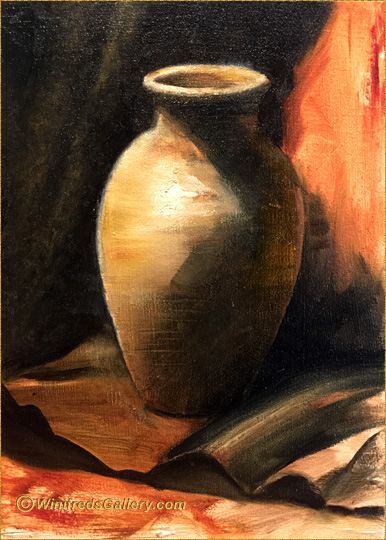
This gives me full control over what’s in my paint and it’s consistency. To test my new paints, I did this quick little painting with paints I made. “Two Vases and a Grape”. It is a little odd looking, isn’t it.The scale of things seem a bit off – but it’s really what I set up. I like the fact that you can’t really tell what’s going on. What is the vase on, and what’s beneath that and why is the other partial vase sitting off to to right – and one grape! If any of these questions arose when this came into view. – I was successful. I also find the shapes and values interesting.
But that’s not all I’ve been doing! On my stove – even as we speak – there is a large quantity of oil boiling, which I’m refining to use with my oils when painting and to use when making handmade paints. I did not know I was this kind of person. I’ve spent 4 hours today so far, almost literally watching a liter of oil boil in 8 liters of water, sand and salt. After this cleaning process is complete – which it is not yet, I will oxygenate the oil further for several days with a little aquarium pump. The idea is to produce a thicker, cleaner, less yellowing, faster drying linseed oil for my oil painting – in the style of the “old masters”. Such oil can not be found commercially today in art stores, though some version may soon be introduced.
Even though there is not a card, I wish you and yours a very Merry Christmas, and a Happy Chanukah!
Related Images: