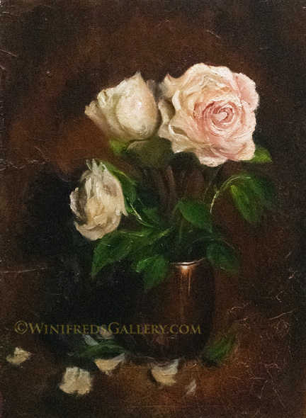
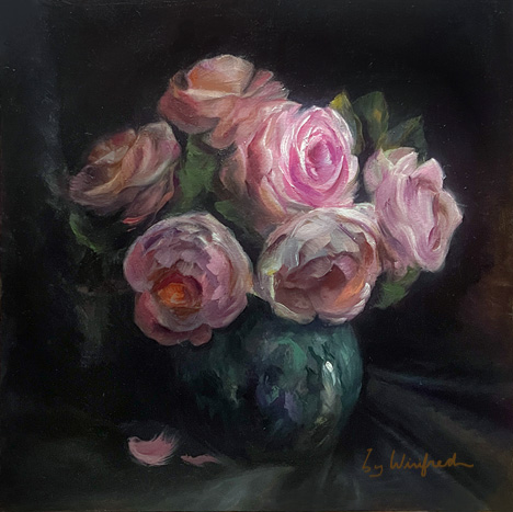
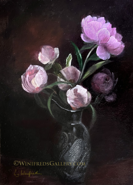
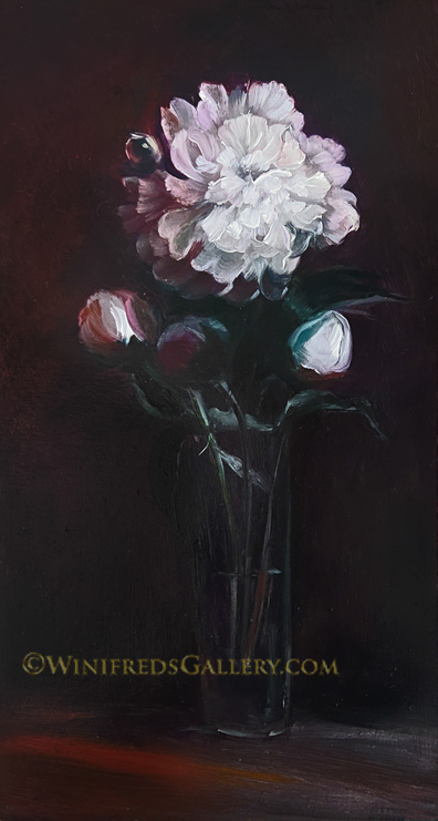
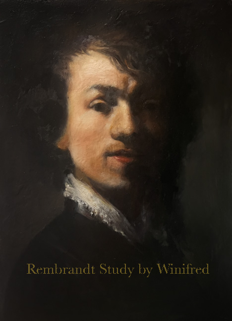
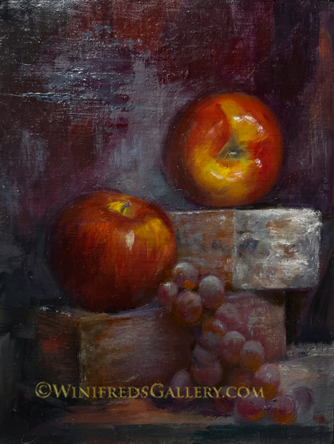
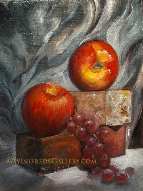
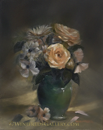
Roses in Green Vase

Pink Roses in Green Vase 12×12 Oil Painting by Winifred Whitfield

Hope you had a fun holiday. It was my first day of air conditioning, but it wasn’t too hot – only 80 degrees. Roses are so complex to paint but I keep trying. In a recent podcast interview of quite an excellent artist, he recalled that in art school, he would view other artist work and think he wished he could paint so well, he wished painting would get easier. He thought that would be the case in the future. Now, 20 years later and a highly acknowledged painter, he proclaims, that though he is more experience with more developed skills, it NEVER gets easier. I hope I don’t bore you with my regular mention of how difficult any given painting was – which is all of them. Sometimes all I can think about is the constant struggle. I should just accept that this is the nature of the journey. and be careful not to go to the point of frustration or a negative mindset. That’s likely why painters remain engaged for so long. They never get to the place of feeling bored, or feel as though they’ve figured it all out. It’s a constant struggle.

The vase is one of my favorite parts of the painting. I changed the original colors but generally maintained the pattern of the vase. It looks lustrous almost like marble. I’m going to rest from roses for a bit to try something different. Have a wonderful week. Winifred

Related Images:

Roses in Small Brass Container

Roses in Small Brass Container – Oil Painting by Winifred Whitfield

Since last I saw you, I’ve been incredibly busy creating new still life reference images to paint. I have a huge collection of “silk” flowers, many diverse yards of fabric, many vases and other containers and a great and versatile video light with I really love. Having such an assortment of goods, I decided to set up new floral still lifes to photograph. I didn’t plan to began my photo shoot at midnight, but I did, and it continued to 4 a.m. I so enjoyed what I was capturing that my obsessive compulsive tendencies were apparent to me. In addition my creative energy always seems to increase with the lateness of the hour. Over the next few days, I continued to set up new back drops, table-top settings, vases of flowers and light configurations. I photographed so many images, that not even one tenth of the images were preserved. I now have a new selection of still life references to choose from. I seem to prefer ones with dramatic and high contrast lighting. I enjoyed such lighting in the image above along with the warm pretty colors, the texture in the background and foreground cloth, and the shapes the shadow and highlights form. It’s so important to begin a painting with a good reference and one which is exciting to paint. I considered setting up my still life and painting it from life but my studio set up is not right for this at the moment.

Bye for now. Hope you enjoy. Winifred

Related Images:

Peony Buds

Peony Bud Bouquet in Decorative Pitcher – Oil Painting by Winifred Whitfield

A couple weeks ago a friend gave me a large beautiful bouquet of peonies from her garden. There were pink peonies with a light yellow centers and even larger white ruffly peonies. I began photographing them right away. I knew I would select a reference image from them one day, when I wanted a very complex and difficult image to paint. I continued to photograph the peonies as the petals wilted and the bouquet grew smaller. The pink flowers with yellow centers wilted first, days later, the white ruffly ones lost their petals. Thereafter, only white buds remained until one of the buds, began to unfold as a small flower. The buds and young flower were originally white but I wanted a different look and feel hence painted them pink and lavender colors and added the small decorative pitcher.

The peonies have all faded now – until they come again next spring. I am happy I captured the many stages of their life in photographic files, in addition to these two oil paintings as memories.

The painting below reflects the last of the larger white peonies and some of the remaining buds. (The pink flowers with yellow centers are not represented in these paintings).

Peony Flower with Buds Oil Painting by Winifred Whitfield

Related Images:

Study of John Singer Sargent Portrait of a Capri Girl

Study – Sargent “Portrait of a Capri Girl” 1878 – 9×12 Oil Painting

It’s difficult to even find this image on the internet because it’s such an early work painted by Sargent and no doubt it’s not one of his most popular paintings. However, I found it at some point in the past and saved it to a collection of his portraits I keep on my computer as possible references. She was one of his very first models. I have created another study of the other from his set of two paintings of the Capri Girl. It is nearly 16×20 and I enjoy it on my wall. At a point I just quit working on this one and decided that “near enough” was good enough”. After all, it was intended as a study, not a copy, and I felt I’d derived sufficient benefit from the process. I wasn’t sure what that was in this instance, but it’s always useful to attempt Sargent’s brushstrokes. I think, I’ll next attempt a still life. I have some new references. Have a wonderful weekend. Winifred

Related Images:

Beads in her Hair

Beads in Her Hair 9×12 Oil Painting by Winifred Whitfield

My painting this week was influenced a little by the Rembrandt study I posted last week, though the beads in her hair give it a pop of modernity. I like it. I enjoy the portrait look of the Old Masters which continues to influence many modern painters. The poses, the lighting, and even the expressions have a certain look. The reference image for this p ainting was a young girl about 10 years old, wearing a very colorful sundress sitting in a swing on a playground in bright sun. This is why she is lit from above. I subdued the lighting atop of her head to keep the focus on her face. I also subdued her expression, making it a little more serious. I wanted to add a pop of color and decided on turquoise which is a nice compliment to the gold and orange colors on her face. So far, I haven’t wanted to change the painting but I make no promises.

The painting is showing up in this post a bit darker than I see it but I know it will vary on every device anyway. There’s nothing I can do about that. Enjoy your day. Winifred

Related Images:

Study of a Master Painting

Study of Rembrandt Self Portrait 9×12 Oil Painting

Rembrandt (1609 – 1669) Dutch Painter and one of the most influential painters who ever lived. If you ask most painters and others knowledgeable about painters, he is likely to be their favorite. Formally, as a photographer, we’d referred to Rembrandt lighting, which describes a specific light pattern on the face. You can see it above – light coming from the side but creating a pattern of light on the opposite cheek and a shadow extending on the shadow side of the face down to the upper lip. It’s a dramatic light pattern which works well for a seriously posed face. I enjoyed creating this study. It was difficult of course and all portraits are but I derived benefit and will take some of his techniques into a future painting I have planned. Also, very significant to his paintings is the very strong contrast with shadows fading softly into a dark background – edges of the hair are lost. Painting Master Copies or Master Studies have always served as a significant learning tool and I will paint more of these studies in the future.

Below is the “red” version of the initial painting. As you know, I pretty much “finish” a painting and shortly thereafter decide I am not happy with it. I decide I need to do more or need to make changes, often MAJOR changes! Most of the time I don’t show you the “after”. Though in this case, I even said I wouldn’t continue to work on this painting. That’s how much I didn’t like it – but it kept talking to me and I took it back to the easel.

Two Bricks – Two Apples 9×12 Oil Painting by Winifred Whitfield

When I decided the painting below wasn’t working, I no longer allowed myself to look at the reference photo. I wouldn’t allow it to give guidance any longer. I alone would have to figure out out what I wanted the new changes to be. That’s taking a bold step as the changes to the “red” painting are pretty dramatic. How it turned out is less important than that I was willing to put aside the photo reference. Fortunately I do prefer the latter version. I like the fact that the elements all flow into each other, it’s more painterly and I love the many reds. One thing for sure is the more I put reference images aside, the better off I will be, allowing a greater channel for creativity. Have a wonderful weekend. I have just begun a new portrait.

2 Apples 2 Bricks and Grapes Oil Painting by Winifred Whitfield

Related Images:

Third Time Around

Kazakhstan Girl with Necklace, Version 3, 12×16 Oil Painting by Winifred Whitfield

This painting has had quite a journey. I think I am finally satisfied with the painting above. It’s rather refined, something I’m comfortable with.This time I added a lace shawl and a more refined necklace patterned after one of my mom’s broaches. Painting the lace and the jewels was a new experience. It’s a matter of making just the right brush marks and using the colors reflected by the light. I found it interesting and rather effective.

Do you recall the progression of the previous versions? See both below. First (the gold) a loosely painted version (photo a bit distorted) which I over painted because of my insecurity paint about loose paintings. I regret that. Below that, I made changes attempting a tighter painting,which I didn’t care for. This led to today’s third version.

I am currently working on a Rembrandt copy. It’s very interesting to do do. It’s not really a copy but but an exercise using Rembrandt’s painting as the reference.

Kazakhstan Girl Oil Painting 12×16 by Winifred Whitfield

Kazakhstan Girl – Version Two 12×16 Oil Painting by Winifred Whitfield

Related Images:

Ruffly Tulips

Red and Purple Ruffly Tulips

After the beautiful red long stemmed tulips faded, this shorter stemmed ruffly variety in intense rose/red and purple tulips emerged. They reminded me of roses and I assure you they were equally complex to paint. I had planted this variety in a flower pot on the edge of a little walkway to my front door where I could see them easily even from indoors. I photographed them about 5 times during the changing light of day allowing me to have a choice of lighting and color. I guess it’s no surprise that I went with the most high contrast and vivid version of color though the other lighting versions were pretty also. Below is the first painting I created and I like it though the photo does it no justice.

Ruffly Tulip Overcast by Winifred Whitfield 9×12 Oil Painting.

The light was cooler on this day, hence an overall cool tone is also. Even these tulips have faded now but I certainly enjoyed them. My neighbors have also. I am pleased that I captured these memories. I have tried over wintering bulbs but have not been successful. I won’t even try this year. I will toss the plants into my compost and start fresh next year. I enjoy the various varieties that are being created year to year. I also share bulbs and pots of bulbs with my nearest neighbors – about 4 different neighbors this time. I know they love them though they might not obtain them for themselves. My Itoh Peony is full of buds, just about ready to bloom. I’m very excited about this.

Well, I’ve had a nice break from portraits. I said I would do a portrait painting for this week but got caught up in tulips. I should have saved these flowers for Mother’s Day. Oh well! I really think I will have a new portrait next time unless one of those peonies blooms! Have a wonderful week. Winifred

Related Images:

Two Daisies

Two Daisies on Orange Oil Painting on Textured Panel


Years ago I created a highly textured panel. I toned it with a burnt orange color and then dripped a solvent on it – just playing and experimenting. I added some brushstrokes and ultimately ended up with something that looked like two fluffy orange peonies in a vase. I thought it pretty fun. Then one day while daisies were in bloom, I put a couple stems in a modern day champagne glass to paint them. Again, I chose a very textured panel to paint on. I decided the orange on orange painting would make a great background for the daisies. So, here we are with texture on texture. I enjoy the warmth and the light as well as painting daisies. I’m not sure why I haven’t painted tulips yet with so many currently blooming in my garden. I think it’s because I have a hard time cutting flowers in bloom.

As it sometimes turns out, I wasn’t very happy with my “2 Apples and 2 Bricks” painting I posted last week – but it’s not one I’ll continue to work on. I’ll never photograph items that have parallel lines with a camera phone again. One apple, however looked edible!

My power has gone off 3 times during the last 2 days. It’s the wind. This has greatly interrupted my work flow though my phone has kept me entertained. Have a wonderful week. Winifred

Related Images:

2 Apples 2 Bricks and Grapes

2 Apples 2 Bricks and Grapes Oil Painting by Winifred Whitfield

In an interview last night I heard a portrait artist say “if you want to improve your portrait paintings, paint fruit”. I actually know this to be true. I would also include flowers as well. It is the practice of creating form, seeing shapes and capturing lights and shadows which is being practiced. My recent still lifes – seem to express a theme – apples and grapes. These grapes weren’t in the reference but I felt the bricks needed them and at this point I could paint them from imagination. I wanted them a bit loose, so it was best for me not to have a reference. You know what would happen – the grapes would have been tight and photographic. It is also helpful that I have learned the science of painting grapes. They are translucent and light passes through them.

There was a drape behind the still life but I didn’t care for it so I painted these swirly things paying some attention to the pattern of light but not the shapes. For some reason, it’s the kind of thing my hand likes to do without too much trouble.

This week, I’ll get back to portraits. I’ve continued to work on the girl from Kazakhstan. Still not quite done. You’ve only seen the first two iterations. There will be more. I should start all of my post with “this is the first draft of…”. I have NEVER posted a painting which I did not substantial change in the following days or weeks. There is a reason for this and it is true for all painters. One has to get some time and distance from a painting and see it freshly in order to see really see it. Our eyes get use to seeing what we’re painting and very quickly we no longer view it’s colors, shapes and relationships correctly. It can conceivably become a “finished” painting in a few days, a few weeks, sometimes months until one looks at the work and doesn’t want to change anything. It’s a nice feeling when that happens. I just finished this painting tonight. I wonder what I will want to change on it in a couple days. Have a wonderful week. Winifred

Related Images: