I found the dramatic patterns of light so beautiful – from the moon to the rippling reflections in the canal. Set against centuries old buildings with a dark silhouetted skyline – that for me is the whole story.

I found the dramatic patterns of light so beautiful – from the moon to the rippling reflections in the canal. Set against centuries old buildings with a dark silhouetted skyline – that for me is the whole story.
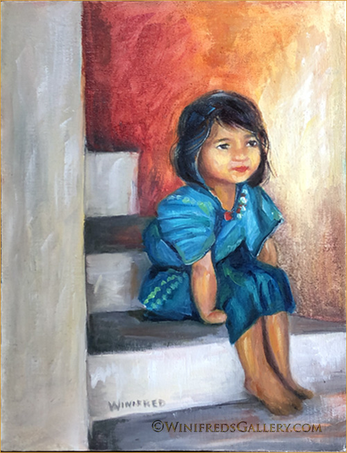
I’ve loved this photo for a long time now and it was time for this painting. The photo reference was by photographers Art and Daphne Carlyle who travel and do many projects for Rotary International. They shared many of their photos with me and I appreciate being allowed to use them in paintings from time to time. Gradually, I’m getting some figurative work done. This is a little Guatemalan girl. I adore her seated position – especially her little left arm and hand tucked beneath her. I can just imagine it – such a kid thing to do.
In addition to the painting which takes place in my studio – I have 3 bins of composting worms – “red wigglers”, busy making what gardeners refer to as “black gold” which is worm poop! There is no unpleasant oder, in fact, it has a fresh smell – like the forest. I’m in the process of separating the worms from the castings. I would show you a photo but it would likely gross you out. I have several thousand worms in the 3 tote sized bins – the kind you find at Home Depot. They’re my pets. I’ve gone from camels to worms – and you thought my paintings were diverse!! See you in a few days. Winifred
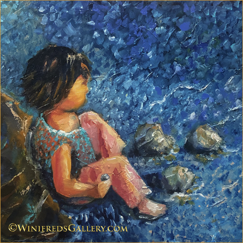
I’d prepared 16×20 linen panel to paint next. My subject matter would be a little girl at the edge of a lake sitting amongst rocks. I thought it might be a good idea to create a smaller painting to work out the colors and design. This is the initial painting for what will likely be a larger painting. This painting was created on a very textured panel which was great in some ways and challenging in others. A linen covered panel would give the painting a different look. Not positive the larger panel will ever happen – but maybe.
Below: While trying to include more portraits and figurative paintings back into my work – I just can’t leave my florals. I find them relaxing and expressive in a different way. Below, I explored a different color palette and painting style which evolved during the course of this painting.
As usual, I didn’t know what this painting would become when I started. It was to be a quick playtime painting. It started very simply, using the shapes and flower placement from a photo.
Below: The next day, I rejected the flower design and I could only look at it and think “so what”. I took it back into the studio. I also didn’t care for the stack of three flowers, top to bottom on the right nor the squeezed in look of the small flower left/adjacent the 3 right stacked flowers. The foliage wasn’t what I wanted either. I might have toss or wipe down this painting panel but sometimes I challenge myself to resolve the problems.
Above: This is also a much paler looking painting than is normal for me. Though I find the color palette attractive, I am uncomfortable/bored – particularly with the light background .
Below: In my next draft. I altered the flower placement and added color and expressive strokes. I found the new colors interesting – I enjoyed the expressive strokes but not the color or strokes on the left. “What is that”? Still I’m in the playful and experimental mode – a very important place to spend time and effort. Overall, this draft remained unacceptable.
Below, the “maybe” final painting with many concerns resolved. I enjoy the background’s broken colors and impressionist strokes. There are small things I may still alter a bit but I can look at this painting now without “grimacing”. Hope you enjoyed this little journey. Winifred
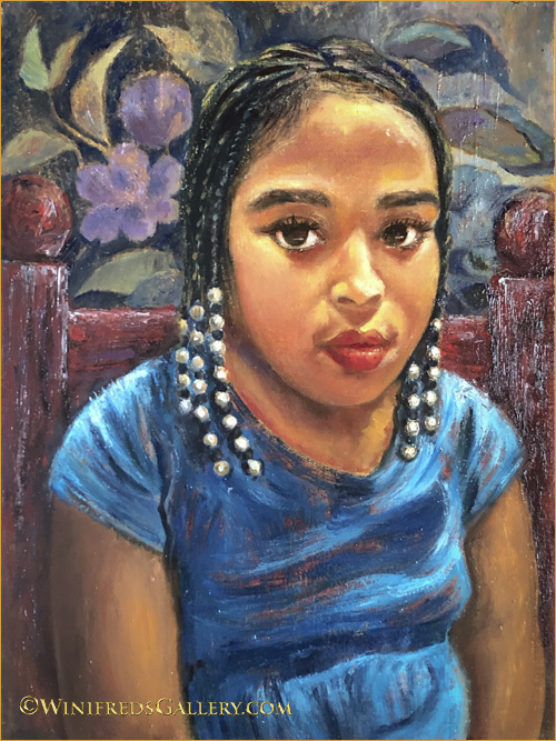
It’s been a year and a half since I painted a portrait. I decided I needed to paint portraits again before I forgot how – though I’m not sure if there is such a thing. I actually think any kind of painting leads to the same place – a more practiced and competent painter – but just in case I decided it was time. I opened my “to paint folder” to make a photo selection. I encountered this little girl a couple years prior, sitting inside a large shopping cart as her mom pushed her about while grocery shopping. She was wearing a pink dress with sparkling white beads in her hair. I ask her mom if I could photograph her. I promised her mom I would send her a digital file of the photo I took and I did. I then put the file away, not sure I would ever paint it.
When I began the painting, I envisioned a simple head and shoulders portrait with a plain background. I knew the beads in her hair would give the painting a certain pop! Below is an earlier unfinished stage of the painting and it was the stopping place for day one.
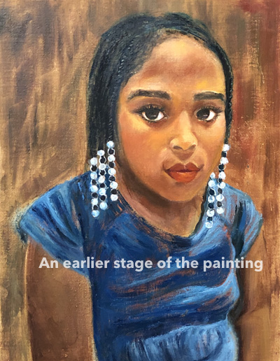
The following day, I painted a simple golden toned background with a bit of color variation and a bit of texture – different from what you see above. I also formed her arms more correctly and changed from the stark white beads – a judgement call – to more painterly beads. I placed the completed phase 1 painting where I could look at it for a while and thought – I DON”T THINK SO! The slouch was awkward against the plain background and bothered me.
I decided to give her a red chair because people often slouch in a chair – this helped. At the end of that painting day, however, I still wasn’t satisfied. I decided the background had to change to something more colorful and interesting. I went through my files, found a simple floral pattern, and used it, generally, as a background reference.
Adding this color, tones and shapes gave me what I wanted. These changes occurred over several days as my vision of the portrait evolved. It’s so much easier and faster to complete a painting if I have all the information and elements in the reference photo from the beginning – but in this case it was a “shopping cart”. It’s a good exercise to work this way, however, as it is an exercise in expanding ones creativity.
Portraits are complex and can be very tedious. This portrait was complex but was actually enjoyable and I will be creating them more often.
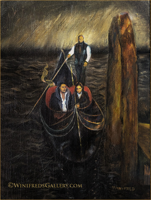
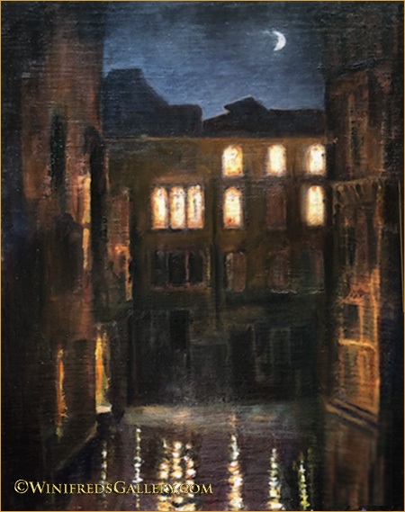
The reference image I took and used for this painting, I found to have a very different look from most Venice canal oil paintings. One reason is that it was taken of a gondola under a bridge – not out in open daylight on the canal. I looked at many other images online, there are thousands and thousands of them but I saw nothing like this one. Another reason I like it is that it has a portrait look to it – as well as looking rather stifly posed. It reminds me of Grant Wood’s portrait of the man and his daughter with the pitch fork – we all know it. My painting is actually not posed. I found the light and warm colors of the wood mooring pretty and loved the glow of outside light hitting the ceiling of the bridge – all of which give it a rather vintage look. These are the first water waves I’ve ever attempted. Not too bad! It’s my first Gondola painting also. I have many other canal images I can choose from for future paintings – many very nice images but nothing else quite like this one.
It’s not an excuse when I tell you that most often the digital files I post just don’t do the actual paintings justice at all – particularly when there are a great deal of texture/hence tiny detail in the panel and painting. The files looks more pixelated. Smooth paintings photograph and present much more accurately and attractively – but I love texture so I struggle with it. I’ve done the best here I can do. This painting represents a finished first draft. I have more work to do. I will wait a week and come back to it. At that time needed changes will just jump off the page. I also think I will give the driver an often seen sunhat and add stripes to his shirt. I’ll let you know if I make significant changes. Thanks for viewing. Winifred
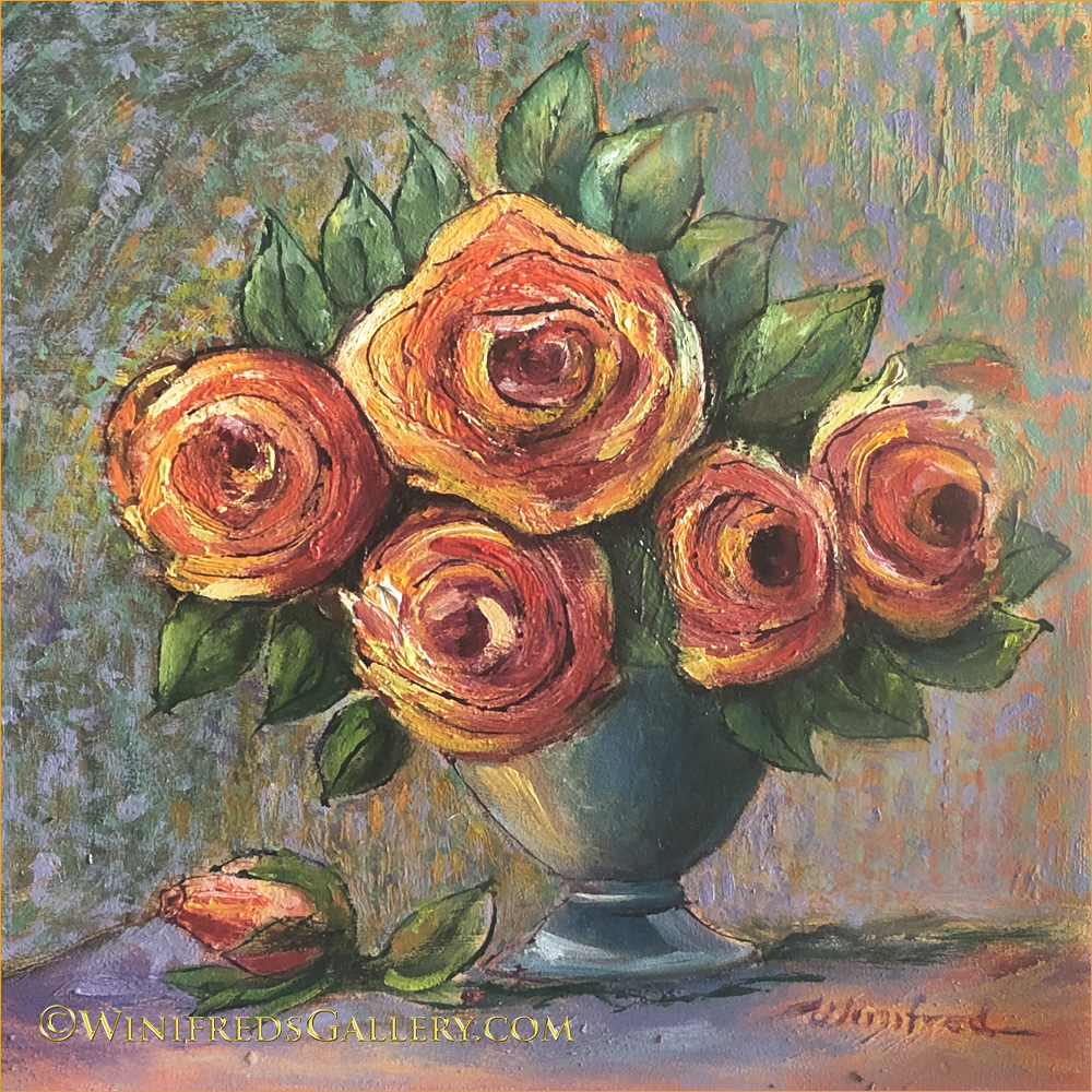
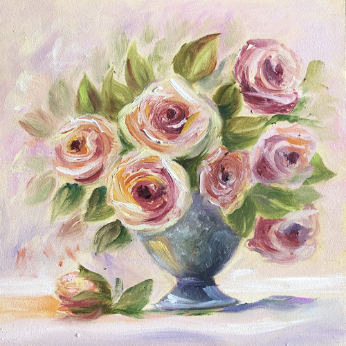
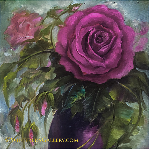
Roses are hard to paint – I think I said that before. I wanted to become more comfortable painting them – hence, I continue. I’ll change subjects pretty soon.
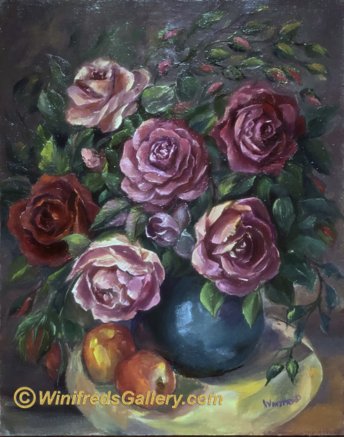
Above, the challenge was to paint a variety of different roses but to maintain a consistent painting style. For me, that required a great deal of discipline. I often like to paint in the “style of the moment”. By working to create a consistent style, some of the spontaneity was removed from the process – a type of “freeness” in hand movement I value. Even the fact that it is a 16×20 – not a small painting, increased the challenge.
Above: I planned to take this vase of silk roses upstairs but set them on the landing temporarily. When I did, I immediately noticed the very interesting pattern of light on the roses but particularly the shadows reflected onto the landing. One rarely paints a still life using overhead light but this was special. I snapped several photos, one of which I would certainly later use as a painting references.
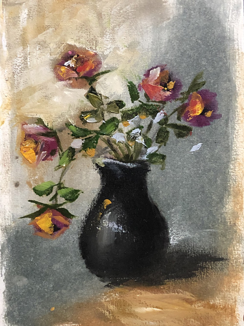
Below: Painting sketch from imagination. My challenge to myself – could I convey in only only a few quick brushstrokes the kind of flower I intended. This was fun! No laboring for hours or days to create this. It was quick, colorful and fun. I hope you recognize the flower!!!
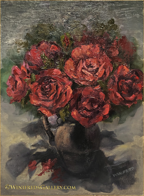
I’m always – well, not always, but from time to time, I go into intense rose practice sessions. Roses are complex and as with any flower, there are many ways to paint them. Above is a more traditional look.
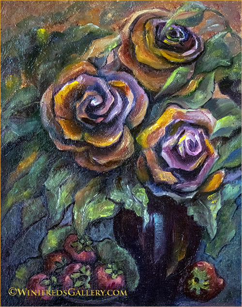
These are abstracted roses. It started with a small aqua vase in a table next to me filed with white artificial roses with a pink trim. I immediately stepped outside of the box in my approach to painting them. My hands didn’t want to be traditional that day though I was completely open to it. Rarely do I know what direction I’m going to take when I start a painting. For me, it’s a good thing and I just enjoy the journey of unexplored roads. If I get completely lost – I toss it, but most often it leads me to a very interesting place I may never have chosen to go. Such was the case here. It does remind me a little of Cezanne’s color palette of golds. greens and blues and the use of black outlines.
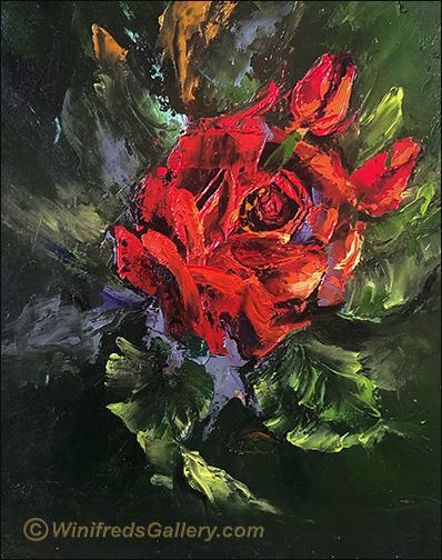
This was a fast rose painting rather than one I labor over for hours – or days. I need to do more if this kind of painting. It gets one out of thinking so much. It gets one out of so much detail. Well, I’m interested to see what will happen next. I have absolutely no idea!!
I made so many typos last post, it was truly embarrassing. I hope never to do that again.
Thank you for looking. Winifred
Hi There! Since in my last post, I presented what would better have been described as a succession of paintings, rather than a progression. This week, I’ll show you a real painting progression.
Because many of my paintings are from imagination, it can take me a while to sort out exactly what I want it to be. This sequence shows the evolution of this painting. In my last post, I thought I was finished – maybe, but this painting has now been sitting for a while and I feel no need or desire to change it. Be sure to read to the very bottom – there’s a surprise!!
Below – the very the beginning. When I started I was thinking hydrangeas.
Below – just a little more development.
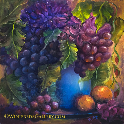
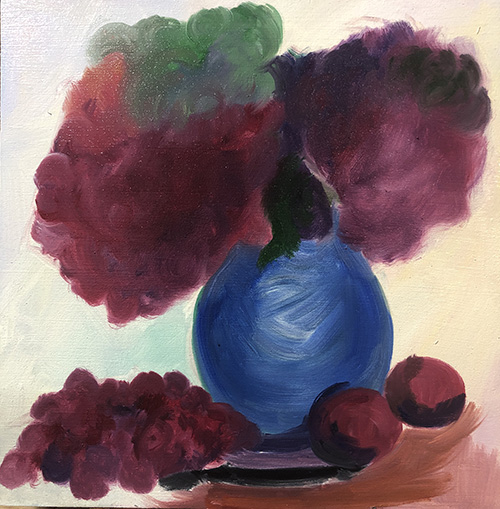
Below – Abstract hydrangeas. It’s apparent I was thinking flowers in the beginning. I thought grapes! Interesting, but I kept painting!
Below, the evolution into grapes – but not grapes I loved…
– so, I kept painting! The colors are luscious, the movement is good but as I kept looking at it – it just wasn’t quite there.
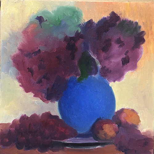
Finally, I FINISHED!! This is the final version – same as the top image. I repeat this image so as to have the progression in order. There’s a pretty big change, from beginning to end. I enjoy painting grapes – the colors and the way light moves through them. I try not to like paintings like this – even my on – I’m not sure why but I guess I do like it – if I create it. HA!
My other news – I have a WORM BIN! I’m excited! I’ve had it for 3 weeks now. I love the little Red Wigglers – all 1500 of them! Why? – I hear you ask – because I want worm castings for my summer containers. Worm castings are pretty amazing for enhancing the growth of food and flowers. They’re in my studio. I won’t say more now. I’ll create a different post soon and tell you all about them. We have names we’ll need to pick out! Just kidding! Bye for now and thank you for following me.
There are so many ways to paint hydrangeas and hydrangea still lifes. I’ve tried quite a few. They are challenging with all the little cluster petals. There are those who paint the little 4 petal clusters all over.
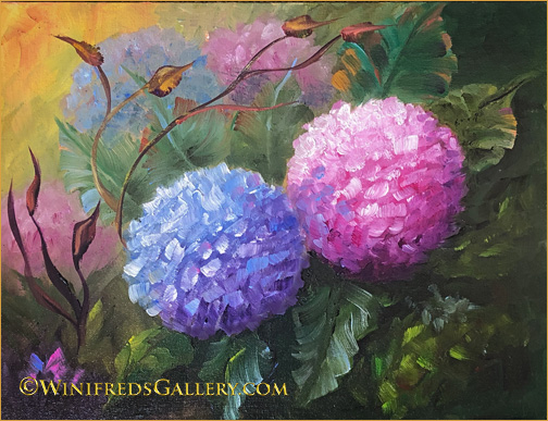
That’s more detail than actually interest me. I like the painting above but find it a bit too “sweet” and whimsical for my preference though I painted it!.
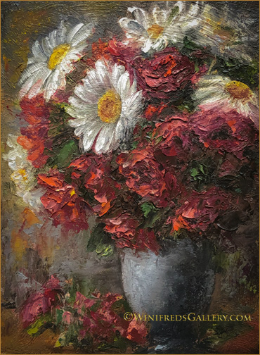
I wanted you to see I can paint other than sunflowers. I picked these flowers from my garden. The rose is a carpet rose, in case you know them. They’re not fussy! They will grow in almost any soil and with minimum care. They only want sun. Given that, they flourish. There are several hundred blooms during late June and July and a new flourish of these flowers in late August and September. Combining a few stems of the roses with fresh daisies made a lovely casual bouquet. I very often paint from photographs. This time I had both the fresh bouquet and a photograph to draw upon.
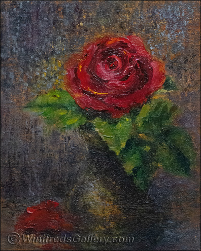
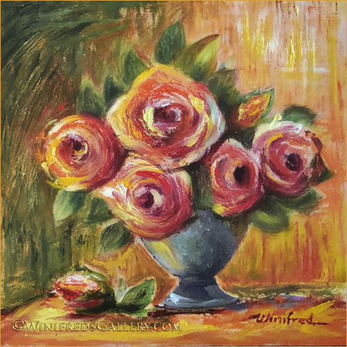
It’s been an enjoyable couple of weeks painting roses, which started with this one. The texture of the linen and the impressionist brushstrokes combine beautifully, I think, with the smoother impasto of the single red rose. I will switch to pink roses next time. The new painting has been designed – and awaits my attention. It will be a larger painting – probably 16×20. Today, I cleaned and reorganized my studio and I’m ready to go. I hope you enjoy the roses. Winifred