
Subscribe to continue reading
Subscribe to get access to the rest of this post and other subscriber-only content.
Related Images:


Subscribe to get access to the rest of this post and other subscriber-only content.
Subscribe to get access to the rest of this post and other subscriber-only content.
Subscribe to get access to the rest of this post and other subscriber-only content.
Subscribe to get access to the rest of this post and other subscriber-only content.

I I hope you’re enjoying the holiday season in anyway you choose. I don’t think I have ever created a holiday themed painting. I never feel inspired to do so. This painting is from a reference I set up about 5 years ago. I had sunflowers then and consistent with the cycle of life, some were in fresh bloom while others withered and died. I wanted to reflect that and to symbolically extend this to all living beings and the connections between them. There’s a relationship here. Although I liked the image from the beginning and felt it, I didn’t feel competent to paint it. It looked so hard to do. Now I felt ready. Enjoy your weekend. Winifred
Subscribe to get access to the rest of this post and other subscriber-only content.
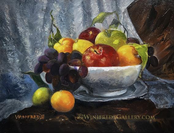
Still lifes are not particularly exciting for me to paint – though I paint them. Painting still lifes is good practice, however, because of the varying shapes, textures and colors involved, along with the challenge of complex composition. Painting still lifes actually helps in painting portraits. In fact, painting in any style assist with painting any other style. You can look at this painting and see all the separate elements I had to paint. There were decisions and layers of brush strokes involved with each item.
I’m working up to the 10,000 paintings said to be necessary before one can expect to claim “mastery” in oil painting. I’m still under 1000 paintings, so I have a ways to go. It’s time for another portrait. Have a wonderful weekend. Winifred
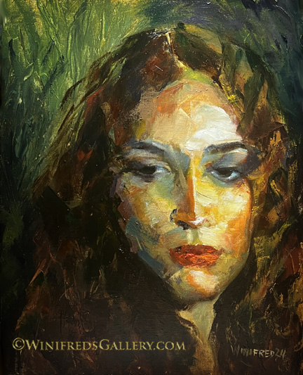
I’ve attempted a similar style of painting a couple timed in the past. They were smaller – 5×7 and were good – however, I felt I’d only been lucky and felt no confidence in my ability to create such paintings. This painting represents a step forward for me. I certainly feel encouraged to try more. Next time, I hope to use fewer strokes and to make every stroke count.
I said, I’d see you on the other side of the election. Well, we have a new President. As you know, he is not the one I wanted. Courts have determined him to be a RAPIST and a convicted criminal. He’s been twice impeached and documented as a prolific liar and fraudster. Regrettably, e’s completely lacking in character. But, it is what it is. I won’t mention him again – he’s not worth it. I’m here to share my paintings.
Have a great weekend. Winifred
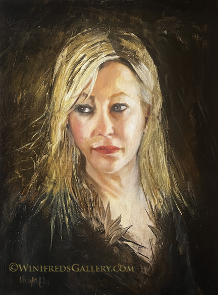
I actually enjoyed creating this painting and it’s emotional content. There was no appreciable suffering during the painting process this time – as is certainly the case with many of my paintings. I even was able to create some energetic brushstrokes in her hair, background and attire. No doubt. it’s a function of experience and growing confidence in brush and paint handling. I am determined to be able to include some level of abstraction into realism. I think the combination is pretty wonderful.
Well, we have a big week ahead. See you on the other side. Have a great weekend. Winifred
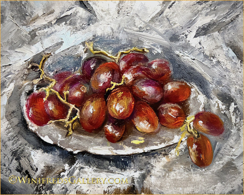
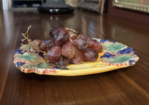
What a journey this painting has had. It was intended as a little practice exercise – to paint something I would not particularly care about. To allow that the painting would not be “precious” as they say, allows one to be more comfortable experimenting – such that what or how one paints just doesn’t matter. So that was my mindset which carried throughout the painting process – as you will see. Below is the reference image – a little yellow plate with grapes on a brown surface.
Below is a crop from my initial painting of the plate and grapes.

When I stood back to look, it was apparent I was doing my same old realism and I didn’t want to do that. So, I scraped the paint off the plate. I think it’s rather pretty but I wanted something different from just pretty. It’s getting less hard for me to to paint something relatively well (the plate) and then decide – NO – scrape it off and try again. I maintained the grapes throughout. Below was the next attempt.
Above, I painted over plate and the background and started adding random colors. Again, I decided NO and scraped off the paint. Then I decided I would approach it differently. I would find my little yellow plate and set up what would be a background and table covering and work from this structure. Below is that photo of what would be my background reference image:
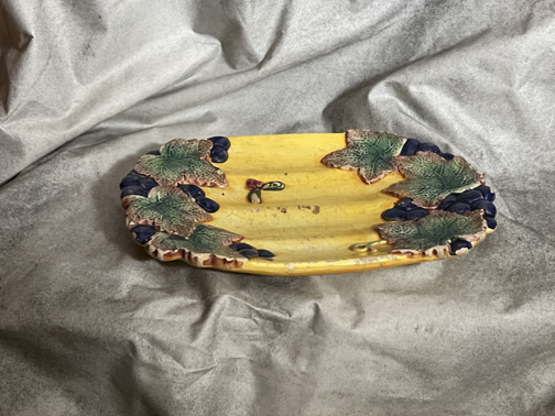
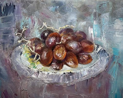
Above: I thought that having this reference would assist me with what I wanted to accomplish. I found a piece of stiff cloth I like to use because it will hold stiff folds. It’s actually a piece of house painters floor protective covering which has vinyl on one side. I set the little yellow plate on it – no grapes – and I photographed the plate against the cloth which gave me a reference background and table covering. Below was my first attempt using the reference to form my background.
Above: Rather interesting colors and shapes but not what I wanted. Here again, the plate shape is painted with a sense of realism reflecting of the original shape than I wanted, if not the color. Thus, I’m heading down the wrong path again. I struggle with this. Below, I try again.
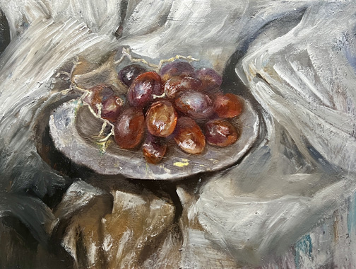
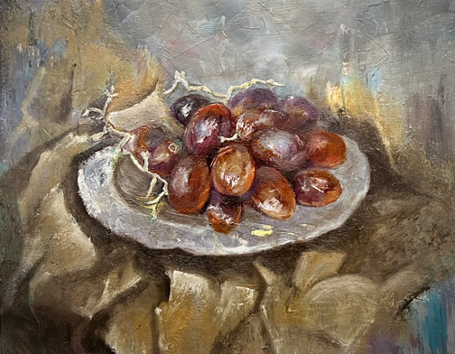
Above: Not so bad except that the color turned to mud because I hadn’t sufficiently dried nor scraped off the tan/gold paint you see before it. This time I would allow it to dry over night and reapply cooler paint colors during my next paint session. Below- the final PERHAPS.
In actuality, the light colors in this painting are very neutral – not so warm hued as they appear in this photo of the painting. (It could just be my screen.) I intensified the grape color, added deeper reds to the grapes and added a couple additional grapes as I always enjoy doing. I admit I never took the grape stems too seriously. I succeeded in a looser background with lots of texture, random abstract strokes and lots of energy. The background is not necessarily pretty but it’s not BORING. That’s important to me. To have energy and not to be boring was my only objective for this little exercise – which turned out NOT to be such a “little” exercise. In keeping with the intention to not make this painting “precious”, I’m going to sand down the background as soon as this painting dries more. I have found that the result of sanding a painting during the painting process or after, most often enhances the painting. It allows some of the underlying colors to come through and it affects the edges in some way. I expect it to become more interesting. I’m not sure what will happen. If the results are particularly interesting I will show you. If you actually made it this far – thank you for sharing this journey with me. Winifred