Subscribe to continue reading
Subscribe to get access to the rest of this post and other subscriber-only content.


Subscribe to get access to the rest of this post and other subscriber-only content.
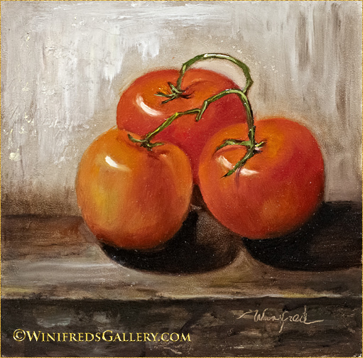
This is the second time I’ve painted a group of “three tomatoes. I waited until I was finished with the painting above before I looked back on the painting (below) created 5 years ago or so in order that it not influence me. I remembered my first tomato painting, below, was very blended and pretty realistic. I worked hard to make sure this latest painting (above) was more textured and loose. It was taken outdoors with a blue sky shining on them giving the cool highlights and creating significant contrast. Evergreens, form the background.
Neither painting was easy. I remember how difficult it was to blend the slight shifts in gradients in the first painting, below. This latest painting, the one above, should have been easier and it probably would have been had I not worked so hard to be true to the many shapes, ridges and color variations of the heirloom tomatoes. It has much deeper in color, more burgundy with green variations.

I like both paintings for different reasons. I definitely like the background and tabletop of the painting above. Choosing a favorite is always complicated. Have a great week. Winifred
I keep a folder on my computer titled “still lifes to paint”. This image has been in that folder since 2018. I set ip the still life and photographed it. I really like the image. I love the rough looking vase ( I guess it’s a vase) against the multi colored silk scarf over the shinny gold cloth. In no way did I feel I could paint it however. Besides, I found the digital file so pretty, I thought there was nothing I could bring to it anyway. And so, for all these years it sat. Every time I’ve come across it, however, I react to it in an admiring fashion. This week I decided I would try it. Afterall, I’ve been practicing for 7 years now. Unlike with painting roses, I actually enjoyed the process – I wasn’t miserable the whole time. Do you wonder what those orange objects are? I’m really not sure. I tried to make them resemble fruit or vegetables moreso than they did when I took them out of the bag of plastic objects I acquired from Goodwill long ago. Some objects in that bag actually looked like apples or oranges, others were not identifiable. They were shapes, with color and that’s all I really cared about.
You won’t believe what I’ve chosen to paint the coming week. I ‘m going back to misery painting roses. I keep thinking it’s got to get easier at some point. I took photos today and I’ve made my selection, guaranteeing you’ll see another “rose painting” in a week or two. The photo is pretty cute. Bye for now. Thank you for looking. Winifred
I didn’t do a new painting this week. I continued to work on a previous painting or was otherwise busy. So, I decided allow you to view a previous painting from my past. I think i painted this in 2018 before I started this blog about seven months after I began oil painting. It is relatively large at 12×16. For sure it’s not perfect but I’m surprised I would actually tackle this level of complexity so early. I did this quite a lot in the beginning. I set up still lifes regularly, photographed them and painted. I played with paint mixtures I mixed and modified oil paint, I made panels to paint on. I was so driven. In this painting the challenge was to paint metals, drapes and fruit. When I look at this painting, I am pleased, but I still find painting roses more difficult.
Below, I put in more time on the painting I posted last week. This is the latest version.
There are so many ways a painting can be expressed. Sometimes, it takes a while for ones vision to evolve. When I posted last week, I had no intention of painting more or differently. However, the next day, when I viewed the painting I decided to put it back on my easel. I didn’t have a full game plan but I wanted “more”. For the most part I just viewed and reacted. I started to use thicker paint, more color and made some adjustments to the values. I added foliage and repainted and smoothed much of the background. I’ll add the original below to make this easier for you. At first it was fine – overnight it wasn’t!
The greatest difference is in the vibrancy of the flowers and the thickness of the paint. Flowers don’t have to be vibrant. They can be subdued. In fact the flowers I was panting weren’t so colorful but I am happier with them now. Overall, the redo is less tentative and I’m glad I did the additional work. Thank you for looking and have a great weekend. Winifred
This is the first year I’ve selected multiple flowers from my garden, in a bouquet to paint. I kept them in the refrigerator most of the time and pulled them out only when I had a reason to refer to them, for example if I wanted to change the angle of a flower. I’m amazed at how long they’re lasting. If I kept them out continuously, they wouldn’t last long at all. I never imagined I would cut roses to paint, though that was the reason for the purchase of the rose bush. I continue to find painting roses intimidating and it continues to be my wishful thinking that I’ll become more competent in doing so. At the same time, I know how many I’ve already painted 60 or 70 or more, and it’s still a real struggle. I think we’ve had that discussion. Daisies and sun flowers aren’t so difficult. There is a way of painting them which I grasp and even enjoy – not so with roses or even the petunias. The next major challenge was trying to get a good image of the painting. My methods have become much more sophisticated and my images have improved, but the fact is, the more distinct the color or brushwork variation in the painting (as opposed to smooth gradients), the harder it is to get a good image – no matter what. Look at the vase, for example, the smooth gradients, as opposed to the flowers petals. I had to do so much manipulation of the image even to get the flowers the least bit acceptable and they’re still not the same as in the painting. I had to do nothing to the vase because of it’s smooth gradient. I really don’t mind painting challenges. I do mind the photography challenges. So much time is wasted. I’ve already started to photograph my next still life. I have about 40 images so far and still none are exactly what I want.
It’s cooler now – 70 degrees was the high today – and yes, I’m happy about Kamala. Have a great week. Winifred
I’ve long wanted to paint an image in this style – an image soft and atmospheric. But, I always chased the detail. In this instance I had blocked in the background enough to know what the color and depth would be. I had painted the vase enjoying the rich color, form and highlight. An initial simple shape of the fruit had been painted. I could turn my attention to the orchids, which had been loosely “rubbed” out of the initial paint layers. Already I liked this painting – it was loose and without too much detail. I only had to finalize all and paint the flowers – or so I thought. The conversation went something like this with my inner voice speaking – really it did.
“YOU’RE DONE WITH THE FLOWERS” What? I said – I really haven’t started on them. “NO. YOU’RE DONE WITH THE FLOWERS – FINISHED”. I wanted to resist – I hadn’t painted the flowers – maybe just a little more paint to shape the petals and to turn their edges, I thought. Resisting, I picked up the brush and put a bit of shadow color on a few petals, and added a bit of highlight color – I didn’t like it. I wiped off the paint. “I TOLD YOU YOU WERE DONE”, said my inner voice, AND IT DIDN’T LOOK BETTER WHEN ADDED PAINT”….. And so I was done.
I’ve never created such soft irregularly shaped, low contrast flower petals in a painting EVER! Look back at last weeks post – hugely different. As a result, I want to create more softness and atmosphere! In general people love contrast. Ask them which image they like and they will they choose the one with the greatest contrast – contrast to them meaning it’s a better image. There’s a place for contrast for sure, but at this time I’m interested in exploring atmosphere and lower contrast, a quality which has alluded my paintings. I wasn’t confident enough to employ this technique, and didn’t really know how to achieve it, and it occurred in this painting, only because I heard a voice greater and louder than mine. I’m pretty excited.
The 5 days of extreme heat – meaning the temperature reached 88 degrees – is over – at least for a while. Finally, I purchased a big air conditioner, and did so before I even knew there would be a heatwave. It was inevitable that the need would occur at some point. Our nights, however, remained cool this time. All is well in Poulsbo. I hope you’re enjoying your summer. I hope you enjoyed my atmospheric painting. Winifred
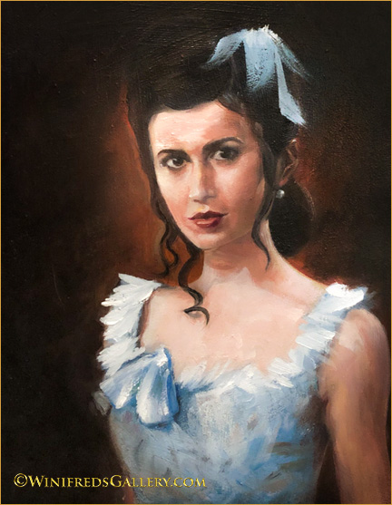
I create my paint sketched freehand with a paint brush. I must have told you by now, how hard it is to do this and to actually achieve an accurate resemblance. It is really hard. There are a few tricks though, to assist you. I used a couple. One is to turn both the reference image and the painting upside down. It helps immensely when you really get stuck and are not seeing some feature correctly. You can see the error of your seeing immediately because when upside down a lip or an eye or any shape becomes an abstract shape and the concept of eye of lip goes away. It turns your brain off a bit but increases your vision. It’s a pretty amazing tool.
They say the eyes are the window of the soul but the mouth creates the likeness. Honestly I spent hours trying to see her mouth correctly. Each tiny curve and tonal value has to be correct for it to properly appear as the reference mouth. If it’s not correct, you have a painting of some unknown person. I spent hour working on/painting her mouth and in the end is is finally correct. Brushstrokes throughout the painting appear a bit choppy particularly in the shadows of this digital file – far less so on the painting itself. I didn’t particularly concern with smoothing brushstrokes. myself with that. I wanted the features to be correct.There are many ways to make portrait painting easier, I could use a grid, there are even ways to copy an image onto the canvas. However, I want to sketch and paint freehand and to strengthen my eye for this capacity. Therefore, I must endure the pain of the process. I don’t mind a bit of suffering to get there. Below: A redo.

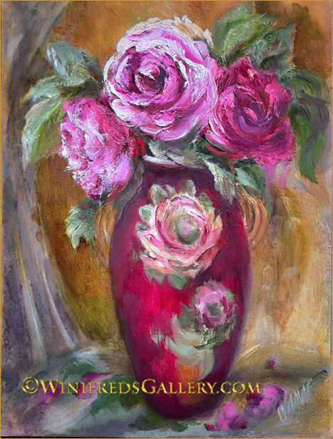
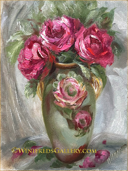
Do you recall the pink roses in the green vase last week? Well, this is it. I gave it a redo. The red rose in the red vase painting quickly had a new home and I missed the red vase in particular. I also kept envisioning gold tones in the background rather than the more cool neutral tones I used before, so in this redo, gold it is. Original below and I do like the original roses. It’s all fun. I’m already thinking about what I’ll do next and I’ve pretty much decided.

Have a great weekend. Winifred
Its been a year or perhaps two since I’ve painted a floral still life and I it really hadn’t part of my plan. I was simply going through my images looking for the next portrait reference and a photo of three roses in a decorative vase (clearly out of place) was before me. I thought I’d do something quick as a diversion.
Actually it was the painting below and to the right which was the first I painted. When it was finished, I wanted to try a different style of painting as well. So, I’ve ended up with two quite different paintings from the same reference image. The image to the right is most like the reference in colors and proportions. The one above is much more of an interpretation.
Well, it’s time for me to get back to my portrait study. The portrait reference is from a tight head shot, which is not the kind of portrait I particularly enjoy painting, but it’s continuing practice in drawing, developing an eye for proportions. and painting features which is a process and practice which never ends.
Hope you enjoy the roses. I know you don’t particularly enjoy commenting, but I would love to hear your thoughts/preference regarding these two paintings, so I will leave the comments turned on – but no pressure. Winifred mailto:art@winifredsgallery.com

I promised you another “bold” stroke painting this week and I thought that would be the case, but as we’ve seen before, I had little control over my hands. The reference image for this painting was taken in my studio 10 years ago or more. She was a lovely model and fancily dressed. I added the bow to her hair and altered the detail trim of her dress to mimic the hair bow style – just to loosen things up a bit. She was from Eastern Europe and came with beautiful long dresses for her photo shoot. Below:
I don’t have Poinsettias but decided a painting of red roses is an appropriate image for almost any holiday occasion. I wish everyone a very MERRY CHRISTMAS and a loving holiday season. Thank you so much for being part of my painting journey. You inspire me. Winifred
Once again we celebrate our respective holidays – gatherings of family, joy, peace – or not! And once again, I’ve reworked this painting! I’ve been at it off and on for 4 years now. Recently, I even sanded down much of the bottom and lower right. I sanded back to the white of the panel. Notice how lustrous those grapes look on the right side. Painting layers of transparent color over a white board gives you the brightest most intense and reflective translucent color. Applying opaque colors is beautiful also – it just depends on the look you want to achieve. I added the bit of cloth and fringe. The bit of white livens the painting over all. I wanted to leave the foliage loose and abstract, though it received a touch up as well.
I can still remember the moment I photographed the lady in the window. She saw me looking at her. I motioned to the camera and looked back up at her – my way of asking permission. I remember that moment of connection with her. She nodded yes, gave me a warm smile – even waved. I wanted “the wave” in the painting but her arm and hand were positioned so awkwardly – I couldn’t make it work.
Below: This is a first time I painted a barn, trees, a field of grass. It was fun. I enjoyed it so much in fact, I painted it twice!
I didn’t like the trees I painted initially so I sanded down that part of my painting. I used an electric sanding machine rather than a sanding block – I was aggressive. I was pleasantly surprised when my trees were were immediately simplified and had a level of abstraction. Artist frequently say that removing paint is as important as putting it on. This is an example and I need to employ this as a technique more often rather than as a last resort. In 2022, my only resolution will be to sand off more paint.
I wishing you the best during this holiday season. Winifred