Small Paintings

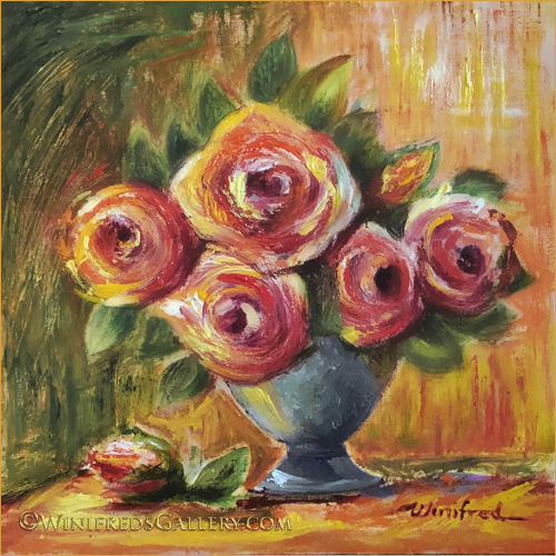
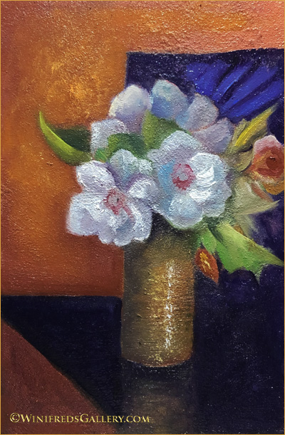
Bouquet with Blocks of Color – 4×6 Oil Painting on Cradle Box by Winifred

The photo reference for this painting was taken in my kitchen with the vase sitting on a counter facing the window. The refrigerator and more counters were behind me. When I looked at the photo, I noticed interesting shapes. Honey colored cabinets were upper right and formed a shape – another shape was formed by the area under the cabinets extending down to the back counter. The stainless refrigerator was upper left and formed a shape. Then there is the counter the vase rest on and the lower triangle is the side of the counter which extends to the floor. I could combine some shapes and leave others separate. I knew I could work these shapes into the overall design if the painting. The vase was ceramic with stripes of color. I tried to work with the stripes this but It didn’t work. It’s interesting how simplifying the color of the vase and creating highlights give it the illusion of a gold/bronze colored metal. The design of the flowers and the design on the dark background just showed up in my head. I welcome these creative visions whenever they wish to enter and guide me. Below – roses.
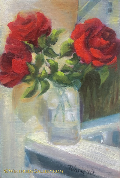


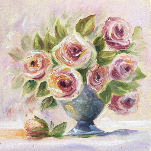
Roses in Sunlight – Oil Painting by Winifred

I’m glad I spent so much time and effort this past year, making roses a friendlier subject to paint. The softness of this painting comes from using a “mop brush” on the painting before it is dry to soften and blur edges. This brush can be used selectively or all over – depending on the look I want to give. I enjoy the feeling of the the heat and sun on these roses.
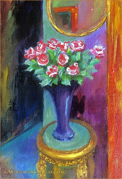
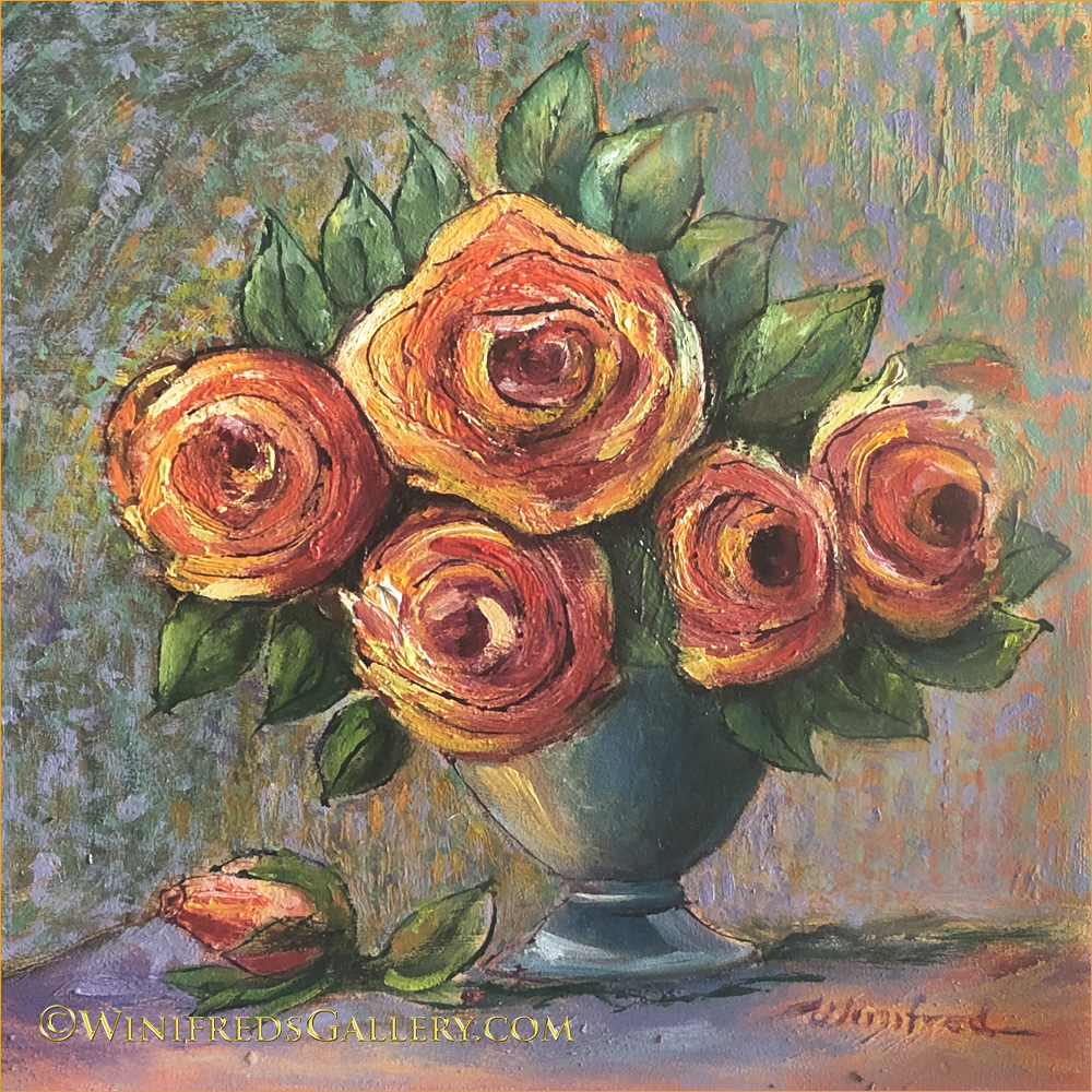
Roses on Gold Gilded Table – 4×6 Oil Painting on Cradle Box by Winifred

Lots of intense color. I love that I can create “gold metallic” where none exist. This painting took way to much time, but it captures a certain space in my home which I see everyday. The orange strip on the right is the edge of a bookcase full of art books.
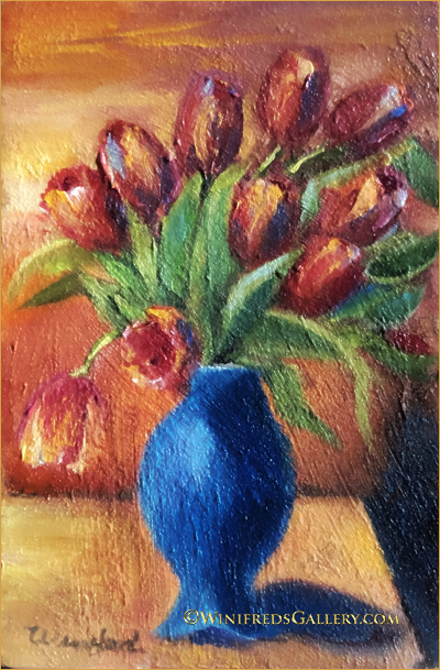
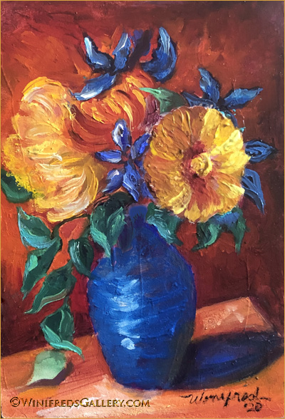
Tulips in Blue Vase – 4×6 Oil Painting on Cradle Box by Winifred

I love texture but there’s really not this much texture in this painting. This texture only reflects the way the light hit the texture and exaggerated it. I should have rephotographed it – but I didn’t. Just think of it smoother. The vase was a cream color – and it did work but decided I an intense blue would be more interesting. You know what VanGogh said about blue, orange and yellow. It’s true – those colors are beautiful together.
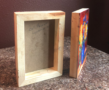
Cradle Box

I’ve referred many times to “cradle box” past couple of weeks and I’ve been ask – “what is a cradle box”. Above – you can see what it is. I’ve now begun to paint the edges. There seems to be no more small cradle boxes remaining on the planet!! I’ve looked everywhere I know to look – mine were purchased more than 2 years ago. Sizes now seem to start at 8×8 inches.

Hope you’re enjoying this small painting series with me. Only 2 cradle boxes remain blank, which I will paint this week. I could conceivably repaint a larger painting from any painting in this series because I have worked out the color palette and design. Many artist do this so as not to have to experiment with design and color in a large painting. Certainly this makes a lot of sense. I will take this under consideration. (: Hope you’re staying safe.
Related Images:

4×6 Floral Series

Spring Bouquet Oil Painting 4×6 Cradle Box – by Winifred

During the last 10 days I painted these six 4×6 paintings – all on cradle boxes I’ve had for more than 2 years. It was an interesting process. I felt I could experiment and take more chances than I otherwise might. I could allow my brush to move and sway and dip into various colors without a care in the world. I could select from thick paint and thin paint. I enjoyed the process and the results. In the beginning, I was more successful with the free flowing process than a subsequent paintings when I began to tighten up – but not too badly.

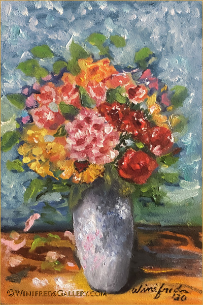
Orange and Blue Floral Oil Painting 4×6 Panel Cradle Box – by Winifred

I had fun with color movement and texture.

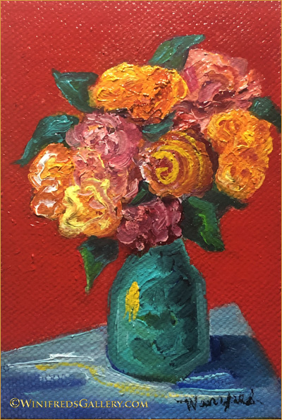
Simply Red Oil Painting on 4×6 Cradle Box – by Winifred

… and more color. I don’t think I’ve ever used a solid color background before – always thinking it better to include some painterly patterns or texture. I now think a simply solid background can be just perfect.

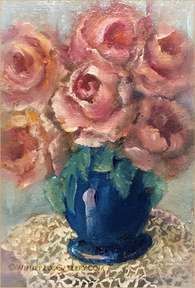
Bouquet with Crochet – 4×6 Oil Painting on Cradle Box – by Winifred

Above I created an old fashioned look, a vase of roses and my first crocheted doily.

Bouquet on Pedestal Oil Painting 4×6 on Panel Cradle Box
– by Winifred

I enjoy playing with light as well as color. I have not used the above still life location before but I certainly will again. I placed a 3 foot garden pedestal on my stairway under a skylight. I could envision that this would create interesting light effects and it did.

Spring Impression Oil Painting on 4×6 Cradle Box by Winifred

This was actually the first 4×6 I painted. It reminds me of a spring breeze.

During the next week, I will paint the edges of the 3/4 cradle boxes these are painted on. I will then apply gold foil to the edges. Right now, it’s just natural wood. This will allow them to look very pretty when you hang them on the wall. A small nail is all you will need or those stick-on strips. I have 4 more cradle boxes and I’ll paint them as well. I’m interested to see what I will create. It’s always a surprise – even for me. Thank you for your interest. Stay safe and have a good week. Winifred

Related Images:

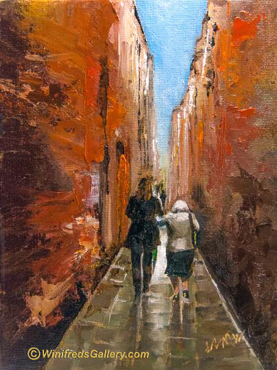
Venice – Physical Distancing

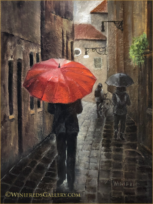
Venice Italy Social Distancing – Oil Painting 12×16 by Winifred Whitfield

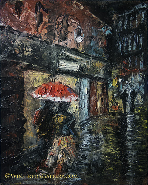
Another colorful umbrella, reflections and lots of texture to paint – a journey unto itself. Initially there was a group of ten people at the end of the stone path. I didn’t find that very interesting and chose not to include them, instead deciding on one person I would create from imagination. There he was standing alone and suddenly became a strong focal point – surrounded by the light and wearing dark clothing. He needed some “stuff” to diffuse the focus. I decided on a bicycle and a backpack – something so often seen in Italy. That alone with shadows for him, and a few smudges allow it to work for me – attention, but not too much – after all, the man with the red umbrella is the “star”. Painting from my Italy photo references gives me the opportunity to paint environments with people, texture, and dramatic lighting formed in a very different way from painting portraits and still lifes – I like that. The fact is, I love it all. Below are a couple of additional previous paintings created nearly 3 years ago – you may not have seen. Hope you enjoy.

Nonna – by Winifred

Above: This is such a tender painting. I love it still – so does a friend who owns it and tells me often this is the first thing she sees when she wakes every morning. She loves her grandmother and this is a reminder of the relationship they share.

Venice at Night by Winifred

Don’t let this one scare you. I have an “undetermined” assessment with the above painting. It was one of my very early paintings and my first impasto painting. What I do like is the energetic brushstrokes – with a bit of an impressionist look to it – though the impressionist were all about painting outdoors in light. t does hold my attention and suggest that I explore it in detail. This painting has had a new home for quite sometimes and he thinks it’s great – whereas I’m still not quite sure about it. I think I’m less bold now and that is NOT good. Actually, the more I look at it – the more I like it. I must try to create a new painting in this style. That would be fun.

In my next post, I hope to enchant you with a series of miniature floral paintings. Miniature for me is 4×6 inch paintings. I’ve completed a couple of them and they are pretty fun to do. It’s different from painting a larger painting. Stay safe. Winifred

Related Images:

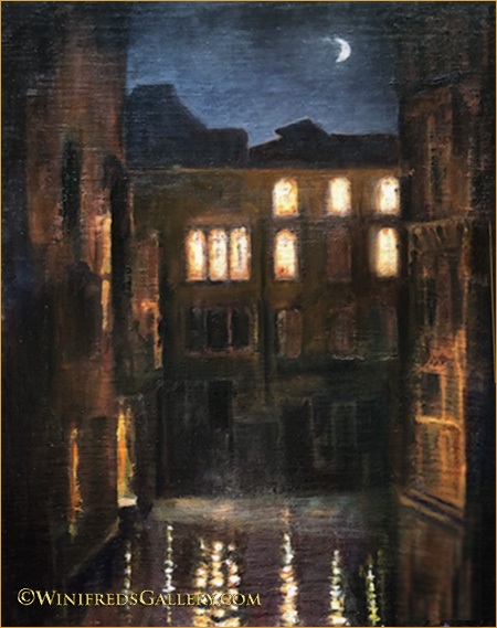
Venice – Crescent Moon and Sparkling Lights

I found the dramatic patterns of light so beautiful – from the moon to the rippling reflections in the canal. Set against centuries old buildings with a dark silhouetted skyline – that for me is the whole story.

Crescent Moon and Sparkling Light Oil Painting 16×20 Linen Panel by Winifred Whitfield

Related Images:

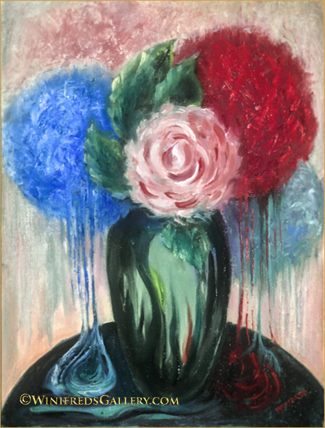
Melting Flowers

Melting Flowers Oil Painting 12×16 on Panel – by Winifred Whitfield

Melting: It happened without thought. I wanted to soften the edges a bit. It started on the red flower side. When I got to the bottom I dragged the brush down just a little further and I liked it. I dragged it longer – even better. I was entering new territory. I decided to just go for it – wherever it would take me – it didn’t matter what would happen – and this was the result. Pretty fun.

I corrected several paintings this week. That felt good – they’ve been accumulating in my studio. It’s unsettling for me after I “see” more clearly to just leave a painting in this state. For one painting it was a 3rd iteration of correction but it is truly better now and it is a paining that I value, hence worth the effort.

In a couple days, I will post a new VENICE painting – perhaps 2. Hope you’re staying safe and finding a way to enjoy your increased “at home time”. Winifred

Related Images:

Daydreaming

“Daydreaming” Oil Painting 9×12 Oil on Linen – by Winifred Whitfield

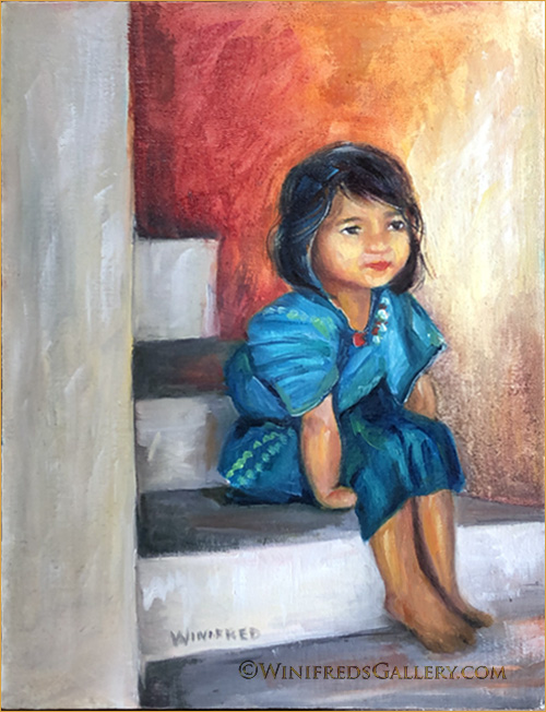
I’ve loved this photo for a long time now and it was time for this painting. The photo reference was by photographers Art and Daphne Carlyle who travel and do many projects for Rotary International. They shared many of their photos with me and I appreciate being allowed to use them in paintings from time to time. Gradually, I’m getting some figurative work done. This is a little Guatemalan girl. I adore her seated position – especially her little left arm and hand tucked beneath her. I can just imagine it – such a kid thing to do.

In addition to the painting which takes place in my studio – I have 3 bins of composting worms – “red wigglers”, busy making what gardeners refer to as “black gold” which is worm poop! There is no unpleasant oder, in fact, it has a fresh smell – like the forest. I’m in the process of separating the worms from the castings. I would show you a photo but it would likely gross you out. I have several thousand worms in the 3 tote sized bins – the kind you find at Home Depot. They’re my pets. I’ve gone from camels to worms – and you thought my paintings were diverse!! See you in a few days. Winifred

Related Images:

A Bit of Cheer

A Bit of Cheer Oil Painting 9×12 Panel – by Winifred Whitfield

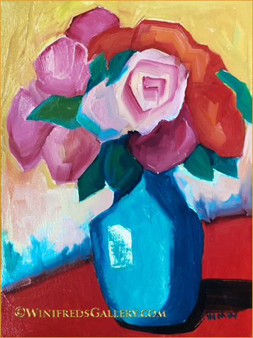
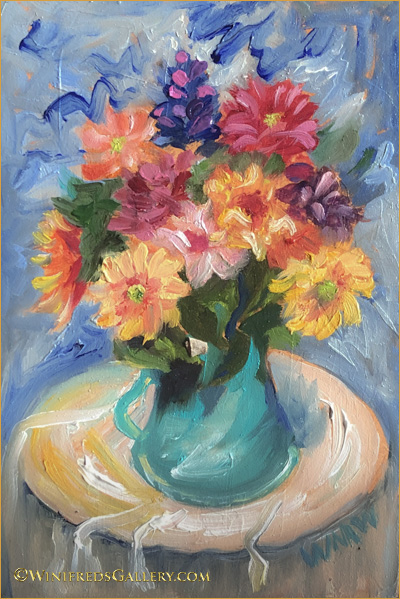
I decided it is a perfect time to post a cheerful floral. It’s such a strange time in out lives. This is a bit different style of painting for me, loose and simple. I think I’ll do more. One interesting side about this painting is that whereas in the painting, the vase is actually turquoise green – looking like the beautiful turquoise of the ocean in Hawaii for instance, it is not blue as shown here. I couldn’t capture the actual color with my camera where the color space is more limited – same with my computer monitor. The other colors are pretty accurate – just not the turquoise. I’m sure no one cares about this but me. SIGH! Have a great week and please stay safe. Winifred

Related Images:

Mainly Foliage

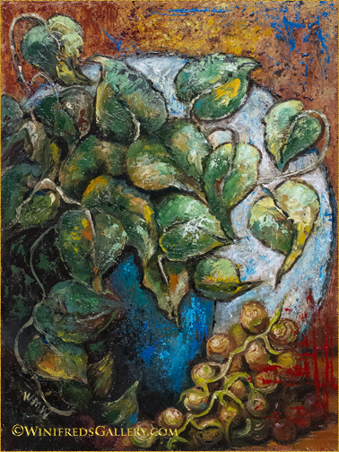
Foliage and Vines Oil Painting on 9×12 Panel – by Winifred

It’s been nearly 2 years since I created both the paintings I’m sharing today. I found this painting a bit odd and it probably is, hence I hesitated to share it. But for me it has stood the test of time and I have no desire to toss it and I toss paintings pretty easily if I cannot enjoy them. In the above painting, I enjoyed the process of creating the vine foliage form, dimension, texture, color and movement. I find it interesting to view. Still, It’s a bit unusual but I think it has merit. Below, I primarily painted foliage again:

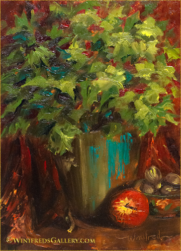
Foliage in Brass Oil Painting on 9×12 Panel – by Winifred

For some reason I think I wrongly consider foliage insufficient as painting content – though in fact there are many other elements included in this still life. It’s just the mind attempting to undermine my efforts, as it does sometimes, but I held onto this painting because in fact, I know better.

I’ve been working on a new painting from a Venice reference. It’s 16×20 which takes more effort to paint and to resolve it’s issues. Perhaps I can share it next week. Please stay safe as we navigate through this Coronavirus event.

Related Images:

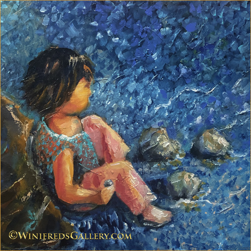
Little Girl with Her Rocks

Girl with Her Rocks Oil Painting 9×9 by Winifred

I’d prepared 16×20 linen panel to paint next. My subject matter would be a little girl at the edge of a lake sitting amongst rocks. I thought it might be a good idea to create a smaller painting to work out the colors and design. This is the initial painting for what will likely be a larger painting. This painting was created on a very textured panel which was great in some ways and challenging in others. A linen covered panel would give the painting a different look. Not positive the larger panel will ever happen – but maybe.

Below: While trying to include more portraits and figurative paintings back into my work – I just can’t leave my florals. I find them relaxing and expressive in a different way. Below, I explored a different color palette and painting style which evolved during the course of this painting.

Colorful Roses Oil on Panel 12×12 by Winifred

As usual, I didn’t know what this painting would become when I started. It was to be a quick playtime painting. It started very simply, using the shapes and flower placement from a photo.

Below: The next day, I rejected the flower design and I could only look at it and think “so what”. I took it back into the studio. I also didn’t care for the stack of three flowers, top to bottom on the right nor the squeezed in look of the small flower left/adjacent the 3 right stacked flowers. The foliage wasn’t what I wanted either. I might have toss or wipe down this painting panel but sometimes I challenge myself to resolve the problems.

Above: This is also a much paler looking painting than is normal for me. Though I find the color palette attractive, I am uncomfortable/bored – particularly with the light background .

Below: In my next draft. I altered the flower placement and added color and expressive strokes. I found the new colors interesting – I enjoyed the expressive strokes but not the color or strokes on the left. “What is that”? Still I’m in the playful and experimental mode – a very important place to spend time and effort. Overall, this draft remained unacceptable.

Below, the “maybe” final painting with many concerns resolved. I enjoy the background’s broken colors and impressionist strokes. There are small things I may still alter a bit but I can look at this painting now without “grimacing”. Hope you enjoyed this little journey. Winifred

Colorful Roses Oil on Panel 12×12 by Winifred

Related Images:

Beads in Her Hair

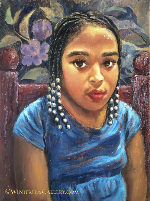
Beads in Her Hair – 12×16 oil on linen panel – by Winifred

It’s been a year and a half since I painted a portrait. I decided I needed to paint portraits again before I forgot how – though I’m not sure if there is such a thing. I actually think any kind of painting leads to the same place – a more practiced and competent painter – but just in case I decided it was time. I opened my “to paint folder” to make a photo selection. I encountered this little girl a couple years prior, sitting inside a large shopping cart as her mom pushed her about while grocery shopping. She was wearing a pink dress with sparkling white beads in her hair. I ask her mom if I could photograph her. I promised her mom I would send her a digital file of the photo I took and I did. I then put the file away, not sure I would ever paint it.

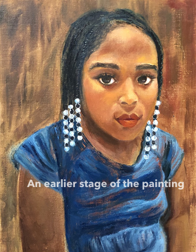
When I began the painting, I envisioned a simple head and shoulders portrait with a plain background. I knew the beads in her hair would give the painting a certain pop! Below is an earlier unfinished stage of the painting and it was the stopping place for day one.

Early unfinished phase 1 of the painting without even simple background complete.

The following day, I painted a simple golden toned background with a bit of color variation and a bit of texture – different from what you see above. I also formed her arms more correctly and changed from the stark white beads – a judgement call – to more painterly beads. I placed the completed phase 1 painting where I could look at it for a while and thought – I DON”T THINK SO! The slouch was awkward against the plain background and bothered me.

I decided to give her a red chair because people often slouch in a chair – this helped. At the end of that painting day, however, I still wasn’t satisfied. I decided the background had to change to something more colorful and interesting. I went through my files, found a simple floral pattern, and used it, generally, as a background reference.

Adding this color, tones and shapes gave me what I wanted. These changes occurred over several days as my vision of the portrait evolved. It’s so much easier and faster to complete a painting if I have all the information and elements in the reference photo from the beginning – but in this case it was a “shopping cart”. It’s a good exercise to work this way, however, as it is an exercise in expanding ones creativity.

Portraits are complex and can be very tedious. This portrait was complex but was actually enjoyable and I will be creating them more often.

Related Images: