
Subscribe to continue reading
Subscribe to get access to the rest of this post and other subscriber-only content.
Related Images:


Subscribe to get access to the rest of this post and other subscriber-only content.
Subscribe to get access to the rest of this post and other subscriber-only content.
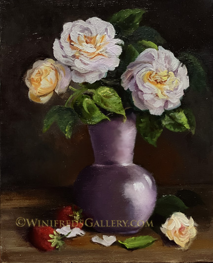
Each season while my roses and strawberries are in bloom, I photograph them and use them as a reference for a new painting. I’ve done this for the past 5 or six years and I can honestly say that it has not gotten easier – and it may never. That’s okay. My roses have so many densely “swirling” petals, as I would describe it. In theory, one is suppose to simplify the form based on highlights, middle tones and shadows, but in the case of my roses the petals are so thin and tight that I’ve never been able to substantially simplify the form. Overall, I like the shapes and colors. Below: I created a master study this past week as well.
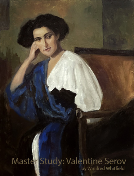
I didn’t attempt to truly complete the reference image but I did enough to serve the purpose of doing such study. The reference has been in my studio for several years awaiting my attention. I liked the block of differing broken color in the upper area of his painting. I m always challenged by backgrounds and this is an approach I will try in my paintings. That’s pretty much the point of painting master studies – paying attention to how the masters painted and resolved their paintings. The artist Modigliani often did broken color blocking as well. He’s another of my favorite artist. My interest in this painting actually stops where that white fabric of the lower skirt starts. I probably should have ended my painting effort there. I found the bottom of his painting not particularly interesting and that white of her skirt distracting.
THE RESISTANCE: Tomorrow, May 14, 2025 should be the greatest protest demonstration against this administration we’ve seen. I believe there may well be millions of democracy loving individuals who take to the streets. in my opinion, Donald is the most corrupt, cruel, and criminal person in this country with his power amplified by virtue of the immunity granted by the Supreme Court. I want to vomit at the thought of the military parade tomorrow. I won’t watch it, of course. I’ll watch coverage of the new Pope and the many demonstrations. It was interesting to see how the media, and Twitter was used to amplify the California protest as justification for calling in the National Guards and the Marines!. It’s the first time I’ve so clearly seen that maneuver, though I think it is used regularly. And of course Donald is grand standing and telling lies to make the protest appear larger and disorderly. For sure he created a distraction which took the ELON attacks largely out of the news. Having hired half of Fox “News”, in his cabinet, they all are skilled at changing media focus. Gavin Newsom, however, has done a great job in fighting back. Stay safe tomorrow. It’s going to be a big day! Winifred
Subscribe to get access to the rest of this post and other subscriber-only content.
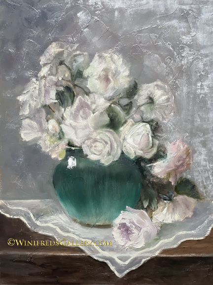
I should have referred to them as “blush” roses. I’m trying here to paint a looser rose – but still it needs to resemble a rose I think. Some do and some don’t. Overall. there are some features I like. I like the setting – the table the translucent cloth. I wanted to “crochet” it but didn’t have time. I do have a favorite rose – bottom front and interesting – I had no reference for that one – from imagination only but not easy for me to do. It looks most sheer and soft. However, one shouldn’t be looking at any single rose, the question is – does the painting work. I do like the background. It’s a style of adding texture I can actually repeat – though randomly created. Initially, I thought the green of the vase vase was too dark and too intense, but I left it. It’s a pretty color and. the fade down gives it a hint of glow and transparency which I like. For some reason quite a bit of gray is showing up in this digital image which is not in the painting.
RESISTANCE: You can imagine I’m in pain with the passage today of that HORRIBLE NEW BILL in the House. Hopefully the Senate will block it. They’ve long said they will not allow it to pass. For the good of the country, I certainly hope not. It is so very IMMORAL. Those who voted for it are IMMORAL. Anyone who supports this bill is IMMORAL. They even allowed into this bill the tax exemption of “gun silencers”, and “tanning beds” for the orange guy I suppose. It’s shocking though I should no longer be shocked at anything they do. No one could have fantasied this script for the United States. I keep holding out for a glimmer of humanity in our governance but I’m finding none. And. the orange guy, I guess feels the needs to shore up racism in this country with white Afrikaners who are 4% of the South African population but own 80 % of the land but feel oppressed. Just think, people went to the polls and voted for this guy – otherwise they would have had to vote for a woman who is Black. This is rarely mentioned but we all know it is the truth.
Moody’s just downgraded the bond rating on securities backed by the FULL FAITH AND CREDIT OF THE UNTIED STATES due to the huge increase in deficit projected. This is also a big deal. Interest cost on trillions of debt outstanding just went up on 10 yr. 20 yr. and 30 yr. treasury bonds. This will mean a massive increase in interest cost to the. government. What do they say about this, they say “we don’t care”. They only care about a tax cut for the richest amongst us. This bill will devastate food care and health care for children and elderly and substantially increase the cost of health care to many using the Affordable Care Plan. I’m putting it out to the universe Senators – WE’RE COUNTING ON YOU!
In case you haven’t heard, an item was approved a couple days ago which will turn an AK7 type rifle into a “MACHINE GUN”. Now they can kill more children and other innocents – though “their thoughts and prayers” will be with their families. Winifred
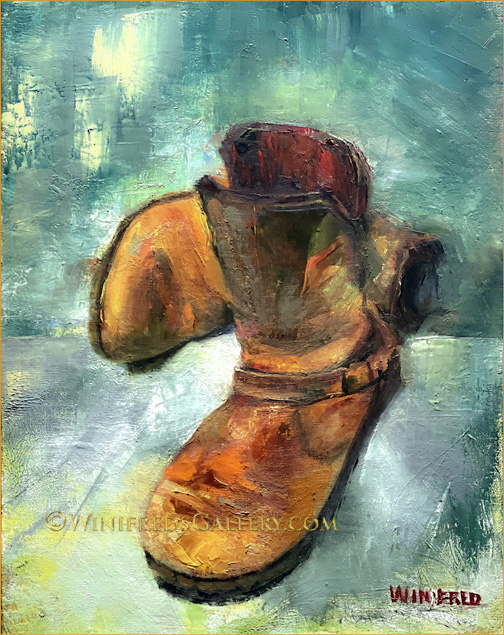
Above you see the final painting of my boots but not necessarily the version I prefer. I found my boots in a box a few months ago. I hadn’t seen them in years. They’re so comfortable and they’re my go to boots for running errands – along with my bright red Pumas. Today is the day following my completion of this painting above and it’s the first time I compared it with the previous version which I over painted – see below.
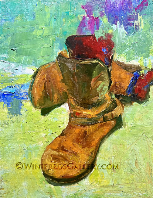
The initial version is very colorful. The brush strokes are expressive. I hadn’t been so “correct” about everything. My brain thinks “it is messy”, I couldn’t handle it and found it a bit too chaotic. I considered this initial version “failed”. That was OK with me. All painting practice is good – just making an attempt is fine. At the point of my “failure” I thought I would try some things. I darkened the background, toned down some of the color and “corrected” shapes within the boots. I didn’t realize I was killing this more exciting painting. The past years of my brain training makes it hard to appreciate random expressive brushstrokes and bold color. I try from time to time but it’s a struggle. My training is portrait realism, though increasingly I add a bit of expression and creativity “around” a face. I tried expressiveness “on the face” once” and posted it. It’s awful!.
I like the final painting, the bluer one at the top – but I find it less exciting. This experience has been important for me and I’ll continue to attempt to push past my limitations and the discomfort I feel when things are not “correct”. It’s sad for a painter to feel that way. Correctness might be important when assessing a realistic portrait but not BOOTS! I took many photos of my boots posed differently. I’ll likely try to paint them again in a different pose.
RESISTANCE: Oh my gosh! When do we get a break!! So far the Supreme Court and other Federal courts are barely holding together the provisions of the Constitution, although it is the Supreme Court which has gotten us into this mess and Garcia is still not back. Fortunately many others immigrants have been saved from deportation without “due process”, at least for now and Trump is pissed. Significantly, Donald’s ‘Big Beautiful New Deal” also failed in committee even before it could go to the House which saves Medicaid, which provides care to “the most vulnerable amongst us” ie, food and health care to children, medical care to people with extraordinary medical conditions, and medical care for the lowest income population and Veterans care as well. We have such immoral leadership in the Republican Party with Donald’s attempt to eliminate this level of support so the richest people in the world and large corporations can have more is IMMORAL – PLAIN AND SIMPLE! The reason Donald’s “Big Beautiful Bill” which he insisted it be called – didn’t get out of committee is because of the RESISTANCE throughout the country. Republicans from some districts know their tenure would be over in 26 if they did not vote to save Medicaid. 5 Republicans on that committee voted with Democrats providing a vote of 21against the bill to 15 which closed it down. I am thankful for those 5 votes. Between the Supreme Court ruling and the defeat of this bill he wanted to pass desperately, this was not a good week for Donald. I think he’s still smiling, however, because of the prospect of a $400 million luxury plane from Qatar. We’ll see. His lack of morality has no bound but then what would one expect from a criminal. This is what criminals do. Bye for now. Winifred
Subscribe to get access to the rest of this post and other subscriber-only content.
Subscribe to get access to the rest of this post and other subscriber-only content.
Subscribe to get access to the rest of this post and other subscriber-only content.
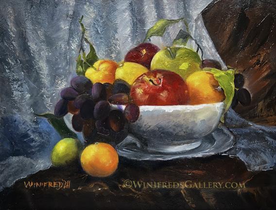
Still lifes are not particularly exciting for me to paint – though I paint them. Painting still lifes is good practice, however, because of the varying shapes, textures and colors involved, along with the challenge of complex composition. Painting still lifes actually helps in painting portraits. In fact, painting in any style assist with painting any other style. You can look at this painting and see all the separate elements I had to paint. There were decisions and layers of brush strokes involved with each item.
I’m working up to the 10,000 paintings said to be necessary before one can expect to claim “mastery” in oil painting. I’m still under 1000 paintings, so I have a ways to go. It’s time for another portrait. Have a wonderful weekend. Winifred