Painting Sunflowers

Sunflowers in Blue Room – 9×12 Oil Painting on Gessoed Board


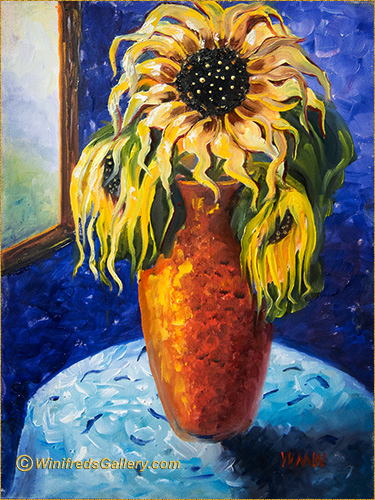
I was in the mood to paint sunflowers this week. I do love them. I had something in mind and made a sketch on my board. Then I thought – now what. What colors will I use? It would be easier to figure this out digitally than in oil – then I would paint it.  I photographed my sketch with my phone and brought the sketch into painter to do a rough paint sketch. Below is the result. I like both of my drafts -great light!
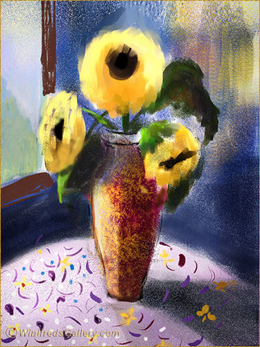
Color Draft #1

I then printed it on a high gloss paper which gave me vibrant color contrast and detail. It would be my visual reference image for my painting – at least loosely so.

It was then late and I sat down to watch “So you think you can Dance”. One dancer wore coral red paints, a teal blue shirt and a blue violet hat. WOW! The colors popped and it was not a color combination I had been conscious of before. I spent some time thinking about the colors and what gave them the ability to compliment and harmonize. I thought – I can still do that. I finished watching the amazing dancers and went back to my computer.

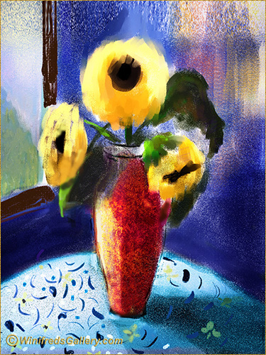
Painter draft sketch 2 – “dancer” color added.

Above, I created a colorize layer and painted in my “dancer colors. It was an improvement – certainly for the subject matter and style in which I would paint. One just never knows where the next inspiration will be found. I didn’t really mean to go to the tip top if the board on my final oil painting at the top of the page. It didn’t start out that way. I still like it. After all, magazines cut of the top of all the models heads these days. It’s a thing! I did get every petal in the frame however!!

~~~~~~

Sunflowers on Black Canvas – 6×8 Oil Painting

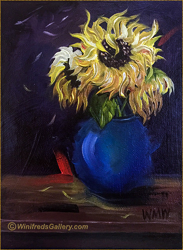
Prompted by a video, my first sunflowers were painted on black canvas. I’ve never done this before. It’s almost easier in a way,  because the darkest values are in place.

I like the painting and the idea. I will certainly do more paintings that way. Interesting I had already purchased Black Gesso and had covered several boards knowing this was something I wanted to do. So, I was ready.


Related Images:

“Oh Give Me A Home”

“Oh Give Me A Home” 9×12 Oil on Gessoed Board

For years there was a herd of Buffalo on Beaver Valley Road in Chimacum WA, a town not far from me. What a sight it was. It was the only herd of Buffalo I’ve ever seen. 

During a drive by one spring day, years ago, there were quite a few calves. I’ve always loved the photos I captured, one of which inspired this painting. I don’t think the buffalo are there anymore – not sure.

Below is my initial sketch on a gessoed board I toned.


Related Images:

Suspending Judgement

Suspending Judgement –  8×10 Oil on Canvas

We’re so hard on ourselves, always wanting to get it right, the design, the color, the brushstroke, the values. perhaps you’ll wonder if others will like it.  What if we suspend  this brainwork and jump into bonafide play – just throw some paint around. No one else needs to see it. Tell the brain to take a rest – you won’t be listening – and you’re doing it just for your self!!  Digital or traditional painter – it won’t matter. That’s what I did to create this painting.

It was fun. There was no thinking – no right or wrong.  I wanted “to do” and not “to think” about it. Lets face it, some of what’s been learned always shows up a bit anyway. You cannot teach yourself “not to walk”  – you just do it. Your painting should take not more than 5 to ten minutes. Try to paint quickly so you don’t have time to think.

For this painting, I only used the left over, already mixed oils on my palette, limiting my  color choices and I started “plopping” on paint with a palette knife. Who knew where it would go – there was no plan. Remember, NO THINKING – just play! We all need to play. It’s amazing the part of yourself you might discover. I had no idea there would be polkadots all over. Never did I DECIDE, “I will put dots all over”. I put a few on the upper part of the painting with the end of a brush, then a few more and a few more. I did think it was pretty cute however.

Funny, I usually do my wildest painting  experiments using a pear as subject.  I don’t have to think about creating a pear shape.  You might want to create something different.  I had a student say she didn’t want to paint a pear but she would paint and apple. Okay, apples are cool and anything else!!

Since you’re here and we’re looking at pears. I’m going to show you another painting. Below is the second oil painting I ever did.  I thought it was ok – for learning to use oils. 

Now, 6 weeks later, I decided to paint from the  same reference photo again – it’s simple, fast and just practice. This time I did a value sketch – I don’t think I did that for the first painting and it’s vitally important. Then, I added paint to it. There’s a big change from my initial painting.  I thought you would enjoy seeing the change.

Orange and Pear Simple Still Life

I’m sure I will paint the reference photo again in a few weeks ti see if I can’t take it in yet another direction. Thank you for taking a look. Winifred


I’m painting far more than I anticipated and hence posting more blogs. If there are too many – do let me know.  You  can also unsubscribe but I would hate to loose you. Winifred

Related Images:

Canal through Murano Italy

“Canal in Murano” (9 x12 inch oil painting on gesso board)

Murano Italy is home of some of the most amazing glass factories in the WORLD!!! It is where Venetian glass was created. In this painting, I’ve attempted to capture a canal running through Murano. However, I find that I’ve buried myself in details. Particularly – so many pilings!! I deliberated but thought I had to add them.

I was afraid that if I didn’t do so, the boats would drift aimlessly into the canal, bumping into each other and float away – what a mess that would be.  

Before Pilings

I’m discovering I like bold blocks of color without lots of fuss.

Starting to add boats

  As you can tell, the above painting phase is not developed, as it could have been, but you can see that it reflects a different possibility from the finished painting which is filled with boats and pilings.

Below, a quick value sketch. Notice, no value for boats!! I love this kind of loose abstraction.

Value Sketch

Below – Adding Initial Color (I love this kind of looseness).

adding initial color

I hope you enjoy seeing how my paintings evolve.  Notice, I didn’t show you the reference photo. I did this on purpose. It is to prevent you from looking back and forth comparing my painting to the photo. However, it is not intended to be compared. This is simply my interpretation – though for sure the photo contained lots of boats and pilings! 

You may think my images are out of order but that the way I chose to present them – it’s the way my mind works. Thank you for visiting my blog and please subscribe if you have not.  Thanks, Winifred

Before Pilings

Related Images:

Three Friends Walking – Traditional Oil Painting

This has been a fun and challenging week of Painting.  I have painted so much that I’ve gone through a couple tubes of oil paint at this point – but that’s what it will take. 

I took photos prolifically, while in Italy.  I thought it adorable when I saw these three ladies walking. Actually, there was a fourth, as you can see in the reference photo, but I found her distracting. I also found the wall/garage door, in front of them distracting also.  I knew I would have to to develop a more interesting and creative environment.  In my first attempt to do this, as you can see in the tonal sketch at the bottom, I painted a wall of square columns – somewhat replicating the right side of the photo.  That didn’t work. Ideally, the design of the painting would be determined in the initial sketch phase – certainly by the time the tonal sketch is done – but sometimes, I just haven’t figured it out – and keep going. This is not the best approach.

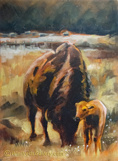
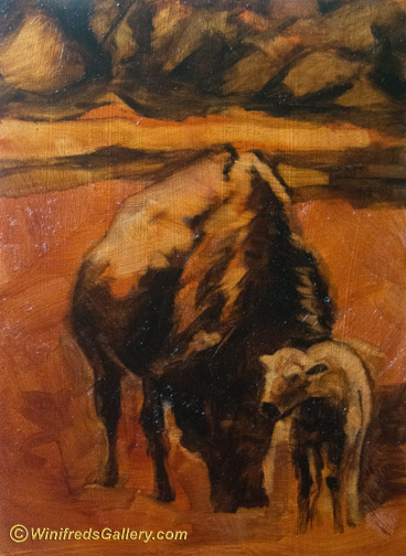
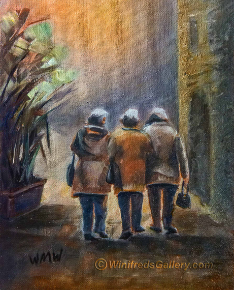
“Three Friends Walking”

Ultimately I decided on a textured side of a building and a curved doorway.  I went with that idea. Still, what to put in front of them.  I didn’t know for the longest.  I rather enjoyed the ethereal look of “space”.  Finally, I envisioned it as an open landscape – leaving it largely to your imagination.  I could play with interesting color for a sky and create just a hint of a horizon line.  I would allow the painting  to maintain these few and simple elements – resting on Interesting light, shadow and color. I’m making baby steps with my oil painting and so long as I do, I hope to progress.

Reference Photo ( hemmed in by their environment)

Tonal Value Sketch –  a great way to see what doesn’t work!

Thank you for visiting my Blog!  Another post will be coming  quickly – colorful buildings, boats and a canal in Murano, Italy – many many boats!!  I never painted so many boats before!  Winifred

Related Images: