Blue Hydrangeas Progression

Blue Hydrangea – 8×10 Oil on Canvas –  Preliminary Oil Painting Sketches

Hydrangeas – Preliminary – Progression

This is my first effort to develop a hydrangea painting. I explored a progression of considerations.  I could have painted clusters of perfect little petal flowers and a lovely blended background, or there are many other pretty styles. I know how to do that, but I would not find it interesting. In fact, I created many versions of this painting – more than you see here. They became less and less spontaneous. All paintings are not going to work, but if I am not pushing the creative envelop, experimenting with color and texture, detail or lack there of, I’m not moving forward. There are aspects of each image I like or don’t like.  I will leave it up to you to wonder through the images.  I will create a final painting  in the future starting with a blank canvas.  At that time, because of this efforts, I will better know how I want to develop it. Thank you and Bye for now. Winifred

Related Images:

Diametrically Opposed

Oil Painting On Canvas 8×8

I set up these still lifes in my studio. Could any bouquets of flowers be  more different in painting style? I love loose painter strokes, but I also found it interesting to try my hand at some basic “one stroke” brush techniques in the image below.  Both were certainly very interesting to paint.


I found myself buried in details the painting below, but the results on this black canvas were vibrant and enjoyable to create.


Related Images:

Classic Portrait Oil Painting

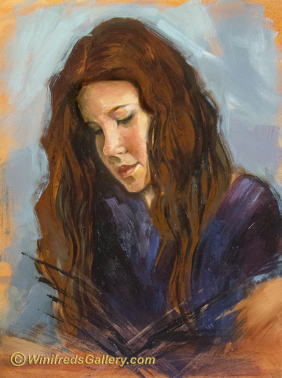
12×16 Oil Painting on Gessoed Board

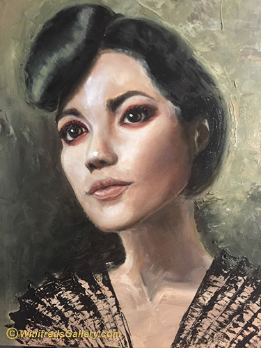
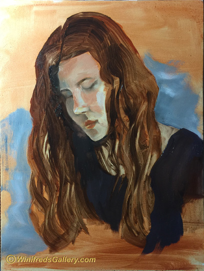
Above – Final Painting

This is my largest painting to date. Sometimes I play. Playing has value. Sometimes I am very serious and want to get it right. What is right?  I wanted  to create a classic painting, with accurate skin tones for this person – I wanted to reflect accurate hues, tones and chroma appropriately sculpting the form of her face – within the lighting in which she was photographed.  “Accurate” is a tall order here – starting with the fact she was photographed in weird light, the photo was printed – meaning a different shift in colorspace. So many things,  have interfered with accurate. That being said, I was deliberate and wanted to do my best.

I took the reference photo while in New York at a gallery opening a few years ago. She was very willing to pose, as I find is usually the case in New York City.   Her dress was black dripping with multiple chains. She had one bare shoulder.  The bare shoulder was covered with huge tattoos likewise all down her arm. She had a long ponytail. Her eyes were rimmed in bright red make up.  I think she might have been disappointed had I not ask to photograph her.  I thought she might be enjoyable to paint.

 Initially, I spent an hour mixing paint. Based on colors and values in the photo, I created a  large variety of subtle shades and hues for her face. That become an enjoyable part of painting – believe it or not – it’s own meditation.

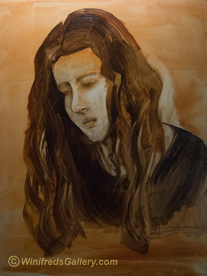
Below is mid stage of the painting. It was a modern, rather vixen look  – but that’s not what I had in mind.

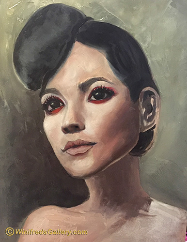
Above – Portrait Stage One

I wanted a more classic look.  I thought a vintage hairdo might be interesting and added a bun to the back side of her head and a long curl.

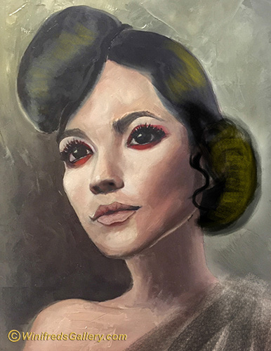
 After looking at the painting for a while – nearly an hour later I decided  to remove the back bun and curl I added – to wipe off the paint from that vintage variation. The  hair paint was still soft/wet.  I then only slightly modified her original “do”, softened and blended  the edges of the hair where it met the face and its exterior edges. In the final image above, I also subdued the red rimmed eyes, subdued the eyelashes, and softened the lip lines. Some of the boldness of the image was lost, but I was after softer and more subdued  look – shocking!! Perhaps, I should have and could have been more careful in painting her neck and upper chest.  I did not do so intentionally – not sure it was the right decision.

Hint:  We all need time away from out art periodically, to bring fresh eyes to our work. There are many ways painters do this.  Viewing your artwork in the mirror can help as well. What I do most often is to photograph my painting with my phone periodically –  a series stages of the painting along with the latest stage.  I can view these images anytime – and I do so frequently. Viewing these images small  on my phone gives me distance and a different way of looking at the painting.  I find this process very helpful and I do this with every painting. It shows me things I might never have seen when looking at the larger painting.

Attire:

I  also wasn’t sure what I would do for attire. I could leave her shoulders bare – or dress her in some way. Again, I photographed the painting with my iPhone and opened it in Painter to explore some alternatives. Thats how I tested a few strokes of “fabric on her shoulder”.  (Bye the way, I also used Painter to test adding the bun which I removed.) I decided that whatever I creates as attire would be loose and easy, hence, I returned to my paints.  In the end, I used the palette knife to create her “stunning” dress top. That was fun!!

Over all I learned a lot in the painting process – always the case.    Once again I learned to try to get color, values, and brushstrokes right the FIRST TIME.  “FIXING”, especially skin, doesn’t usually lead to good results.
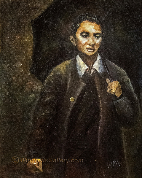
Related Images:

Portrait Painting of Girl

Portrait of a Girl – 9×12 Oil on Gessoed Board 

I think portraits are the most challenging images to paint – even using a reference photo.  As you can see below, I create a very loose sketch initially and then work into the detail. I also always want to bring some level of artistic expression and creativity to the painting rather that to just to paint what I see. This can be challenging to envision, and a bit frightening to execute. I have to let go and take chances.  I consider it better to try and screw up than to play it safe.

Below – Loose Tonal Value Portrait Sketch

Below – Starting to Add Color

I  always like this stage of a painting.

Related Images:

“Oh Give Me A Home”

“Oh Give Me A Home” 9×12 Oil on Gessoed Board

For years there was a herd of Buffalo on Beaver Valley Road in Chimacum WA, a town not far from me. What a sight it was. It was the only herd of Buffalo I’ve ever seen. 

During a drive by one spring day, years ago, there were quite a few calves. I’ve always loved the photos I captured, one of which inspired this painting. I don’t think the buffalo are there anymore – not sure.

Below is my initial sketch on a gessoed board I toned.


Related Images:

Vessel Loading – Bainbridge Island to Seattle

I spent the day with a young friend from Seattle on her13th birthday more than a year ago. Now it was time for her to return home.  I took her to the ferry – her mom would meet her on the other side. Amongst others, I took this photo as she prepared to board the Bainbridge Island Ferry.

A few days ago,as I perused my photos searching for any interesting reference photo to paint – I came upon that image and was inspired to paint it. Getting the perspective right was challenging  for sure and the was a dominant consideration for this painting. 

Initial Sketch and Design 

Developing Values and Perspective

Values and perspective  and image content are increasingly developed. 

Below:

I’ve  been reminded of a digital painting I created a few years ago. I was in New York and walked down the stairs into Penn Station. Immediately, I saw this little girl playing the trombone and her brother holding the music.  I love the story and the memory. I added a few dollars to the trombone case.

Related Images:

Canal through Murano Italy

“Canal in Murano” (9 x12 inch oil painting on gesso board)

Murano Italy is home of some of the most amazing glass factories in the WORLD!!! It is where Venetian glass was created. In this painting, I’ve attempted to capture a canal running through Murano. However, I find that I’ve buried myself in details. Particularly – so many pilings!! I deliberated but thought I had to add them.

I was afraid that if I didn’t do so, the boats would drift aimlessly into the canal, bumping into each other and float away – what a mess that would be.  

Before Pilings

I’m discovering I like bold blocks of color without lots of fuss.

Starting to add boats

  As you can tell, the above painting phase is not developed, as it could have been, but you can see that it reflects a different possibility from the finished painting which is filled with boats and pilings.

Below, a quick value sketch. Notice, no value for boats!! I love this kind of loose abstraction.

Value Sketch

Below – Adding Initial Color (I love this kind of looseness).

adding initial color

I hope you enjoy seeing how my paintings evolve.  Notice, I didn’t show you the reference photo. I did this on purpose. It is to prevent you from looking back and forth comparing my painting to the photo. However, it is not intended to be compared. This is simply my interpretation – though for sure the photo contained lots of boats and pilings! 

You may think my images are out of order but that the way I chose to present them – it’s the way my mind works. Thank you for visiting my blog and please subscribe if you have not.  Thanks, Winifred

Before Pilings

Related Images:

Three Friends Walking – Traditional Oil Painting

This has been a fun and challenging week of Painting.  I have painted so much that I’ve gone through a couple tubes of oil paint at this point – but that’s what it will take. 

I took photos prolifically, while in Italy.  I thought it adorable when I saw these three ladies walking. Actually, there was a fourth, as you can see in the reference photo, but I found her distracting. I also found the wall/garage door, in front of them distracting also.  I knew I would have to to develop a more interesting and creative environment.  In my first attempt to do this, as you can see in the tonal sketch at the bottom, I painted a wall of square columns – somewhat replicating the right side of the photo.  That didn’t work. Ideally, the design of the painting would be determined in the initial sketch phase – certainly by the time the tonal sketch is done – but sometimes, I just haven’t figured it out – and keep going. This is not the best approach.

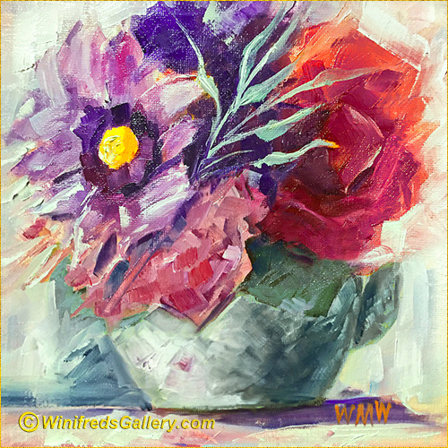
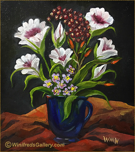
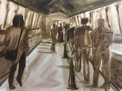
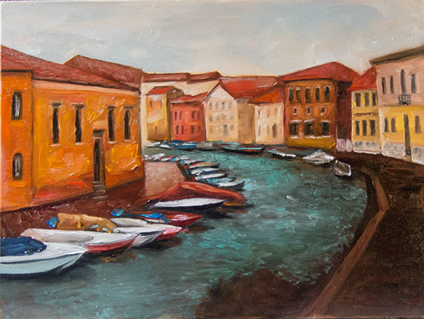
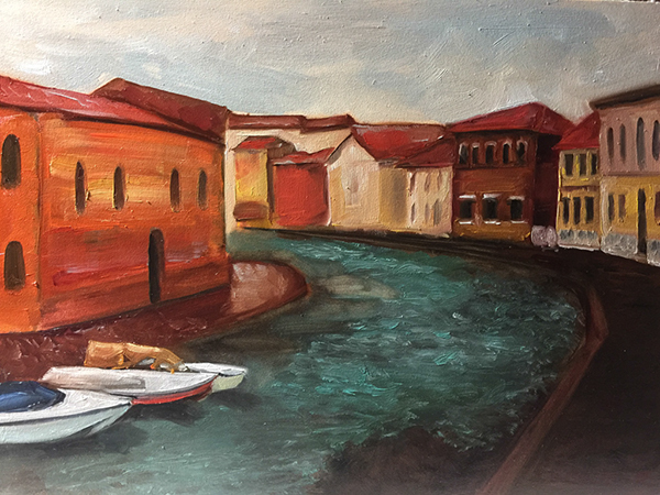
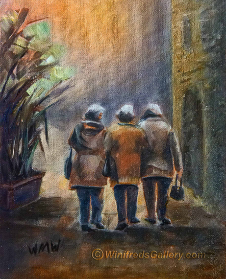
“Three Friends Walking”
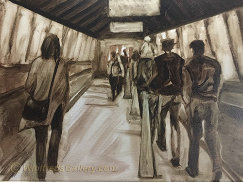
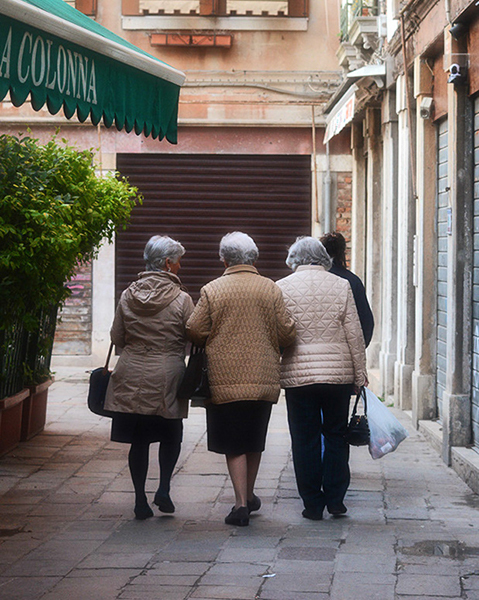
Ultimately I decided on a textured side of a building and a curved doorway.  I went with that idea. Still, what to put in front of them.  I didn’t know for the longest.  I rather enjoyed the ethereal look of “space”.  Finally, I envisioned it as an open landscape – leaving it largely to your imagination.  I could play with interesting color for a sky and create just a hint of a horizon line.  I would allow the painting  to maintain these few and simple elements – resting on Interesting light, shadow and color. I’m making baby steps with my oil painting and so long as I do, I hope to progress.

Reference Photo ( hemmed in by their environment)

Tonal Value Sketch –  a great way to see what doesn’t work!

Thank you for visiting my Blog!  Another post will be coming  quickly – colorful buildings, boats and a canal in Murano, Italy – many many boats!!  I never painted so many boats before!  Winifred

Related Images:

Portrait Paintings – Italy

The Shop Keeper – Oils – Italy

I decided I was ready to try painting portraits with oils. Color mixing and blending edges has improved tremendously.  Both task are important to portrait painting. “The Shop Keeper is my most recent painting.  

This lady was so lovely and so willing to pose to display to the camera some of her goods.  I ate some of the fresh pick fruit from the fields. OMG!! So yummy!! The photo has been substantially reinterpreted. 

Reference Image for Painting Above


Weary

This portrait I also enjoy. It’s from my “Venice at Night” series which I photographed in the rain.  This portrait, I feel. I think she is very tired. It is the emotional content of this photo which inspired the painting.

Unfortunately, I have not been able to capture the painting in the photo of the painting. I am not pleased with it’s appearance.

In the distant past, artist, almost exclusively, mixed all of their colors from very few pigments.  For both of these paintings, like artist from the past, I used only black, white, yellow and red pigments to mix the other colors you see.  I’ve learned quite a bit about mixing pigments by doing this. I’ve not been able, however to get a decent blue, which I read would occur when mixing Ivory black with Titanium White. I’ve gotten a mixture a little warmer than grey but not exactly what I was after.   No doubt it is my paint and the quality of my pigments.  Of course, I could just use one of the  several blues I own – but I just didn’t choose to. It’s been a great exercise.

Reference Image for Painting Above


Related Images:

Winifred Creating Triangles in Composition

A couple of days ago I posted some new paintings on facebook.  My take on the “Three Graces” which I will share with you in several variations, including the reference image.

In addition to enjoying them, a artist friend Cyndi Hornsby noticed that there were so many triangles contained within the composition “8 or 9 at least” she said.  I certainly found the forms very pleasing but had honestly not paid attention to the triangles.  And then I did. WOW!!

I went to internet and picked up a few quotes which I think aptly apply.

Triangular Composition


  • The triangle is used as a tool in composition to indicate the important elements in a work of art. The artist will create the primary subject inside the boundaries of a large imaginary triangle. The viewer will intuitively be drawn into the important elements of the picture through the use of triangular composition. There may be smaller triangular compositions that complement the main subject. There are no rules as to the size or placement of the triangular composition.
  • Simple geometric shapes within a painting or photograph can help strengthen the composition. A triangle is one of the strongest compositional shapes, as it can add a sense of visual unity. In essence, a triangle is a closed curve incorporating at least one diagonal. Since the curve is closed, it won’t lead the eye outside of the frame. A single triangle in in the middle of the frame can lead to a somewhat static composition, but triangular composition can be found in many famous works of art.

  • The shape of a triangle is made up of two diagonal lines that are anchored on a horizontal line. In a painting or photograph, a triangle will guide our eye to the triangle’s three separate points. The image or figure at the peak of the triangle will appear to superior to other images; if the triangle is reversed, the figure at the bottom will appear inferior. A triangular composition can help make an image more coherent and the form appear more dynamic.


`


`The original reference image is below:


`

Related Images: