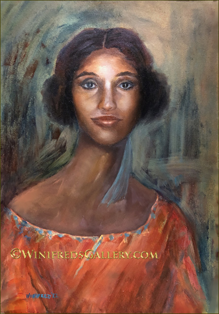
Lady in Orange – Oil Painting 14×20 by Winifred Whitfield
This is my first post of the new year and it was an enjoyable portrait to paint. I selected the photo reference from a collection I photographed a few months ago. I chose this reference because her soft but direct gaze. This painting is on a surface I never used before. It’s on a paper made specifically for oil paints. Paper has long been considered acceptable and durable if on archival surface , though normally it has to be treated/primed to protect if from oil. The paper I used for this painting was purchased “ready to paint”, though I added additional layers of primmer protection. This paper provided a different painting experience both in terms of brush responsiveness and the look of the painting. It also gives a different look to the image as you see it posted. It’s just another option and I’m sure I will use this surface again. This painting can now be mounted to hard board and framed.
View and enjoy – comments are DISABLED. I hope you have a healthy and creative 2022. Winifred
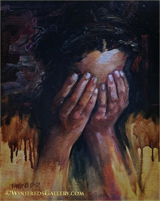
The Weight of the World – Figurative Oil Painting 11×14 by Winifred Whitfield
I painted this portrait during the time of the Tokyo Olympic Games. It portrays an emotion of the almost unbearable, whether it be sheer exhaustion, pain, sadness, defeat or even in the case of Simone Biles, “the twistees”. I’m sure this was an emotion that many of the athletes experienced at one time or another, as we all have in our lives.
As far as Simone Biles is concerned, I’m very proud of her decision to limit her performances in order to take care of mental and physical self. I hope we are all able to grow to to do the same.
I took many photos of this young lady with the intention of adding to my photo reference collection. I have many beautiful portraits of her. They are NORMAL beautiful portraits. Somehow, for reasons I cannot remember, I saw her hands go up to her face. It was not a pose I had created – not sure how it happened but I ask her immediately to repeat the action. I saw something special in it and more importantly I FELT something. Though I otherwise have some stunning photos of her, I immediately knew this was the pose I wanted to paint. It was so full of emotion. Hope you enjoy. Winifred
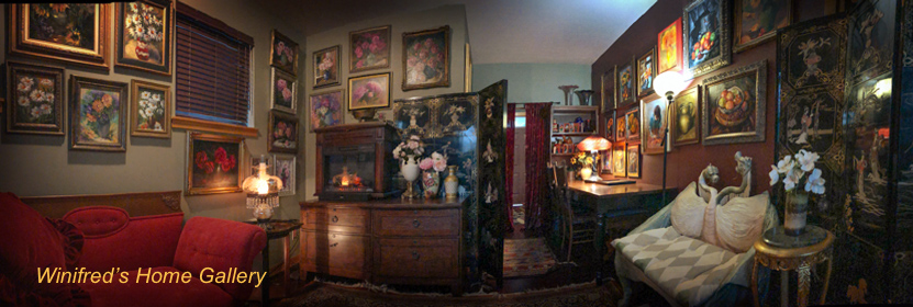
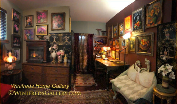
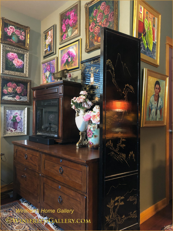
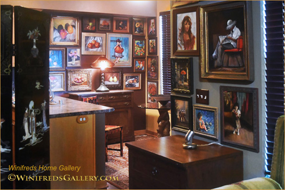
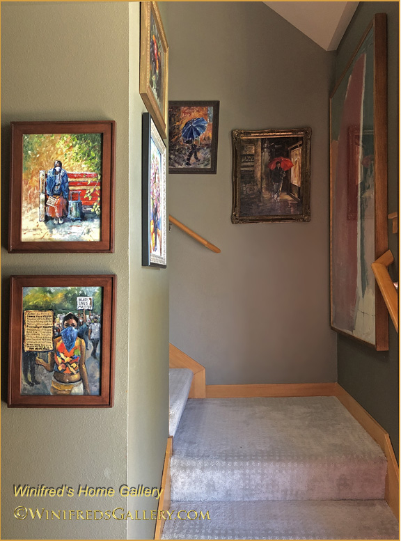
Welcome! Something big has happened to my home! With the help of two talented and wonderful friends my environment has changed dramatically, my home has become a gallery. (Above: Almost a 270 degree living room/gallery panorama). Overall 86 paintings are on my walls.
Creating this environment was an immense amount of work. During my past 5 years painting with oils, I didn’t hang paintings on my walls. I chose to daily paint daily – and not focus on using my painting as decor. Well, that’s changed. Paintings stacked up in a spare room in a hap hazard fashion. I needed to either hang them or box them for protection. Painting still lifes, more so than portraits, was new for me. Early in my oil painting life I received many commissioned portrait sales. They were beautiful. I’m comfortable with portraiture. For 20 years, I had created portraiture photographically, as digital art and then in oil. I love portraiture, although, as you will see, I wanted to spread my wings.
Winifred’s Home Gallery Living Room – 2 walls
Now, I’m surrounded by paintings of all kinds. Not only that, I brought into this space my most interesting soft furnishings to compliment the painting presentation, which I’ll also show you. I’m thoroughly enjoying the new environment and I can now easily share my work with invited friends and neighbors.
Winifreds-Home-Gallery-Corner
Each wall or grouping has a theme by content or color. There were roses and peonies on one wall, oranges and yellows, primarily sunflowers and fruit on another. I paid close attention as the concept was developed and the layout created on the floor before it was installed on the wall. Husband and wife team, Sapna Sopori and Alex Wisniewski – have professional lives which have nothing to do with this kind of activity. However, I had noticed Sapna’s passion for decorating and lots of picture hanging in her home. I ask if she would help me. She excitedly said “yes”. Not sure what I would have done without the two of them.
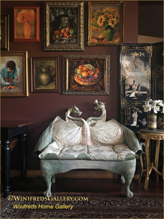
Dragon Bench by Marilyn Phillips – Winifred’s Home Gallery
This dragon bench is certainly one of my favorite pieces of soft art, made by artist Marilyn Phillips. I’ve had it for a long time. It fits in very well with the paintings. Sapna, who designed this project is captivated by the dynamic of the single escaping grape in the still life above and the dragon, thinking that at any moment grape might just fall into the dragons mouth. The paneled room divider with it’s square sections also works perfectly in the overall design scheme.
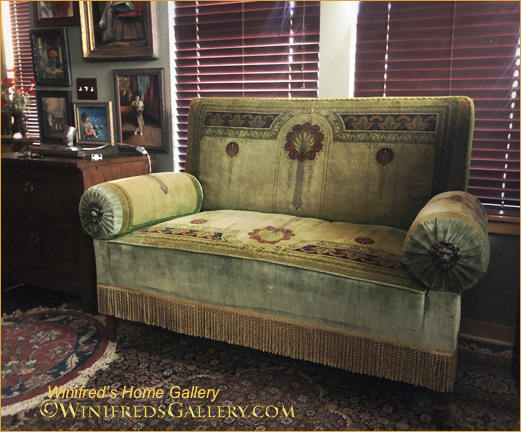
Below: I don’t know much about the origins of the settee below. It’s an antique. I previously used it in my portrait studio.
Red Vintage Settee with Arms that Ratchet Down – Winifred’s Home Gallery
This settee was the most used piece of furniture in my portrait studio and gallery because of it’s adjustability. The arms can be moved from completely vertical to completely flat. In addition, it’s so perfect for a mid day nap! It’s also the perfect compliment for my collections of daisies and sunflowers paintings above or in fact any group of paintings. By the way, I’m thinking of painting that gray/green wall a deep burgundy/brown so the blinds disappear. I actually have just the correct color on the opposite wall.
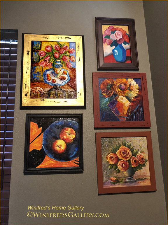
The paintings below, are on the wall just to the left of the red settee – still in the living room. On this wall the paintings are a little more abstract than others.
Winifred Home Gallery Abstracts
Below: To the left of paintings above is my green settee.
Antique Green Decorative Settee with Arms and Back that Pull Off – Winifred’s Home Gallery
I found this unusual piece of furniture at the Salvation Army Antique store in Seattle 20 years ago. I was so excited. It was torn in places; you can see the new fabric used to make repairs.The arms can be rolled out and off. They are attached with curved metal rods. The back will pull off. I wondered about the origins of this unusual piece. A while back, on a business trip to Colorado I entered an antique store – where to my surprise were several identically configured pieces of furniture – but with different fabric. They were in a terrible state of repair. The shop owner explained that they use to be in the lobby of old movie theaters. I’ve been told that the fabric on my settee is something very special – designed by someone very famous who has work in the Metropolitan Museum of Art in New York. I’m making efforts to know more about it. I should do an image search – but as yet, I’ve not.
As we pass the green settee, we approach the dining area.
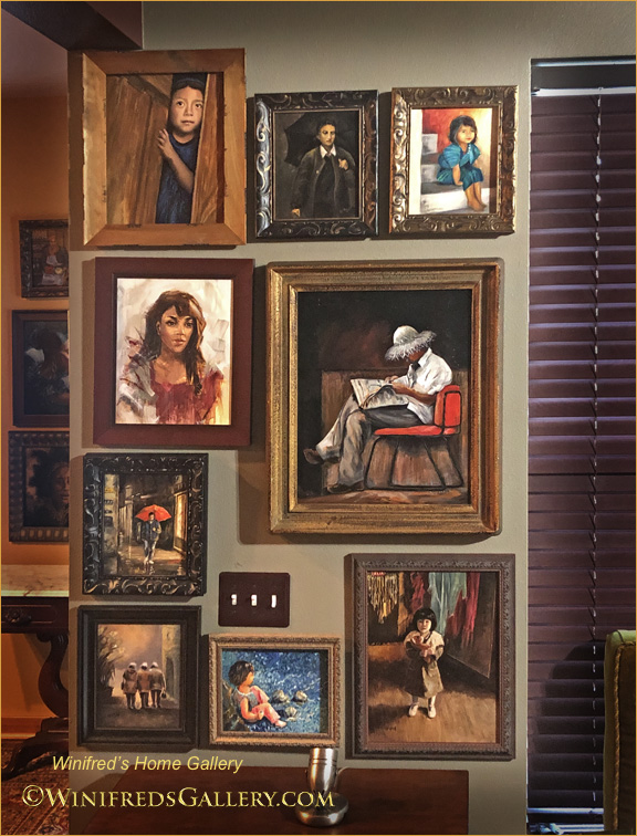
Winifred’s Home Gallery Figurative and Portraits
Above and Below:- Wall of portraits and figurative paintings. I’m enjoying doing portraits and figurative painting again.
Winifred’s Home Gallery Portrait
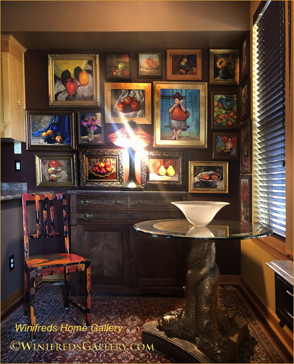
Below: Dining area.
Paintings in Dining Area. also Tiffany three headed dragon table base and Joseph Clearman Art glass lamp on cabinet lighting the paintings.
Winifred’s Home Gallery Dining Area – Still lifes and figurative painting. Art glass Lamp by Joseph Clearman.
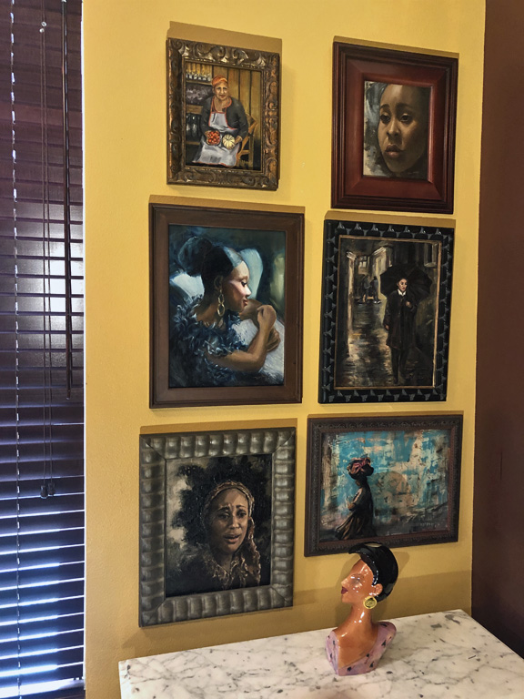
To the right side of the blinds in the dining area is another portrait wall which includes shopkeeper in Italy and Italian women walking in the rain with umbrella, a Guatemalan woman and intense portrait of a women in “despair” and a musician in glamorous attire. Below the portraits is a ceramic art piece named by artist Steven McGovney named “Winifred”. It’s a book end. There were two. The other bookend “Priscilla” was blonde and sadly she was broken.They were best of friends!
Winifred’s Home Gallery Portraits and Figurative
Above: My most recent portrait/figurative paintings have some cyan coloring. The others I painted earlier, including two which are part of my Venice collection.
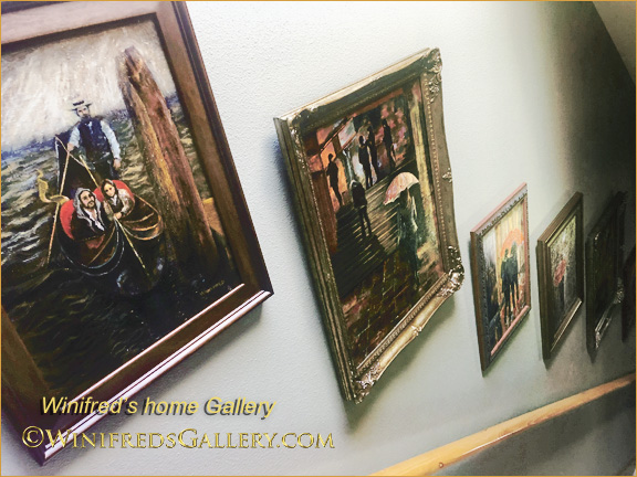
Winifred’s Home Gallery – Toward Stairway – Venice Collection.
Moving toward the stairs and the entry of my home are two paintings commemorating the Covid Pandemic and Black Lives Matter demonstrations which took place during this period. We then head toward the stairway to view the “Venice in the Rain” series. It’s a themed series which includes people with umbrellas, painted from photos taken on a rainy night in Venice. I have created 11 paintings in that series. Only 7 are on that wall, but there was no way to capture them all at the same time.
To the far right on the stairway landing, you see a glimpse of another painting. It’s a painting which purchased in New York years ago from painter Steve Lindsay
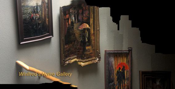
Below: I attempted to create a panoramic image of the Venice themed paintings while walking downstairs. In a way, it didn’t work, but in a different way, it worked fantastically. I love the breaking apart and abstraction which occurred. It’s the best!!!
Winifred’s Home Gallery Stairway – Panorama!
Winifred’s Home Gallery The Venice Collection on Stairway
It’s done!!
Comments are back on. I’d love to know what you think. Thank you … and Thank you Sapna and Alex. Winifred
This has been a fun and challenging week of Painting. I have painted so much that I’ve gone through a couple tubes of oil paint at this point – but that’s what it will take.
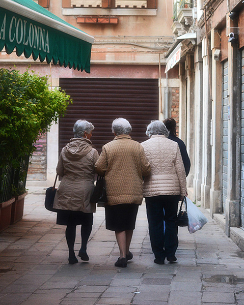
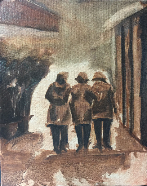
I took photos prolifically, while in Italy. I thought it adorable when I saw these three ladies walking. Actually, there was a fourth, as you can see in the reference photo, but I found her distracting. I also found the wall/garage door, in front of them distracting also. I knew I would have to to develop a more interesting and creative environment. In my first attempt to do this, as you can see in the tonal sketch at the bottom, I painted a wall of square columns – somewhat replicating the right side of the photo. That didn’t work. Ideally, the design of the painting would be determined in the initial sketch phase – certainly by the time the tonal sketch is done – but sometimes, I just haven’t figured it out – and keep going. This is not the best approach.
“Three Friends Walking”
Ultimately I decided on a textured side of a building and a curved doorway. I went with that idea. Still, what to put in front of them. I didn’t know for the longest. I rather enjoyed the ethereal look of “space”. Finally, I envisioned it as an open landscape – leaving it largely to your imagination. I could play with interesting color for a sky and create just a hint of a horizon line. I would allow the painting to maintain these few and simple elements – resting on Interesting light, shadow and color. I’m making baby steps with my oil painting and so long as I do, I hope to progress.
Reference Photo ( hemmed in by their environment)
Tonal Value Sketch – a great way to see what doesn’t work!
Thank you for visiting my Blog! Another post will be coming quickly – colorful buildings, boats and a canal in Murano, Italy – many many boats!! I never painted so many boats before! Winifred
The Beginning!! You can watch me progress. I created these paintings during the past 3 weeks. Really, oils out of tubes!!! Some paintings have turned out better than others – no surprise!! The first painting which you see was my first oil painting. I actually destroyed the canvas but kept this photo of it. Fortunately, I photograph various stages of a paintings development. This was a very early stage of the oil painting. I kept painting and painting until ultimately I ruined it. It was not worth the time to try to recover it – I just threw it out. I’m glad I had such an early lesson on the detriment of overworking a painting.
Above – My first oil painting
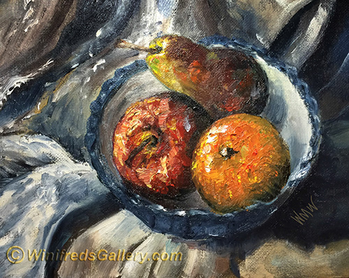
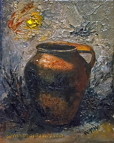
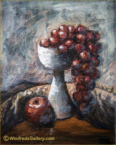
Lighting is one of the most important aspect of creating a still life, Having a few fun items to paint is important as well. Almost anything can be interesting if well lit. I have used both daylight and artificial light as a source in my still life paintings.
Orange and Pear Simple Still Life
I used daylight for the above painting of the orange and the pea abover.
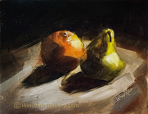
I continue to enjoy lots of texture in my paintings, which I create allowing my brush to “dance” as I paint. Pretty fun. Most of these paintings are 8×10.
I paint almost everyday – stoping for a day only when I burnout, before proceeding again.
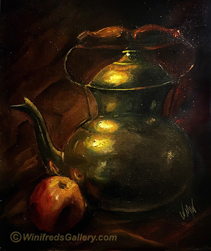
Above, Brass tea pot. I will certainly create more.
Don’t you hate to feel this pause in our adventure!! It will continue you know – in one form or another.
My news is that I am going to be consistently more active with my blog – especially if you sign up for it – in the upper right corner of my Home Page. You will only need to enter your email address to affirm that you want to be a subscriber. Then wait for my Blog Post “every now and then”. You will not be overwhelmed with post for sure! There will be a very nice gift emailed to the first 15 who subscribe, so “don’t delay – subscribe today” !!
Info will be provided on by blog beyond that which is posted on my Youtube channel. If you are not a Youtube subscriber to my channel, please do so as well. I have 60 or more videos with about 700 subscribers – and growing. Winifred’s Youtube Channel
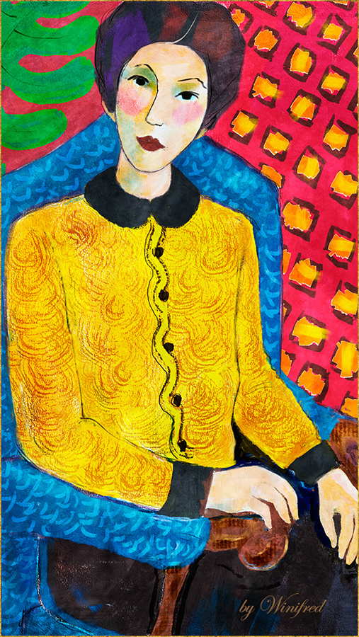
One last Painting. The title on the cover of the video below is misleading – this video is not a discussion about the course. After it was recorded, uploaded, downloaded and a few other complicated maneuvers required to post it here, I noticed that I had not removed the text which was appropriate elsewhere – it was too late – no more!! This video is the recording of a painting which you have not seen – I don’t think – it also shows a few of my Matisse inspired paintings
Creating a Painting from Photo Sketch 2
For those of you who were not in the course, it was offered at Digital Art Academy where I am an instructor. Please check them out. Set up an account and browse through the many course offerings available. This course will be available again soon as “Open Enrollment”, allowing you to download all course content and to work at your own pace.
I am having so much fun. I enjoy the creative journeys I take myself on. Always so much to learn and so much new to create.
In this tutorial, I demonstrate how to make basic changes to your “Real Watercolor” Property Bar settings, in order to create customized brushes variants suited to your needs and taste. I manipulate settings one at a time, holding others constant, to demonstrate the effect. The difference between Digital WC, Watercolor and Real Watercolor is briefly described. After viewing this tutorial you will feel more confident in your ability to paint with Painter’s Real Watercolor and control your brushes. This tutorial is for users of Painter 12 as well. Personally, I am enjoying learning more about these brushes each day and the only way to do this is to paint and to experiment.
You will see several of my recent Painter “Real Watercolor” paintings in the video but I have added additional Watercolor practices paintings below. I am constantly working on my brushstrokes. One of my objectives it to use fewer strokes – to simplify my paintings.
You probably know by now that I love patterns and love to sketch, enhance, or paint and fill with patterns. This is a quick video to show you the process. I hope you enjoy. Winifred
It is no secret that I love to paint and I am also considered a versatile painter. I can create paintings in a variety of painting styles. Some of these images you will love, some you may not. That is fine – the idea is to create and personal paintings which you, your family or your clients will love in your personal style.
In several of my online galleries, you will see some beautiful but pretty traditional painting styles. I have created this post to show you some ways I have ‘ramped’ it up a bit, including one painting from imagination and a couple of portrait paintings with patterns at the very bottom. I can hardly believe how many “hats” I have painted. I love to paint women in hats. Even my painting from imagination included a hat. Alas, you might have guessed, I wear a sun hat everyday of the Summer if I am in the sun.
If you would like to increase your painting skills or if you are just starting as a beginner one of my personalized training workshops, “Almost One to One” might be just what you are looking for. Please visit my Store to preview my Tutorials and take a look at my Personalized Training Workshops.
I hope you enjoy the images which follow. Thank you. Winifred Whitfield


 “Three Friends Walking”