Small Paintings

Bouquet with Blocks of Color – 4×6 Oil Painting on Cradle Box by Winifred

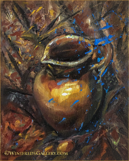
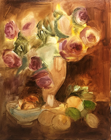
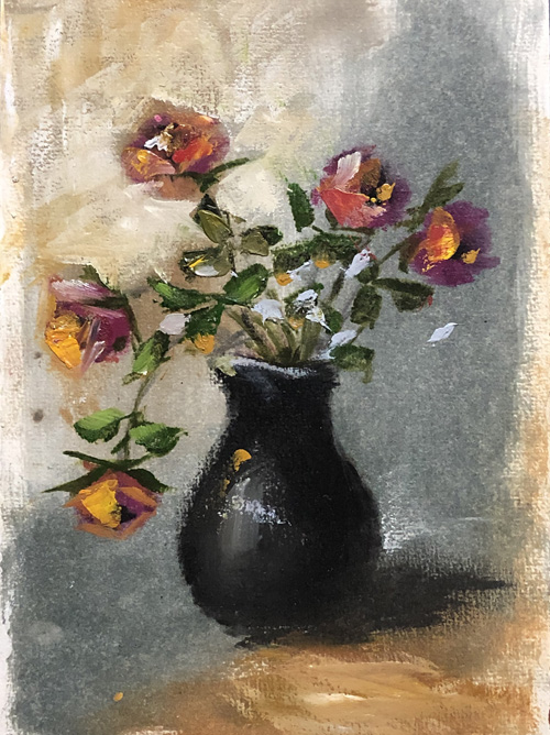
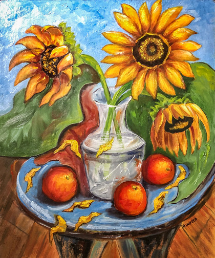
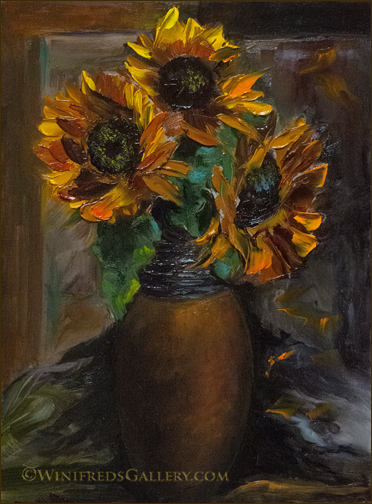
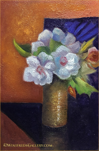
The photo reference for this painting was taken in my kitchen with the vase sitting on a counter facing the window. The refrigerator and more counters were behind me. When I looked at the photo, I noticed interesting shapes. Honey colored cabinets were upper right and formed a shape – another shape was formed by the area under the cabinets extending down to the back counter. The stainless refrigerator was upper left and formed a shape. Then there is the counter the vase rest on and the lower triangle is the side of the counter which extends to the floor. I could combine some shapes and leave others separate. I knew I could work these shapes into the overall design if the painting. The vase was ceramic with stripes of color. I tried to work with the stripes this but It didn’t work. It’s interesting how simplifying the color of the vase and creating highlights give it the illusion of a gold/bronze colored metal. The design of the flowers and the design on the dark background just showed up in my head. I welcome these creative visions whenever they wish to enter and guide me. Below – roses.


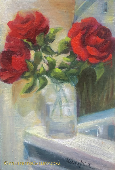
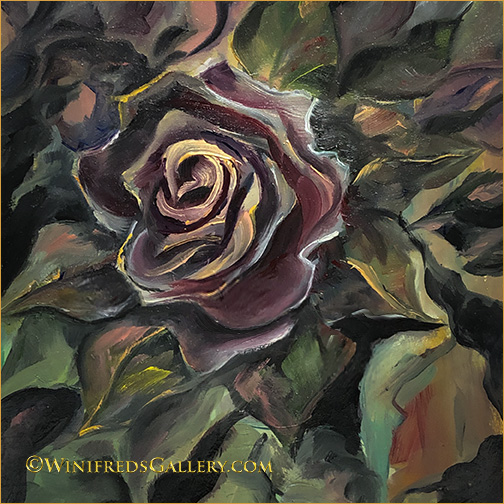
Roses in Sunlight – Oil Painting by Winifred

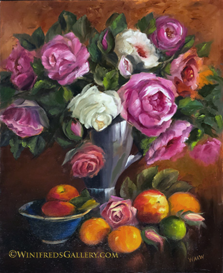
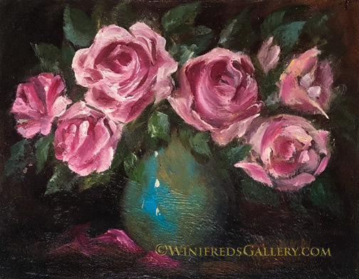
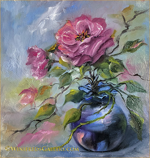
I’m glad I spent so much time and effort this past year, making roses a friendlier subject to paint. The softness of this painting comes from using a “mop brush” on the painting before it is dry to soften and blur edges. This brush can be used selectively or all over – depending on the look I want to give. I enjoy the feeling of the the heat and sun on these roses.

Roses on Gold Gilded Table – 4×6 Oil Painting on Cradle Box by Winifred

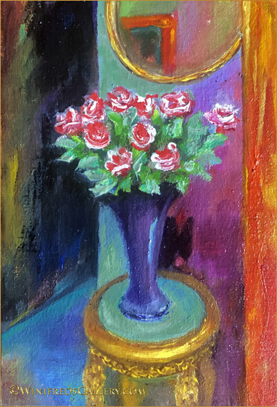
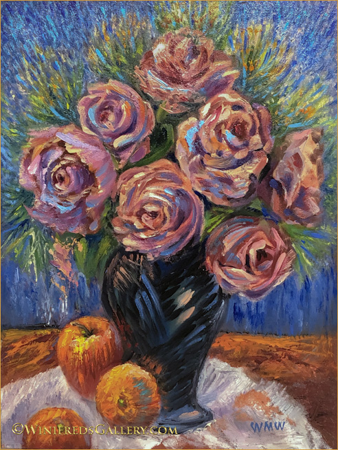
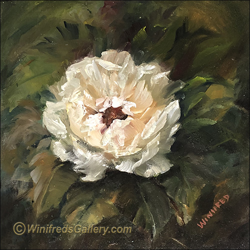
Lots of intense color. I love that I can create “gold metallic” where none exist. This painting took way to much time, but it captures a certain space in my home which I see everyday. The orange strip on the right is the edge of a bookcase full of art books.

Tulips in Blue Vase – 4×6 Oil Painting on Cradle Box by Winifred

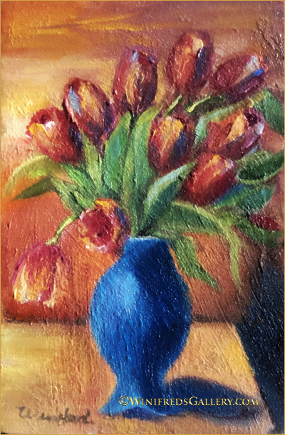
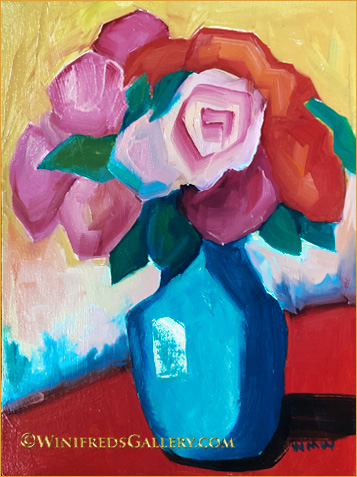
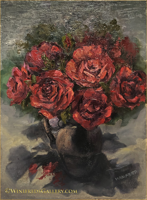
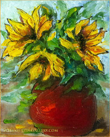
I love texture but there’s really not this much texture in this painting. This texture only reflects the way the light hit the texture and exaggerated it. I should have rephotographed it – but I didn’t. Just think of it smoother. The vase was a cream color – and it did work but decided I an intense blue would be more interesting. You know what VanGogh said about blue, orange and yellow. It’s true – those colors are beautiful together.

Cradle Box

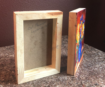
I’ve referred many times to “cradle box” past couple of weeks and I’ve been ask – “what is a cradle box”. Above – you can see what it is. I’ve now begun to paint the edges. There seems to be no more small cradle boxes remaining on the planet!! I’ve looked everywhere I know to look – mine were purchased more than 2 years ago. Sizes now seem to start at 8×8 inches.

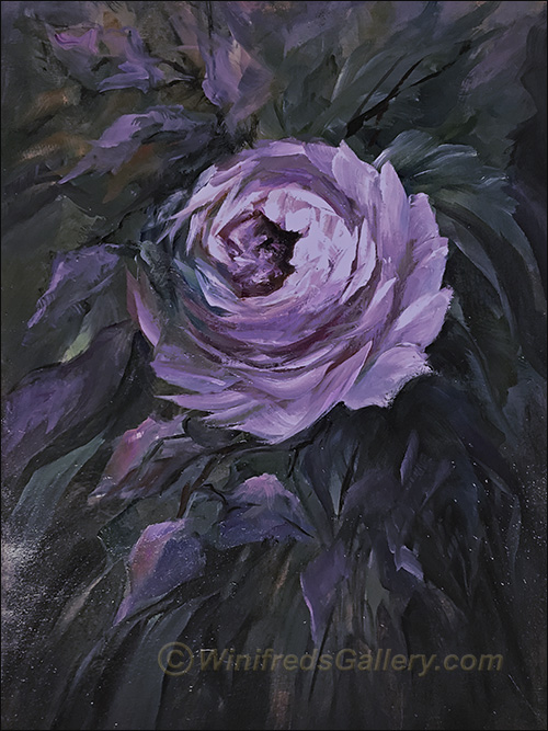
Hope you’re enjoying this small painting series with me. Only 2 cradle boxes remain blank, which I will paint this week. I could conceivably repaint a larger painting from any painting in this series because I have worked out the color palette and design. Many artist do this so as not to have to experiment with design and color in a large painting. Certainly this makes a lot of sense. I will take this under consideration. (: Hope you’re staying safe.

Related Images:

A Bit of Cheer

A Bit of Cheer Oil Painting 9×12 Panel – by Winifred Whitfield

I decided it is a perfect time to post a cheerful floral. It’s such a strange time in out lives. This is a bit different style of painting for me, loose and simple. I think I’ll do more. One interesting side about this painting is that whereas in the painting, the vase is actually turquoise green – looking like the beautiful turquoise of the ocean in Hawaii for instance, it is not blue as shown here. I couldn’t capture the actual color with my camera where the color space is more limited – same with my computer monitor. The other colors are pretty accurate – just not the turquoise. I’m sure no one cares about this but me. SIGH! Have a great week and please stay safe. Winifred

Related Images:

Taking Chances

Impressionistic Peach Roses with Fruit 12×16 Oil Painting on Panel by Winifred

 I place a high value on taking chances.  In fact, I don’t really believe taking chances is a risk, I believe the risk occurs if you don’t. If I choose a safe path, one I believe will keep me from “messing up my painting, for sure this will inhibit my growth.  I’m thinking now about  thoughts which went through my mind with these two paintings – both of which presented me with opportunities to “mess up” – but I took a chance anyway.

I don’t find it particularly difficult “to paint what I see” from a reference photo or from a still life I set up.  For the most part, however, my interest is not realistic paintings  – except portraits.  I’m interested in “interpreting” or abstracting away from realistic visual references. This is much more interesting and exciting for me.

I find this more challenging because it means, I have to “make up things that aren’t there”.  I have to eliminate part of the content which is there. I have to create elements, colors, textures which are not present.  I have to make up brushstrokes which alter the surface of my reference.  I might “mess up” – I often think as I commence some of my more abstracted or elaborate processes!  This thought regularly enters my mind and I have to pause to “talk” to my mind about it.  “You can’t mess up” –  I tell my mind. In fact, I tell my mind that imagining/abstracting new content – new ways to express the elements being observed “ is its only job” – and the only way to build new skills, confidence and creativity – no matter the outcome!  

 I want to have ideas – receive ideas but to try not to tightly control the process expression.  By doing this with each painting – even in small steps, I know my creativity and confidence grows.  I believe both of the above paintings are examples of being a bit “out of control”. It doesn’t even matter whether they’re good paintings or not. The only thing that really matters to me is that I tried something new which caused some discomfort and I did it anyway. I hope to continue this practice throughout this new year.  

I think the saying is – “feel the fear and do it anyway! 2020!!

Related Images:

Abundance

Winifred Paints Roses in Vase with Fruit Still Life 16×20

With my large format printer removed from my very long table, I have a new place I can set up to shoot still lifes with ease. The wall is a rich burgundy and I have a source of both natural and artificial light available to create reference photos from which I can paint. Often I don’t have a great deal of fruit in the house, but at the time I created this reference photo, I had abundance of fruit in the house – as well as artificial flowers. I used an electric coffee maker as my vase. My arrangements always take a while to create but ultimately, everything came together nicely.

Abundance – Initial color sketch 16×20 – by Winifred

Above, I liked the rough color/value sketch. It’s a loose painting style, some of which I hoped I would maintain in my final painting – but I failed to do so. In fact, I will soon create a painting where this painting style is the style for the painting. I like the fact that I can now, so quickly create shapes recognizable as a roses – which are complex to paint.

Below is a painting from my initial still life set up in the new location. I will soon purchase new silk roses with new colors and rose types.

6 Roses in Turquoise Vase – 11×14 panel.

I do love the turquoise and vivid magenta hues together. Thank you for observing my progress. Winifred

Related Images:

Bouquets of Roses

Roses are hard to paint – I think I said that before. I wanted to become more comfortable painting them – hence, I continue. I’ll change subjects pretty soon.

Rose Bouquet with Apples – 16×20 Oil Painting on Panel by Winifred

Above, the challenge was to paint a variety of different roses but to maintain a consistent painting style. For me, that required a great deal of discipline. I often like to paint in the “style of the moment”. By working to create a consistent style, some of the spontaneity was removed from the process – a type of “freeness” in hand movement I value. Even the fact that it is a 16×20 – not a small painting, increased the challenge.

Red Roses with Shadows on Stairs – 12×16 Oil on Canvas Panel

Above: I planned to take this vase of silk roses upstairs but set them on the landing temporarily. When I did, I immediately noticed the very interesting pattern of light on the roses but particularly the shadows reflected onto the landing. One rarely paints a still life using overhead light but this was special. I snapped several photos, one of which I would certainly later use as a painting references.

Below: Painting sketch from imagination. My challenge to myself – could I convey in only only a few quick brushstrokes the kind of flower I intended. This was fun! No laboring for hours or days to create this. It was quick, colorful and fun. I hope you recognize the flower!!!

Rose Bouquet 6×8 Sketch – by Winifred

Related Images:

Rose Variety

The rose paintings continue. For awhile now, I haven’t had to wonder what I was going to paint! For the past several weeks, it’s just been roses.

Lilac Rose Oil Painting – by Winifred

Above, abundant energy and foliage, and for me, unusual colors in this painting.

Rose in Blue Pearlized Vase – by Winifred

Above: It’s playful and energetic, So long as I’m moving my hands, I’m growing in skill and confidence in my brushstrokes.

White Rose Oil Painting – by Winifred

Above: I love the feeling of the thick paint and texture in this painting which give it so much dimension. It jumps off the background.

Geometric Rose Oil Painting – 9×9 by Winifred

I think you can see my issue. My painting styles are quite diverse. It would be hard to recognize them as coming from the same person. I would have to say that the painting style immediately above comes with the greatest ease and most likely would be found to be the least desirable! That’s the way it goes. I will not abandon this hand I’ve been given.

Related Images:

Sunflowers, Sunshine and Blood Oranges

Sunflowers and Blood Oranges 20 x 24 Oil Painting by Winifred

In my last post I shared the initial paint sketch, for the above painting I had in mind. It was part of a process which really makes a positive difference, though I rarely follow it. A large sketch – about 11×14 was created, followed by the small painting to test color and design (see previous post). The test painting was a long and skinny. I then did a vine charcoal sketch on my 20x 30 inch panel. This required altering the aspect ratio from the small test painting, but knew I could manage this. The idea was not to make the final painting identical to the small painting. I painted the full 20 x 30 painting, which I like, but have decided to crop it to 20×24. Both versions work but the cropped is just a little more impactful. This is my largest painting to date. I will be creating more. Hope you enjoy. Thank you, Winifred

Related Images:

Back to Painting Sunflowers

Sunflowers with Oranges 5×12 Oil Painting – by Winifred

My Venice paintings were rather complex – not to say, sunflowers are not challenging, but painting them brings a smile. The above oil painting was particularly enjoyable and was created from imagination. I created quite a lot of paintings from imagination when I painted digitally. I felt I had less to risk if I screwed up. I could throw away a layer – only part of the image, and make corrections. I feel great joy when I look at the above painting, which hopefully means I’ll create more.

Sunflowers in Red Vase -8×10 Oil Painting – by Winifred
Golden Sunflowers – 9×12 oil painting by Winifred
9×12 Impasto Oil Painting of Sunflowers – by Winifred

Related Images:

Paintings Coming 2019

HAPPY NEW YEAR!! I’ll make new strides in 2019. No playing it safe – such as with my tomatoes. Painting this was not easy for sure. Each color and tonal variation had to be mixed separately. Oil paints don’t easily blend together and you can see the color variations are many. However, though tedious, I purchased 3 tomatoes and had them to look at. Basically, I painted what I saw – realism.

Winifred Whitfield Paints Ripe Juicy Tomatoes -8×8 Oil Painting

Just imagine, however, you set up a still life, below, but you chose to completely alter the color, textures and even some content – more abstract, more impressionistic. This makes the painting even more complex though giving one the opportunity to stretch the imagination, completely personalizing the style mood, color texture all. I’m will do more if this, attempt to stretch my capability with each and every painting. I hope you will enjoy.

12×16 still life oil painting with oranges by Winifred

There will be times when I work very seriously, but I also believe in play. Below, you can see play!! Grapes, pear and a shadow. This was fun. Thank you for sharing my painting journey and hope you will continue into the future. Wishing you and your family the best in 2019. Winifred

Grapes, Pear and Shadow oil painting by Winifred

Related Images:

Brass Against Red Backdrop

Brass Teapot Against Red Backdrop – 12×16 Oil on Linen Panel

Brass Teapot on Red – Oil Painting by Winifred

In June, I set up and photographed many still lifes.  This was one I knew I would paint at some point – and finally, the day came.  Painting the textures of the various articles was challenging and fun.The colors are luscious. To make this painting easier, I opened the photograph in Photoshop, and used the dropper, to select individual hues and values to make color swatches. I printed these color samples on high gloss paper and took them into my “wet” studio to mix my paints to match the precise oil colors for the painting. Very effective! Hope you enjoy. Winifred

Related Images: