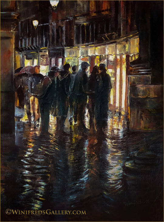
Venice at Night – Gathering, Oil Painting 12×16 by Winifred Whitfield
Often, if not all the time you’ll see groups of people gathered in the many narrow paths and streets of Venice, Italy. At night, this is an even more striking as they are lit by golden window light. Add rain and you add shimmer to the darkened silhouettes. Umbrellas don’t play a dominant role in this painting but they are present. Hope you enjoy. Winifred
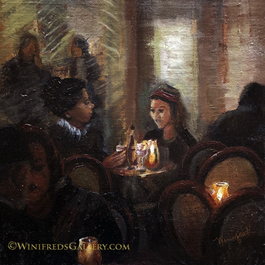
Candlelight in Venice Cafe, 12×12 Oil Painting by Winifred Whitfield
From time to time, over the past 4 years, I’ve viewed the reference photo I took and used for this painting. Often I felt it far too complex for me to paint – or at least, I didn’t want to work that hard. I did love the shapes of the chair backs and of course, the candlelight and the shadowy figures in the dark. Finally I decided I was ready and actually enjoyed the painting process very much. As always there is a change in painting content from that which existed in the photo but that’s to be expected. Hope you enjoy. Winifred
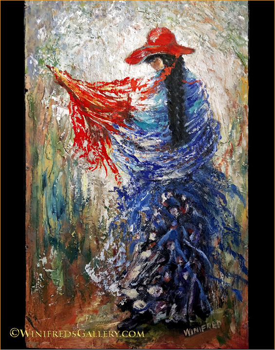
Raising the Red Umbrella – Oil Painting 9.5×17 by Winifred Whitfield
I textured my panel before I began this painting. I made a modest attempt to bear in mind the shape of the figurative elements so the texturing wouldn’t look completely crazy!
There was no umbrella showing in my reference photo though I knew she held one and so with a few expressive red lines, an umbrella was created. When people have seen this painting, they thought it referenced a far away exotic country. The fact is, I took the reference photo of a friend returning from a celebration. She was walking right in front of me, in the middle of the concrete street, with cars on the edge of the road and houses in front of her, right here in Poulsbo, Washington.
I’m enjoying living in a gallery. Many friends and neighbors have visited. It’s quite enjoyable when they do. Call first. 360.779.1375. If you don’t know about the gallery, please see my previous post. I hope to see you in the near future. Have a great day.
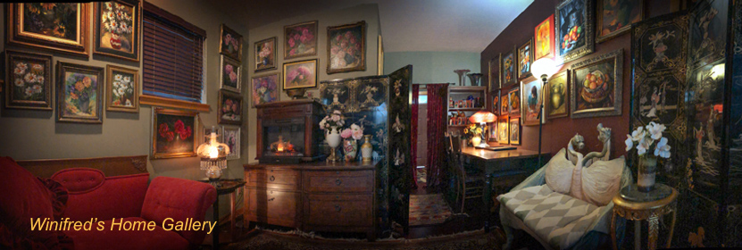
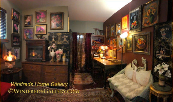
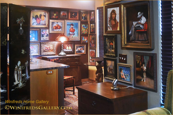
Welcome! Something big has happened to my home! With the help of two talented and wonderful friends my environment has changed dramatically, my home has become a gallery. (Above: Almost a 270 degree living room/gallery panorama). Overall 86 paintings are on my walls.
Creating this environment was an immense amount of work. During my past 5 years painting with oils, I didn’t hang paintings on my walls. I chose to daily paint daily – and not focus on using my painting as decor. Well, that’s changed. Paintings stacked up in a spare room in a hap hazard fashion. I needed to either hang them or box them for protection. Painting still lifes, more so than portraits, was new for me. Early in my oil painting life I received many commissioned portrait sales. They were beautiful. I’m comfortable with portraiture. For 20 years, I had created portraiture photographically, as digital art and then in oil. I love portraiture, although, as you will see, I wanted to spread my wings.
Winifred’s Home Gallery Living Room – 2 walls
Now, I’m surrounded by paintings of all kinds. Not only that, I brought into this space my most interesting soft furnishings to compliment the painting presentation, which I’ll also show you. I’m thoroughly enjoying the new environment and I can now easily share my work with invited friends and neighbors.
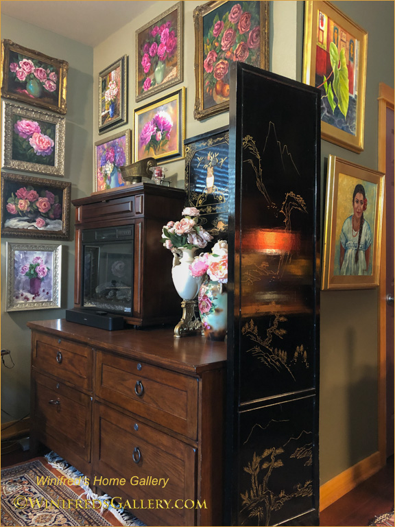
Winifreds-Home-Gallery-Corner
Each wall or grouping has a theme by content or color. There were roses and peonies on one wall, oranges and yellows, primarily sunflowers and fruit on another. I paid close attention as the concept was developed and the layout created on the floor before it was installed on the wall. Husband and wife team, Sapna Sopori and Alex Wisniewski – have professional lives which have nothing to do with this kind of activity. However, I had noticed Sapna’s passion for decorating and lots of picture hanging in her home. I ask if she would help me. She excitedly said “yes”. Not sure what I would have done without the two of them.
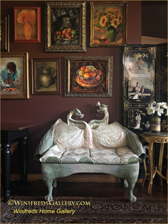
Dragon Bench by Marilyn Phillips – Winifred’s Home Gallery
This dragon bench is certainly one of my favorite pieces of soft art, made by artist Marilyn Phillips. I’ve had it for a long time. It fits in very well with the paintings. Sapna, who designed this project is captivated by the dynamic of the single escaping grape in the still life above and the dragon, thinking that at any moment grape might just fall into the dragons mouth. The paneled room divider with it’s square sections also works perfectly in the overall design scheme.
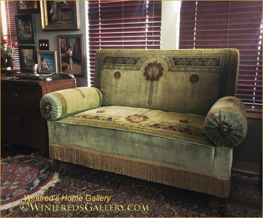
Below: I don’t know much about the origins of the settee below. It’s an antique. I previously used it in my portrait studio.
Red Vintage Settee with Arms that Ratchet Down – Winifred’s Home Gallery
This settee was the most used piece of furniture in my portrait studio and gallery because of it’s adjustability. The arms can be moved from completely vertical to completely flat. In addition, it’s so perfect for a mid day nap! It’s also the perfect compliment for my collections of daisies and sunflowers paintings above or in fact any group of paintings. By the way, I’m thinking of painting that gray/green wall a deep burgundy/brown so the blinds disappear. I actually have just the correct color on the opposite wall.
The paintings below, are on the wall just to the left of the red settee – still in the living room. On this wall the paintings are a little more abstract than others.
Winifred Home Gallery Abstracts
Below: To the left of paintings above is my green settee.
Antique Green Decorative Settee with Arms and Back that Pull Off – Winifred’s Home Gallery
I found this unusual piece of furniture at the Salvation Army Antique store in Seattle 20 years ago. I was so excited. It was torn in places; you can see the new fabric used to make repairs.The arms can be rolled out and off. They are attached with curved metal rods. The back will pull off. I wondered about the origins of this unusual piece. A while back, on a business trip to Colorado I entered an antique store – where to my surprise were several identically configured pieces of furniture – but with different fabric. They were in a terrible state of repair. The shop owner explained that they use to be in the lobby of old movie theaters. I’ve been told that the fabric on my settee is something very special – designed by someone very famous who has work in the Metropolitan Museum of Art in New York. I’m making efforts to know more about it. I should do an image search – but as yet, I’ve not.
As we pass the green settee, we approach the dining area.
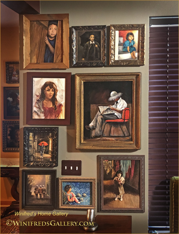
Winifred’s Home Gallery Figurative and Portraits
Above and Below:- Wall of portraits and figurative paintings. I’m enjoying doing portraits and figurative painting again.
Winifred’s Home Gallery Portrait
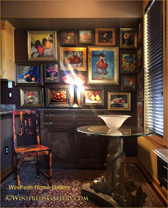
Below: Dining area.
Paintings in Dining Area. also Tiffany three headed dragon table base and Joseph Clearman Art glass lamp on cabinet lighting the paintings.
Winifred’s Home Gallery Dining Area – Still lifes and figurative painting. Art glass Lamp by Joseph Clearman.
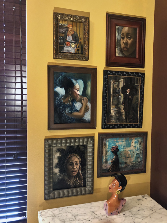
To the right side of the blinds in the dining area is another portrait wall which includes shopkeeper in Italy and Italian women walking in the rain with umbrella, a Guatemalan woman and intense portrait of a women in “despair” and a musician in glamorous attire. Below the portraits is a ceramic art piece named by artist Steven McGovney named “Winifred”. It’s a book end. There were two. The other bookend “Priscilla” was blonde and sadly she was broken.They were best of friends!
Winifred’s Home Gallery Portraits and Figurative
Above: My most recent portrait/figurative paintings have some cyan coloring. The others I painted earlier, including two which are part of my Venice collection.
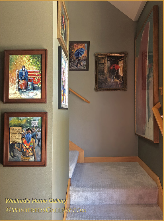
Winifred’s Home Gallery – Toward Stairway – Venice Collection.
Moving toward the stairs and the entry of my home are two paintings commemorating the Covid Pandemic and Black Lives Matter demonstrations which took place during this period. We then head toward the stairway to view the “Venice in the Rain” series. It’s a themed series which includes people with umbrellas, painted from photos taken on a rainy night in Venice. I have created 11 paintings in that series. Only 7 are on that wall, but there was no way to capture them all at the same time.
To the far right on the stairway landing, you see a glimpse of another painting. It’s a painting which purchased in New York years ago from painter Steve Lindsay
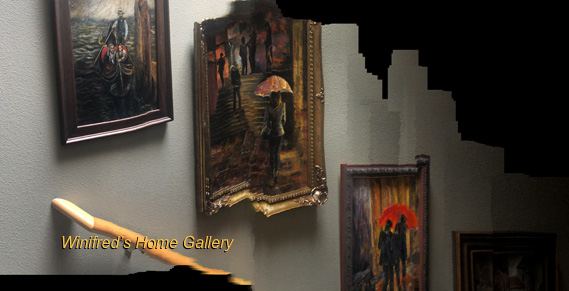
Below: I attempted to create a panoramic image of the Venice themed paintings while walking downstairs. In a way, it didn’t work, but in a different way, it worked fantastically. I love the breaking apart and abstraction which occurred. It’s the best!!!
Winifred’s Home Gallery Stairway – Panorama!
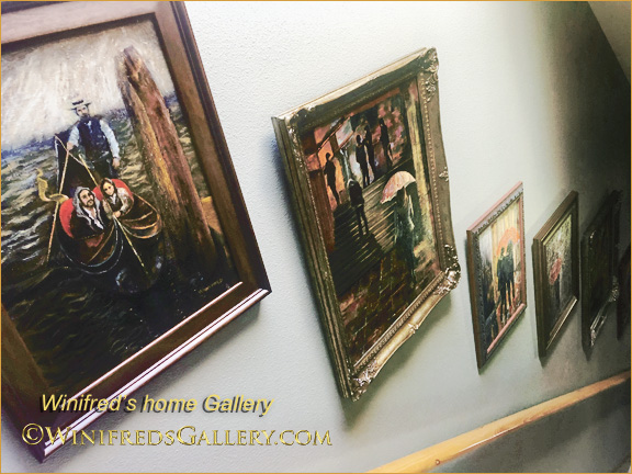
Winifred’s Home Gallery The Venice Collection on Stairway
It’s done!!
Comments are back on. I’d love to know what you think. Thank you … and Thank you Sapna and Alex. Winifred
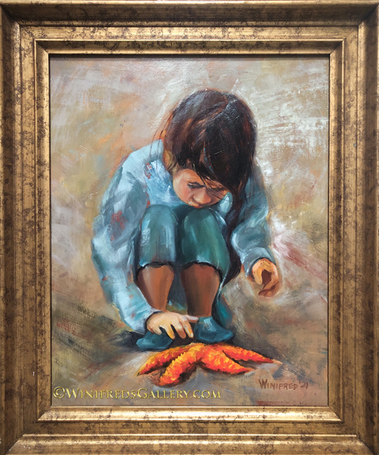
Girl with Starfish 16×20 Oil Painting by Winifred Whitfield
I took the reference photo for this painting probably 17 or 18 years ago. It’s a photo, not even a digital file which I happened upon recently. This painting may get additional attention in the future – which is frequently the case, but for now, I’m just try to figure out how to get through the extreme and unusual heat expected over the next few days. Monday is projected to reach 106 – historic by far! The great majority of people in the Northwest don’t have air conditioning – including me. We would typically not use if for more than 1 or 2 days during the summer if the temperature reached the high 80’s or low 90’s for a couple of days. But as we’ve seen radical weather changes all over the country, it could happen here, again. Although no air conditioners are available right now – sold out, I think I’ll place an order believing that as early as it is in summer, I should plan for a duplicate performance. This is what’s on my mind today.
Fortunately, my studio is probably 20 degrees cooler than it is outside – so I’ll keep painting for sure. With care, keeping blinds and doors closed and fans going, I can maintain a reasonable comfort level and “power through” the heat. Sunday 99, Monday 106 degrees,Tuesday 90. Wednesday 81 or something like that, so I’ll manage. I’m a person who prefers 70 degrees so this heat will be challenging. Hope you’re comfortable wherever you are.
Lady Carrying Load – Guatemala 16×12 Oil Painting by Winifred
There was no abstraction in the photo reference. It was a normal street scene with a building in the background, a door, a window, a street and a curb. Originally I painted this. The photo was interesting, but in the painting those street/building elements were not working design wise as I had painted them. I decided it would be a better choice to eliminate them. I wiped those elements from my panel, leaving some rough drying brush marks and the color changes I’d made to the background. It turned out the removed elements had not been essential to my focus – the woman carrying the load on her head. I added some additional brushstrokes to enhance the abstraction, the painting was was done and I liked it. Quite by accident I’d created an urban street scene abstraction or what might remind me sadly of war torn Gaza as a background. (Photo reference by Daphne and Art Carlyle).
There will be one more painting from a Guatemalan photo reference and I’ll be done with that series. It will be a man.
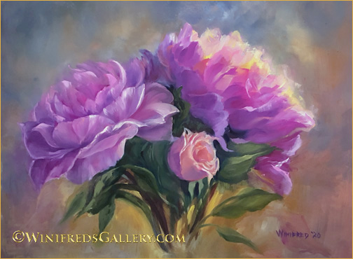
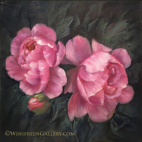
Ray of Hope Oil Painting 12×16 by Winifred Whitfield
That’s what a friend said when she saw this painting. Perhaps she was referring to the light hitting the peony petals, but for me it has two meanings, as we hopefully we soon move toward the end of this election – and hopefully with Trump gone!
I created another peony painting this past week – below – but it no longer exist.
Three Peonies. Only digital file remains. By Winifred
I broke the panel and threw it away. I have a bit of regret, I must say. I think I should take a couple days at least before I do these impulsive things – but I won’t dwell on it. One really cannot SEE a painting clearly if it is completed in a day. One is far too close to it at that time. I couldn’t see fully the merits or the faults. It’s pretty amazing what one does see a couple days later – or perhaps a week later when you’ve moved a bit past the “touchup” and “fix it” mode. It’s a very different experience – but at the time – I felt the need to break something!! The peonies in this painting are actually pretty well done. So I will make this a rule for myself – WAIT.
Obviously flowers are my subject matter of choice. I didn’t know this would be the case when I began to paint. The fact is that flowers are colorful and joyful. Who doesn’t like to receive a bouquet of flowers! I’m painting happiness and given so many of the policies and practices in this country – I need it! Hope you’re having a good week. May MY candidates win!! Winifred
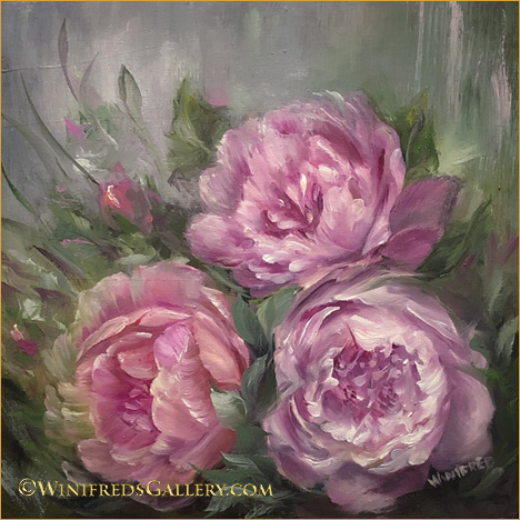
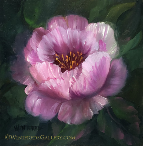
Peonies in the Sun – Oil Painting 12×12 by Winifred Whitfield
Peonies are so beautiful and have such an abundance of petals and complexity – they have long been an intimidating subject matter. But, I decided it was time to take the challenge. I started with the violet poppy, the last image on the page, because it has a similar shape and structure – but fewer petals. Next I painted the Peony you see just below this one. Each time I painted, the process became less arduous. I’m actually looking forward to the next. Practice and I understand the creation of “muscle” memory play a part in creating confident brushstrokes. For sure, I remember when I looked at some YouTube demos on painting peonies, and had no clue how the painter was forming the shapes and petals. At this time, I can hardly remember that feeling. It’s encouraging to know and to expect that if I do my job – I will move forward.
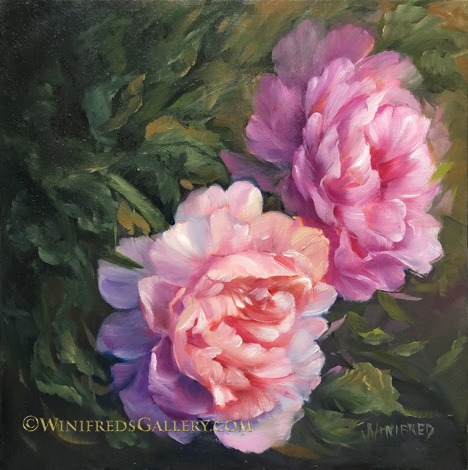
Peonies 1 – Oil Painting 12×12 by Winifred Whitfield
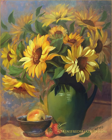
Dance of the Sunflowers 16×20 Oil Painting by Winifred Whitfield
I wonder if it’s apparent why I chose this name for the painting. If it’s not apparent, it doesn’t really matter. If it is apparent, it just adds a little delight. I don’t think I told you that I didn’t plant sunflowers this summer. I thought I’d skip a year given the massive plantings the two summers previously. Plus, it’s best for the soil. But wouldn’t you know it – in the container closest to the street, a volunteer appeared. It grew and grew. Then it began to bud. Not just one flower appeared but 20 at least, up and down the stem.
I’ve had sunflowers stalks with multiple flowers on the stem before, but nothing like this. It seemed to make up for the absence of all the others. It’s abundant show is over now and just a couple days ago, I removed its tall strong stem. This painting is my memory. It had grown in a pot containing strawberries which are featured in the painting as well. The apple played no part of my growing season, I just thought it was a nice element of design. I enjoyed the sunflower showing up like that – quite a surprise. It was the unplanned child! Hope you enjoy! Winifred
Rose Peony – by Winifred – Oil Painting on Cradle Board 4×6
This is the first peony I’ve attempted and I worked not to make it realistic – but hopefully suggestive. I’ve actually come to the end of the 12 cradle box project and as it turns out, I’m glad I don’t have anymore of the boxes. Now I can turn my attention to something different.
Below, I like the color and boldness. I think I’ll paint in this vain for a while.
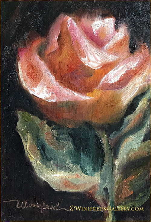
Peach Rose – by Winifred – Oil Painting on Cradle Board 4×6
It’s on the early side in the Northwest for planting but I’m doing it and starting seeds as well. Last year it was mid June or later before I got started. I purchased my first tomato plant, and I’ve propagated my first geraniums. They will be fuchsia burgundy and white. They are unusual and beautiful. I have 14 growing!! Have a great week. Winifred