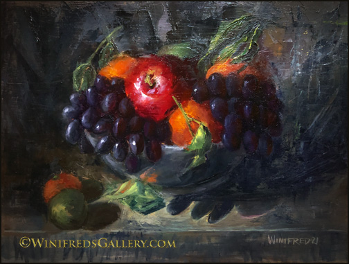
Tilted Bowl of Fruit 16×12 Oil Painting by Winifred
It started when shopping for fruits and veggies. I saw a bunch of large tangerines in the center of the fruit display. They had large gnarly green leaves attached. I would include them as they would add a special touch to the bowl of fruit I’d create. I tilted the bottom of my support to change the point of view just a little to add additional interest. Primarily, I used a palette knife but not for everything. Always a challenge but I enjoyed creating this colorful energetic painting.
Scattered Grapes and Roses 11×14 Oil Painting by Winifred Whitfield
I haven’t painted with a palette knife in quite a long time. I loved doing so. Of course the grapes were the most fun. Including grapes just popped into my head and I went with it. I can just hear you now. Don’t worry, I will do more – I love all of this texture!
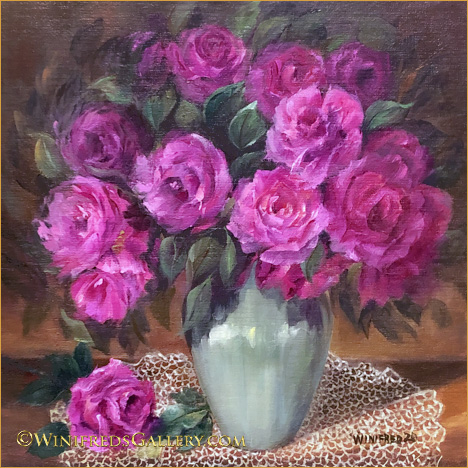
Roses of Purple and Gold – Oil Painting 12×16 by Winifred Whitfield
I used a different color set this time. I still can’t claim that painting roses is getting easier. I could chose to paint only two or three at a time – but I don’t really want to remove the challenge – and challenge it is. Have a great weekend! Winifred
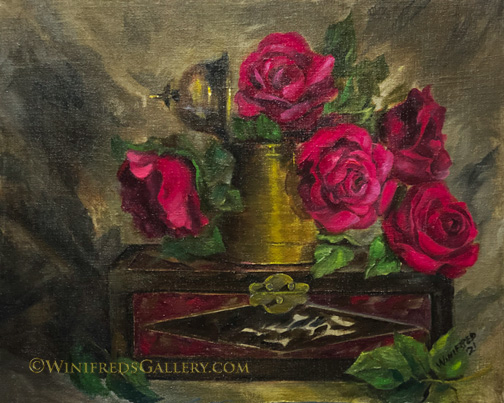
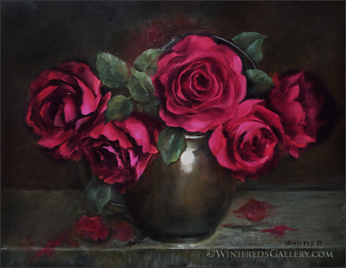
Roses Atop Decorative Box 16×20 Oil Painting on Linen – by Winifred Whitfield
In no way did I expect to show you yet another painting of red roses. I assure you that I attempted a different painting but it just didn’t work out. This still life had been planned as next in line. It was sitting on a table waiting to be placed in my still life lighting area. I knew I would enjoy this subject matter and I did. I’ve had this box for years, having always enjoyed the colors and design. The drape behind the still life set up gave me interesting shadows and direction of light – strong elements I’d not envisioned. I love it when that happens.
It’s been a horrendous and tragic past week – but Trump is all but gone. I hope you have a great week to come as we celebrate Martin Luther King Day. Ironic to put both of those names in the same paragraph. Destruction – Peace!
WELCOME TO JOE BIDEN AND KAMALA HARRIS – our new President and Vice-President! What a mess they inherit!
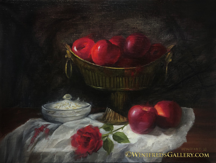
Apples and A Rose 20×16 Oil Painting on Linen Panel
Happy New Year to all! I’m thinking of last year this time – we had no idea what was coming and we watched the world change and it was disastrous. This year, I’m hoping for positive change on so many levels.
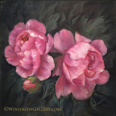
I’m enjoying creating paintings on dark backgrounds as the last two have been. They’re dramatic – especially with the reds. Setting up a still life and attempting to crease a pleasing design is one of the greatest challenges. The actual painting is not as hard as that to do.
In the past I’ve create portraits and digital portrait paintings, often even full bodies, which grew out of a dark background of shadow. I find myself wanting to do the same with still lifes in oil. I’ve created paintings like this before but not for a while. Its a comfortable visual style for me.
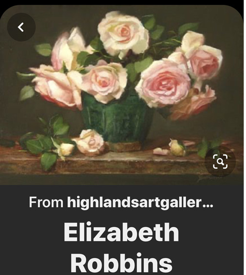
I’m also beginning and online painting class. There’s a lot of that going on these days. I love to collect others painters techniques. I like the work and style of painter and instructor Elizabeth Robbins. My interest is not to paint like her, but I love to learn the process and thinking of artist whose painting styles I admire. She paints lots of still life florals with very soft edges and lots of pretty soft colors. Below, I show you an example of her painting and include a link to her instruction site she host with a landscape painter friend, where you can see more of her work – Inspired to Paint.
Elizabeth Robins Oil Painting
We’re even planning to schedule a portfolio review of my work. That should be interesting. I’ll let you know what she says – maybe!! I sincerely wish you a healthy and happy new year. Winifred
Crimson Roses at Christmas 16×20 Oil on Panel – by Winifred Whitfield
I’m wishing you, your family and friends a wonderful holiday season – even though you may be dealing with loss, illness and separation. At the same time, I understand that in combining this season with Covid 19, or other circumstances can amplify all the emotions, be they joy, sadness or disappointment. That’s just the way it is and always has been. Tomorrow is a new day.
Basically, I’m a non sugar eater. Sweets are just not my thing. I like salty and spicy. But if I take a bite, of a delicious sweet, that will often change things and I will consume it! It’s a carb/brain thing. I’ve been given a few treats the last few days that just blew my warm socks off – so good! I ate them. There was Tiramisu cake, absolutely amazing, and some pecans dipped in dark chocolate and a chili spice – so unbelievable good and dried fruit and nuts covered dark chocolate. I’m not beating myself up about it. I just enjoying. I even received a gift of Cranberry infused Vodka. I’m usually a modest red wine drinker and occasionally champagne but I said “yes” to this offer. I thought it was Vodka mixed cranberry juice – but NO, it’s infused with cranberries. I don’t know exactly what that means but it’s a potent drink. Later today, I’ll mix it with Prosecco and enjoy.
I haven’t posted in a while. It’s not that I didn’t paint – I didn’t like them. My paintings of roses are continuing to grow stronger for the most part. Roses are difficult to paint – more so than peonies, in my opinion. I’m pretty happy with these – though I will make a few changes.
Another unarmed Black man was killed by police. I won’t mention it when it doesn’t happen. Black Lives Matter.
Rose Bouquet Magenta Oil Painting 16×16 Linen Panel by Winifred Whitfield
Painting this was a labor of love. Definitely it was labor but I rather enjoyed the arduous process of painting roses with a different look using looser more feathered strokes and edges. I’ve always wanted to do this but I had to figure out my process and become confident that loosening my control and grip of the brush would give me the results I wanted. I’ve made similar starts in the past on a flower or two, but to be stylistically consistent with more than a dozen flowers is an accomplishment. The fact is, a bit earlier in the process, I actually removed 7 roses (after lamenting the effort which had gone into painting them). The field was too crowded and the design flawed. The painting became stronger when I allowed the eye some room to move about.
Because I had created a rather classic look, I decided to paint a Dollie, which no one uses or paints anymore. I found that my hand and brush is willing to create this type of pattern without struggle – it was almost relaxing, no thinking involved. Painting roses is not. Thank you for the visit! Hope you enjoy. Have a great week. Winifred
This is one of those times fortunately when I really enjoy both images equally. They’re different but both make me feel good. I needed a break from my very formal peonies and this was the break I needed.
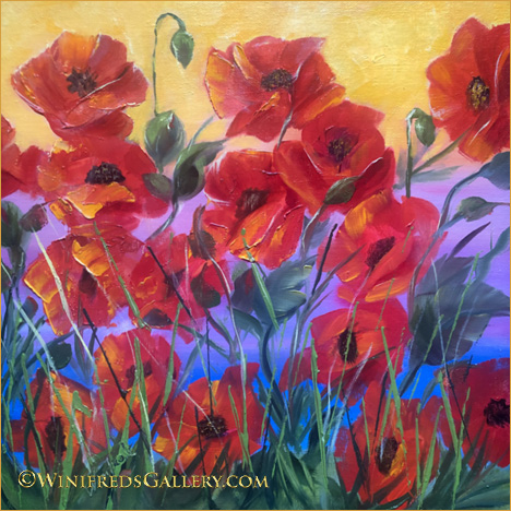
Red Poppies Oil Painting 12×12 by Winifred
Joyful red poppies, swaying in the wind. I love the colorful background – I never created a background quite like this before – but I will again, in some form.
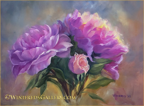
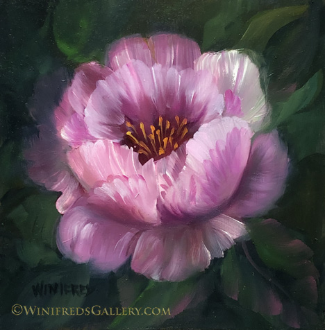
Ray of Hope Oil Painting 12×16 by Winifred Whitfield
That’s what a friend said when she saw this painting. Perhaps she was referring to the light hitting the peony petals, but for me it has two meanings, as we hopefully we soon move toward the end of this election – and hopefully with Trump gone!
I created another peony painting this past week – below – but it no longer exist.
Three Peonies. Only digital file remains. By Winifred
I broke the panel and threw it away. I have a bit of regret, I must say. I think I should take a couple days at least before I do these impulsive things – but I won’t dwell on it. One really cannot SEE a painting clearly if it is completed in a day. One is far too close to it at that time. I couldn’t see fully the merits or the faults. It’s pretty amazing what one does see a couple days later – or perhaps a week later when you’ve moved a bit past the “touchup” and “fix it” mode. It’s a very different experience – but at the time – I felt the need to break something!! The peonies in this painting are actually pretty well done. So I will make this a rule for myself – WAIT.
Obviously flowers are my subject matter of choice. I didn’t know this would be the case when I began to paint. The fact is that flowers are colorful and joyful. Who doesn’t like to receive a bouquet of flowers! I’m painting happiness and given so many of the policies and practices in this country – I need it! Hope you’re having a good week. May MY candidates win!! Winifred
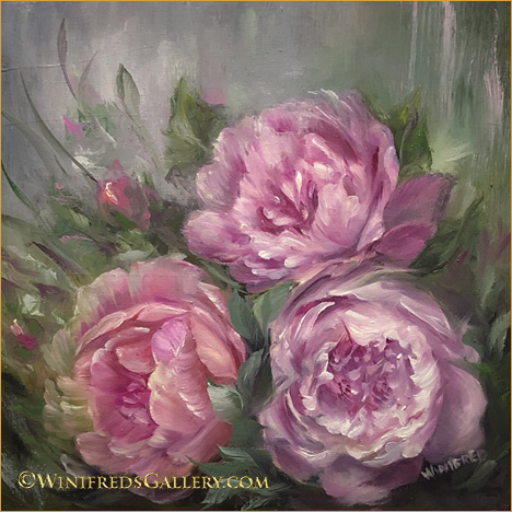
Peonies in the Sun – Oil Painting 12×12 by Winifred Whitfield
Peonies are so beautiful and have such an abundance of petals and complexity – they have long been an intimidating subject matter. But, I decided it was time to take the challenge. I started with the violet poppy, the last image on the page, because it has a similar shape and structure – but fewer petals. Next I painted the Peony you see just below this one. Each time I painted, the process became less arduous. I’m actually looking forward to the next. Practice and I understand the creation of “muscle” memory play a part in creating confident brushstrokes. For sure, I remember when I looked at some YouTube demos on painting peonies, and had no clue how the painter was forming the shapes and petals. At this time, I can hardly remember that feeling. It’s encouraging to know and to expect that if I do my job – I will move forward.
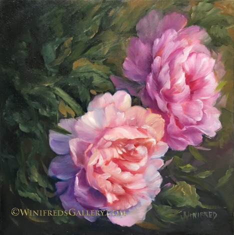
Peonies 1 – Oil Painting 12×12 by Winifred Whitfield