Spring in New York

Spring 2012

I don’t know when New York has had  a winter such as the one past.  There was a freaky heavy snow this past Halloween.  I was in town at that time as well.  I found the beauty but was not inconvenienced by it.  Back again, to experience an early full blown sun lit Spring.  I spend many of my days at the museums. Yesterday I saw the Gertrude Stein collection at the Met.  A couple of days ago, I viewed the Diego Rivera exhibit at MOMA.

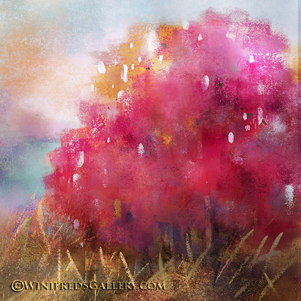
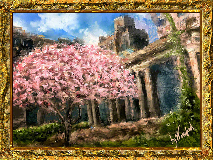
Since recently taking a class in painting street scenes, I must say that I have been looking at the people, traffic and buildings in New York in quite a different way. After leaving the Met a few days ago, I walked wistfully down 5th Ave.  Central Park was across the street from me  to my right and I sought to hug any strip of shade I could find next to the buildings which flanked me to my left. Suddenly I came upon a courtyard with two cherry trees in bloom.  A high fence  beautiful ornamental wrought iron fence shielded the property from the public.  I stuck my iPhone through the , however to snap a couple of images. An interesting perspective, I thought.  This is the resulting painting.  I like it quite a lot.
Related Images:
Corel Painter 12.1 Tutorial – Sampling Multiple Colors

Sometimes magic occurs in our paintings when we least expect it. I love that

By Winifred

There are times I want to talk about a painting.  Not in this case. This painting tells its own story very well.


Related Images:

Painting Italian Street Scenes 2

Focusing  on Perspective

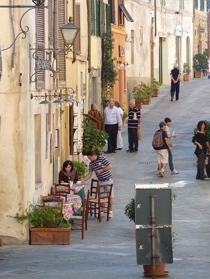
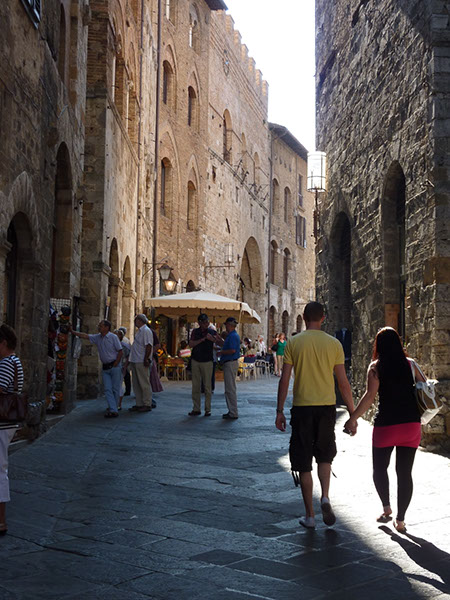
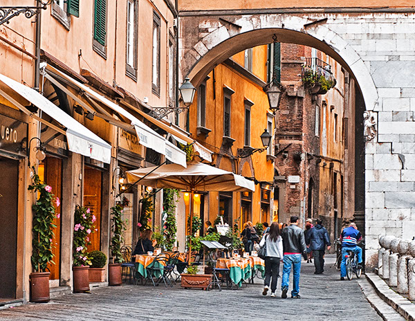
I chose this image to paint. It has strong leading lines and a lovely outdoor cafe.

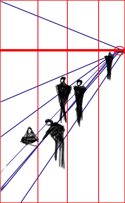
I simplified the structure as shown in the diagram below.

Determining the horizon line is not scientific but one was chosen along

A vanishing point was also identified.

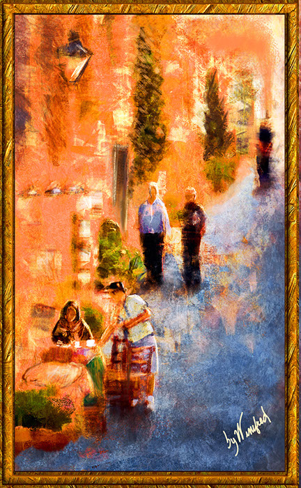
This is the final painting.

Related Images:

Expressive Brush Strokes

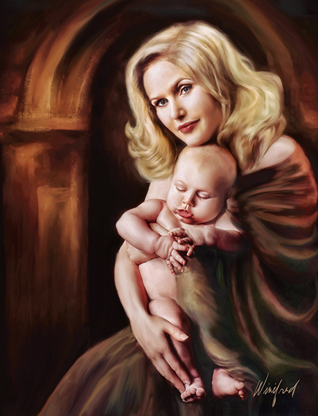
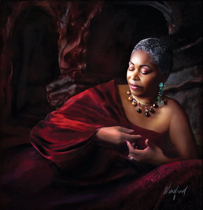
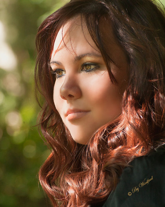
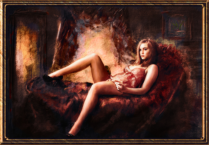
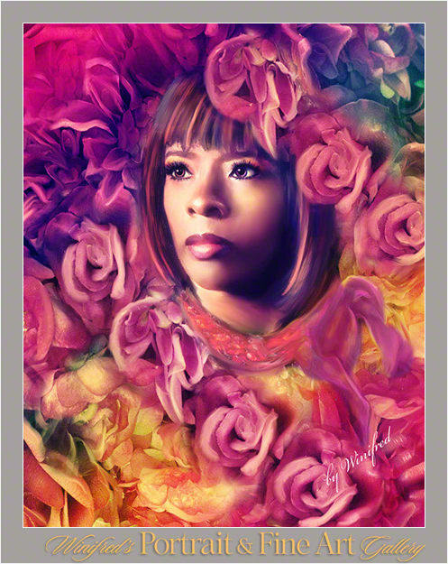
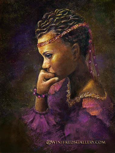
I have been creating beautiful portrait paintings for  my clients for many years now.  However, I have been very conservative with my brushstrokes.  My clients have tended to want a more smooth look in their painting – or perhaps that was simply my projection.  I think I will begin to veer away from this from time to time. Skin will always be smooth but I can create greater expressions within other aspects of the painting.  The following is one such example.  The response to this painting has been very favorable.  Ultimately, I want to make my clients “thrilled” with their portrait and I will always stay with in their  comfort level.

Related Images:

Winifred Painting Street Scenes

A new 4 week class has begun with the Digital Art Academy focused on painting street scenes. We were all given the same reference image and allowed  total artistic  flexibility in how we developed our paintings from the image.  It was wonderful to see the range of artistic expression amongst all in the class.  Off course no one else  painted  people in  different clothing nor created duotone paintings.  I think I have been watching too many historic European movies.

This is  the reference photo used.

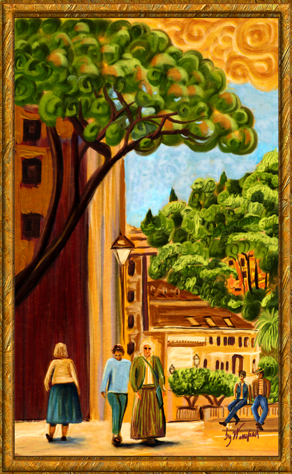
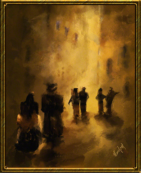
This was my interpretation as a painting.

Related Images:

Corel Painter 12.1 Painting With Impasto

See how I visualize and compose a painting, Add impasto texture to your painting. This video demonstrates these processes.

Related Images:

My Watercolor Experience in Corel Painter 12

My Corel Painter 12 watercolor class is over. I have been studying with quite a wonderful and watercolor obsessed instructor who teaches at the Digital Art Academy – Skip Allen.  He is passionate about watercolor and brush making.  I thought it important for me to at least become familiar with this digital media – to understand it’s opportunities, challenges, and to understand the brush controls. I  also wanted to work with some of the concepts of traditional watercolor as we attempt to translate this into a digital medium.   The following video  will discuss the 3 types of Painter watercolor brushes.   I will show a few paintings I created. I will  demonstrate how some of the brushes work – you will be so amazed to see them.

Related Images:

Create “Flower Girl” Portraits in Corel Painter or Photoshop

Creating Flower Girls

You have seen my “flower girls” posted in a previous blog. I made this video to show you how to create them. It is quick and easy  – unless you choose to paint them as I did.  But for this video, I chose to do a non painted demo just to show the technique. I think you will find it interesting –  I hope you will enjoy.

Related Images:

Negative Watercolor Painting

Negative Painting in Corel Painter 12 – Painting on the Outside

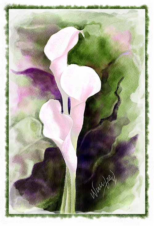
I bet you never heard the term “negative” painting before.  I had not until today – in my online class with Skip Allen, my watercolor instructor at the Digital Art Academy.  There was quite a bit of discussion about this term.  First of all it is a watercolor term, and it refers to painting in the negative space, the space which surrounds the focal point of your painting, to give the subject of your  depth and luminosity. That as opposed to doing substantial positive painting  on the subject of the painting itself.  Am I being clear? Hopefully looking at my finished image helps.  In case you are interested, Skip gave us references  of a couple of watercolor painters who do “negative” watercolor painting,

Jeannie McGuire

Linda Kemp

Calla Lily by Winifred

I would say that it definitely does have a different look to it and I do like it.

Related Images:
Watercolor – A Little Cafe

Well, I am making progress – I hope you think so after what I showed you yesterday.  That was playtime –  this is more serious.

I started with this photograph.   I think I was in – I am not sure really.  I will do better with that next time. Anyway… the photo from which I painted…

I then took in into Corel Painter.  This is how I set up my workspace.  I am surrounded by many tools, brushes even images when I paint.

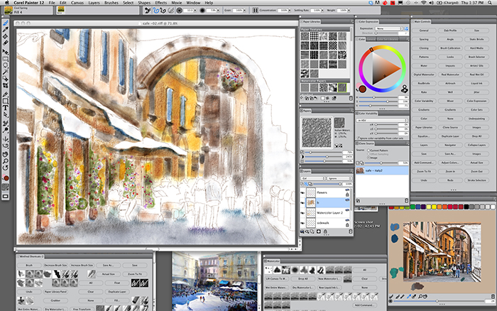
Thus is a screenshot I took while I painted.  It shows the canvas I am painting on, to the right of that, there is a selection of paper textures I can bring into my painting to simulate watercolor paper or many other textures I might want to include. Next, my color wheel and to the right of that many short cuts for actions I might take during the course of my painting.  On the bottom row you see another, what we call “custom pallet”.  It is a way of keeping some of my favorite tools, commands and brushes close at hand. Next you see a blue toned water color image by traditional water colorist David Taylor.  I wanted to keep it close at hand to reference his style and just for inspiration.  Beyond that – more tools.  Beyond that a mixer pad.  I can mix colors on the mixing pad, just as any artist would use a mixing pad.  In addition, new to Painter 12.1 I can bring in an image to my mixer pad  to use in my selection of colors.  In this instance,  you can see a small version of my reference image. it served two purposes. One, I could select my colors from it as I painted, and two, it also served as my visual reference for the  painting.

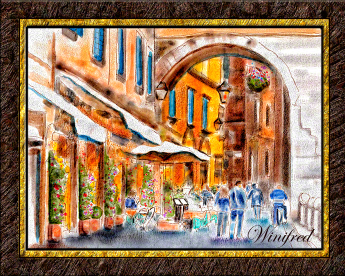
This is my final image – at least for today.  I enjoyed painting it.

Related Images: