Mainly Foliage

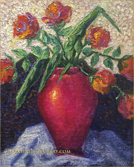
Foliage and Vines Oil Painting on 9×12 Panel – by Winifred

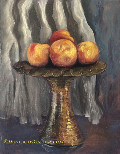
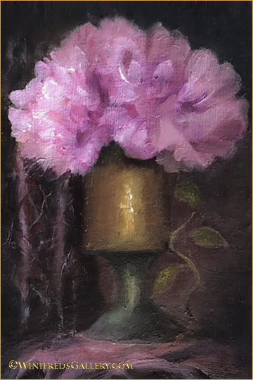
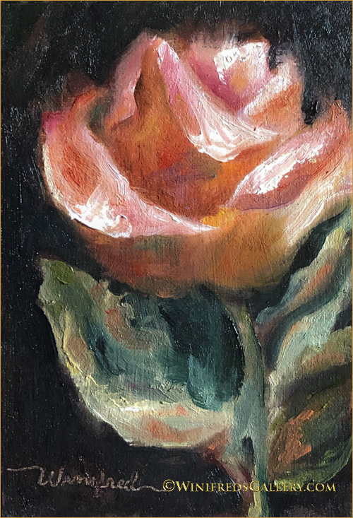
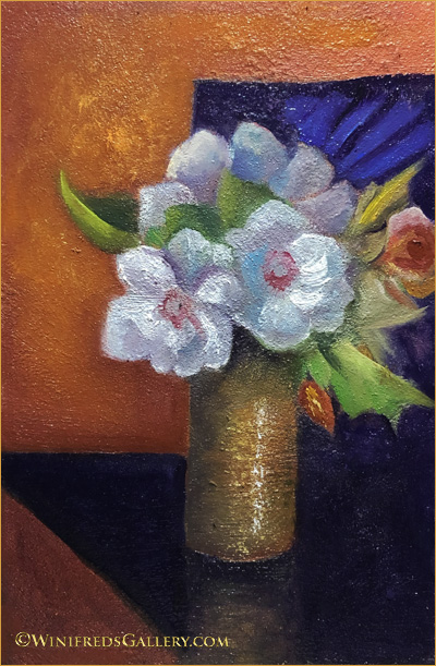
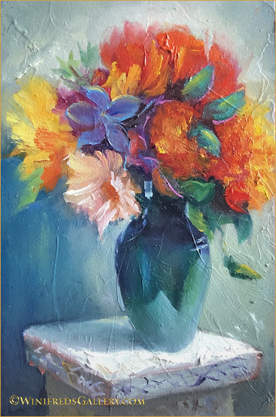
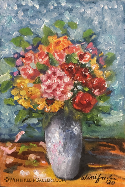
It’s been nearly 2 years since I created both the paintings I’m sharing today. I found this painting a bit odd and it probably is, hence I hesitated to share it. But for me it has stood the test of time and I have no desire to toss it and I toss paintings pretty easily if I cannot enjoy them. In the above painting, I enjoyed the process of creating the vine foliage form, dimension, texture, color and movement. I find it interesting to view. Still, It’s a bit unusual but I think it has merit. Below, I primarily painted foliage again:

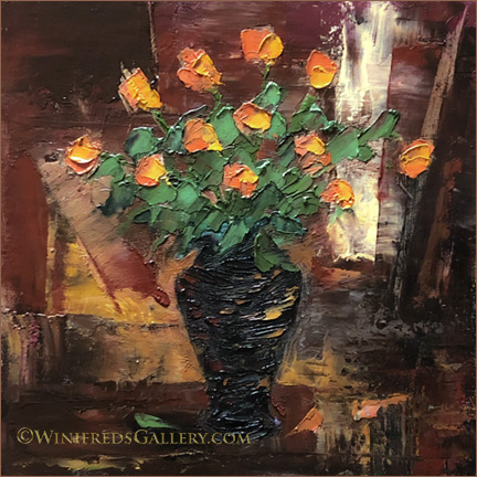
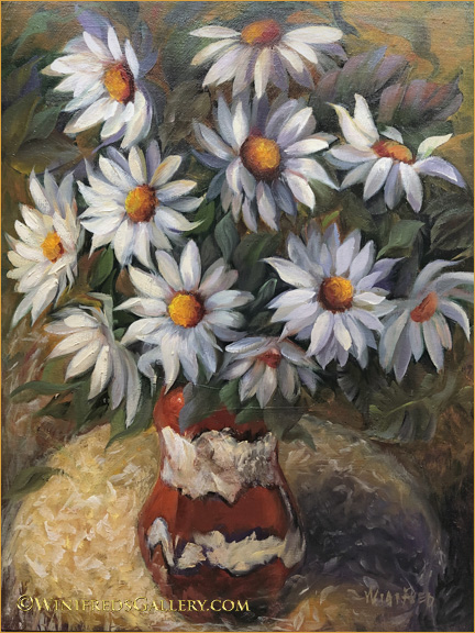
Foliage in Brass Oil Painting on 9×12 Panel – by Winifred

For some reason I think I wrongly consider foliage insufficient as painting content – though in fact there are many other elements included in this still life. It’s just the mind attempting to undermine my efforts, as it does sometimes, but I held onto this painting because in fact, I know better.

I’ve been working on a new painting from a Venice reference. It’s 16×20 which takes more effort to paint and to resolve it’s issues. Perhaps I can share it next week. Please stay safe as we navigate through this Coronavirus event.

Related Images:

Little Girl with Her Rocks

Girl with Her Rocks Oil Painting 9×9 by Winifred

I’d prepared 16×20 linen panel to paint next. My subject matter would be a little girl at the edge of a lake sitting amongst rocks. I thought it might be a good idea to create a smaller painting to work out the colors and design. This is the initial painting for what will likely be a larger painting. This painting was created on a very textured panel which was great in some ways and challenging in others. A linen covered panel would give the painting a different look. Not positive the larger panel will ever happen – but maybe.

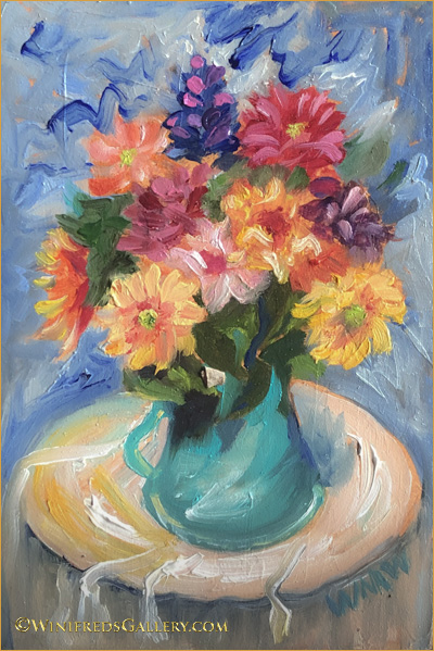
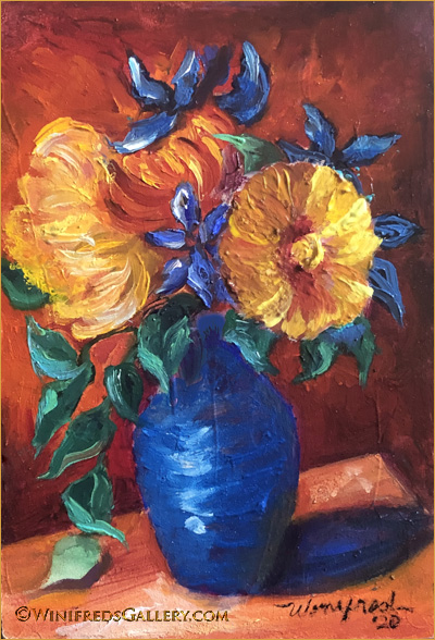
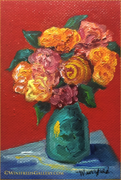
Below: While trying to include more portraits and figurative paintings back into my work – I just can’t leave my florals. I find them relaxing and expressive in a different way. Below, I explored a different color palette and painting style which evolved during the course of this painting.

Colorful Roses Oil on Panel 12×12 by Winifred

As usual, I didn’t know what this painting would become when I started. It was to be a quick playtime painting. It started very simply, using the shapes and flower placement from a photo.

Below: The next day, I rejected the flower design and I could only look at it and think “so what”. I took it back into the studio. I also didn’t care for the stack of three flowers, top to bottom on the right nor the squeezed in look of the small flower left/adjacent the 3 right stacked flowers. The foliage wasn’t what I wanted either. I might have toss or wipe down this painting panel but sometimes I challenge myself to resolve the problems.

Above: This is also a much paler looking painting than is normal for me. Though I find the color palette attractive, I am uncomfortable/bored – particularly with the light background .

Below: In my next draft. I altered the flower placement and added color and expressive strokes. I found the new colors interesting – I enjoyed the expressive strokes but not the color or strokes on the left. “What is that”? Still I’m in the playful and experimental mode – a very important place to spend time and effort. Overall, this draft remained unacceptable.

Below, the “maybe” final painting with many concerns resolved. I enjoy the background’s broken colors and impressionist strokes. There are small things I may still alter a bit but I can look at this painting now without “grimacing”. Hope you enjoyed this little journey. Winifred

Colorful Roses Oil on Panel 12×12 by Winifred

Related Images:

Beads in Her Hair

Beads in Her Hair – 12×16 oil on linen panel – by Winifred

It’s been a year and a half since I painted a portrait. I decided I needed to paint portraits again before I forgot how – though I’m not sure if there is such a thing. I actually think any kind of painting leads to the same place – a more practiced and competent painter – but just in case I decided it was time. I opened my “to paint folder” to make a photo selection. I encountered this little girl a couple years prior, sitting inside a large shopping cart as her mom pushed her about while grocery shopping. She was wearing a pink dress with sparkling white beads in her hair. I ask her mom if I could photograph her. I promised her mom I would send her a digital file of the photo I took and I did. I then put the file away, not sure I would ever paint it.

When I began the painting, I envisioned a simple head and shoulders portrait with a plain background. I knew the beads in her hair would give the painting a certain pop! Below is an earlier unfinished stage of the painting and it was the stopping place for day one.

Early unfinished phase 1 of the painting without even simple background complete.

The following day, I painted a simple golden toned background with a bit of color variation and a bit of texture – different from what you see above. I also formed her arms more correctly and changed from the stark white beads – a judgement call – to more painterly beads. I placed the completed phase 1 painting where I could look at it for a while and thought – I DON”T THINK SO! The slouch was awkward against the plain background and bothered me.

I decided to give her a red chair because people often slouch in a chair – this helped. At the end of that painting day, however, I still wasn’t satisfied. I decided the background had to change to something more colorful and interesting. I went through my files, found a simple floral pattern, and used it, generally, as a background reference.

Adding this color, tones and shapes gave me what I wanted. These changes occurred over several days as my vision of the portrait evolved. It’s so much easier and faster to complete a painting if I have all the information and elements in the reference photo from the beginning – but in this case it was a “shopping cart”. It’s a good exercise to work this way, however, as it is an exercise in expanding ones creativity.

Portraits are complex and can be very tedious. This portrait was complex but was actually enjoyable and I will be creating them more often.

Related Images:

Portrait of Despair

Portrait of a Woman in Despair – 12×16 Oil Painting by Winifred Whitfield

I painted this portrait a couple of years ago to reflect how I often feel in this political environment of the Trump Presidency which emboldens racism and sexism. In my opinion, this country is moving backwards. There is a lack of dignity in the office of the president, lack of humanity, lack of respect for people of color and lack of respect for other people who lack means and hope which includes many of his white followers – I find this appalling. I fluctuate between despair and rage! I wanted to create a portrait which reflected this. The next post will be a portrait of a young girl which I’m currently painting and flowers!!

\

Related Images:

Venice Italy – Walking in the Rain

Three Men Three Umbrellas 12×16 Oil on Panel

I enjoyed taking photos of life in Venice – mostly, I loved images of people with their colorful umbrellas walking in the rain. I’ve created many paintings from them which no doubt will continue. The painting above is new. I I liked the varied focus and directions of the walkers, but all with umbrellas which unified the scene. The two paintings below were painted a few months ago but I was not happy with them.

As with relationships, some paintings become stronger over time, while others become weaker. I substantially altered the two paintings below after I looked at them for a while. I often post an image of a painting immediately after I first paint it – not a really good idea. I need to place a painting convenient to glance at it for a week or so before deciding if it’s really finished. It makes a HUGE difference to do this. Some paintings might require only minor adjustments, others major. There are other paintings I scrap completely and sand down the panels for in the future.

Two Ladies – One Red Umbrella 12×16 Oil on Panel by Winifred Whitfield

Often there is no rain actually visible in my reference photo. It is often only the reflections on the pavement and big umbrellas which signal there is rain. In the painting above, I decided to paint more visible indications of rain.

The reference photo for the painting below was very calm with the subject walking past a smooth pink building wall. I wanted to shift to a higher energy. I added the white drips to the big blue umbrella edge, kicked up raindrops in the pavement and added lots of texture and movement throughout. It’s much more colorful and fun.

Blue Umbrella in Murano Italy 12×16 Oil Painting – by Winifred Whitfield

Comments: Some of you make a comment about a painting. I always reply but I’ve recently been told that you can’t see my responses and do not receive notification of my reply. I was also asked how you can access the comment section of the blog. I will inform Jon about this to see how this might be managed. Thank you for your interest. Winifred

Related Images:

Venice Italy – Gondola Under Canal Bridge

Couple in Gondola Under Canal Bridge – 12×16 Oil Painting by Winifred Whitfield

The reference image I took and used for this painting, I found to have a very different look from most Venice canal oil paintings. One reason is that it was taken of a gondola under a bridge – not out in open daylight on the canal. I looked at many other images online, there are thousands and thousands of them but I saw nothing like this one. Another reason I like it is that it has a portrait look to it – as well as looking rather stifly posed. It reminds me of Grant Wood’s portrait of the man and his daughter with the pitch fork – we all know it. My painting is actually not posed. I found the light and warm colors of the wood mooring pretty and loved the glow of outside light hitting the ceiling of the bridge – all of which give it a rather vintage look. These are the first water waves I’ve ever attempted. Not too bad! It’s my first Gondola painting also. I have many other canal images I can choose from for future paintings – many very nice images but nothing else quite like this one.

It’s not an excuse when I tell you that most often the digital files I post just don’t do the actual paintings justice at all – particularly when there are a great deal of texture/hence tiny detail in the panel and painting. The files looks more pixelated. Smooth paintings photograph and present much more accurately and attractively – but I love texture so I struggle with it. I’ve done the best here I can do. This painting represents a finished first draft. I have more work to do. I will wait a week and come back to it. At that time needed changes will just jump off the page. I also think I will give the driver an often seen sunhat and add stripes to his shirt. I’ll let you know if I make significant changes. Thanks for viewing. Winifred

Related Images:

More from Venice Italy

Man with Red Umbrella – 16×20 Oil Painting on Panel by Winifred

Not a single floral this time! At some point, and very soon, I will post the entire collection of my paintings from Venice – I have many favorites. The image above has been posted before, I am posting it now because I am sure many have not seen it, and because I don’t have a new painting ready this week. I’ve been working on 2 paintings simultaneously – and neither is complete. I’ve been slow because I wanted each layer to dry before continuing to paint and because it has been a very busy week with other matters. Below, however, you can see what I’ve started. Hopefully, I’ll get them finished next week – not sure, both have a long way to go.

There are many painters who could get to this stage rather quickly, because they paint fast – which I don’t, or they may trace a photo onto a panel, or use a projector to project an image onto a canvas to trace or even print images on canvas with a printer. I only recently learned about this. The most I use as an external aid, is to create a 9 section grid on my photo and then loosely the same grid spacing on my panel, to help me accurately place the content of my reference. Before I create the grid on the photo, I often spend a substantial amount of time creating the actual reference I want to paint. I manipulate the photo substantially to alter or adjust the photo content as I want it to appear. I adjust the location of photo elements, the size, perspective, color. Ultimately my reference photo is not the photo I start with. It is very handy to determine these things before I begin painting rather than blundering along using the original unaltered photo trying to make changes to it “on the fly”.

Below, is the sketch painting phase of my first Gondola and driver with passengers. Hopefully the reason for this choice will become clear when complete.

There are many short cuts artist can use these days in the painting process which speed them alone to galleries or clients, but I tend to stick with the long and time consuming way of doing things. It’s just my way and sometimes it is tedious. I could even add more squares to my grid, to aid in capturing the proper placement of the reference image but I prefer the practice of increasing my ability of doing this from site. You’d be surprised how challenging it is. Some day, I may speed up my processes. Bye for now. Winifred

Related Images:

The Sleeping Cat

The Sleeping Cat 12×16 Oil Painting on Textured Panel by Winifred

The painting was completely from imagination – except for the cat! I couldn’t sufficiently visualize cat anatomy in the curled sleeping position. I found a photo and loosely sketched it’s form and then painted it. The flowers didn’t start out as tulips. My sketch had bulbous shapes at the end of a stem. That would have been fine also, but I began to see tulips, so tulips they became. 

This still life painting was as much fun to paint as it appears. I made a sketch from imagination and then painted it. My surface is a very textured panel I created, then painted with a thin rich yellow underpainting.   I mixed my other paint colors with a medium I made to thicken and strengthen the paint layer I would apply. This product would also isolate the paint layers to keep addition paint application from readily mixing thereby keeping the paint colors very rich.  I could brush various colors over the  underpainting  and the new paint would attach only to the peaks of the panel texture – depending on brush pressure.  

Another thing different about this painting is the brushes I used to create addition texture variability. Notice the kitty and the fringed rug the kitty is lying on.  Normal brushes don’t easily make marks like those. I took otherwise perfectly good bristle brushes and cut/chopped the bristles to create irregular configurations.  This made a big difference in brush marks throughout.  I have created a whole set of these strange brushes in varying sizes and shapes.
I don’t normally spend so much time talking about my paintings on my blog but I’ve done so because I find this to be such a fun joyful painting with a different kind of look. Hope you enjoy!

Related Images:

The Vintage Tray

Roses on Vintage Tray 12×16 Oil on Panel

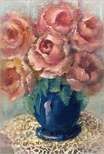
Roses are beautiful but complex to paint. It’s been a few months now, that I focused on painting roses. I started by painting single roses which I enjoy, but I also wanted to paint rose bouquets and to paint roses abstractly without a visual reference. This required that I understand the flower structure and be able to visualize the petals/flowers and lighting as the flower is turned.


I love the vintage tray the vase is sitting on.  I purchase most of my still life elements at Goodwill or at Poulsbo Antiques. On this one occasion, I walked into Goodwill and immediately spotted this tray – actually a removable table top.  You can’t see much of the tray in this painting, but it really is beautiful.  It was $175.00.  I had no place to use it as a table and it was far too expensive to use as an occasional still life prop – so I walked away – reluctantly.  The next time I was there it was $75.00. “WOW”, I thought, but I still walked away.  The next time, I was there it was $15.00!!!  This item had been in the floor so long that the cashier further reduced it to $11.00. We all love a good deal!!
Hope you enjoy this painting.  Next week I will post a very different style of painting – for me, and painted completely from imagination – no roses involved.

Related Images:

Taking Chances

Impressionistic Peach Roses with Fruit 12×16 Oil Painting on Panel by Winifred

 I place a high value on taking chances.  In fact, I don’t really believe taking chances is a risk, I believe the risk occurs if you don’t. If I choose a safe path, one I believe will keep me from “messing up my painting, for sure this will inhibit my growth.  I’m thinking now about  thoughts which went through my mind with these two paintings – both of which presented me with opportunities to “mess up” – but I took a chance anyway.

I don’t find it particularly difficult “to paint what I see” from a reference photo or from a still life I set up.  For the most part, however, my interest is not realistic paintings  – except portraits.  I’m interested in “interpreting” or abstracting away from realistic visual references. This is much more interesting and exciting for me.

I find this more challenging because it means, I have to “make up things that aren’t there”.  I have to eliminate part of the content which is there. I have to create elements, colors, textures which are not present.  I have to make up brushstrokes which alter the surface of my reference.  I might “mess up” – I often think as I commence some of my more abstracted or elaborate processes!  This thought regularly enters my mind and I have to pause to “talk” to my mind about it.  “You can’t mess up” –  I tell my mind. In fact, I tell my mind that imagining/abstracting new content – new ways to express the elements being observed “ is its only job” – and the only way to build new skills, confidence and creativity – no matter the outcome!  

 I want to have ideas – receive ideas but to try not to tightly control the process expression.  By doing this with each painting – even in small steps, I know my creativity and confidence grows.  I believe both of the above paintings are examples of being a bit “out of control”. It doesn’t even matter whether they’re good paintings or not. The only thing that really matters to me is that I tried something new which caused some discomfort and I did it anyway. I hope to continue this practice throughout this new year.  

I think the saying is – “feel the fear and do it anyway! 2020!!

Related Images: