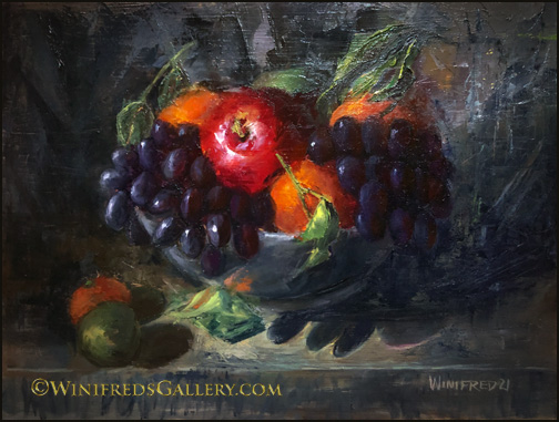
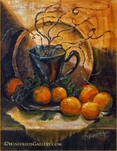
Tilted Bowl of Fruit 16×12 Oil Painting by Winifred
It started when shopping for fruits and veggies. I saw a bunch of large tangerines in the center of the fruit display. They had large gnarly green leaves attached. I would include them as they would add a special touch to the bowl of fruit I’d create. I tilted the bottom of my support to change the point of view just a little to add additional interest. Primarily, I used a palette knife but not for everything. Always a challenge but I enjoyed creating this colorful energetic painting.
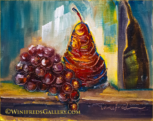
Scattered Grapes and Roses 11×14 Oil Painting by Winifred Whitfield
I haven’t painted with a palette knife in quite a long time. I loved doing so. Of course the grapes were the most fun. Including grapes just popped into my head and I went with it. I can just hear you now. Don’t worry, I will do more – I love all of this texture!
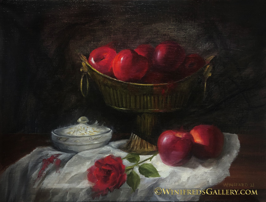
Apples and A Rose 20×16 Oil Painting on Linen Panel
Happy New Year to all! I’m thinking of last year this time – we had no idea what was coming and we watched the world change and it was disastrous. This year, I’m hoping for positive change on so many levels.
I’m enjoying creating paintings on dark backgrounds as the last two have been. They’re dramatic – especially with the reds. Setting up a still life and attempting to crease a pleasing design is one of the greatest challenges. The actual painting is not as hard as that to do.
In the past I’ve create portraits and digital portrait paintings, often even full bodies, which grew out of a dark background of shadow. I find myself wanting to do the same with still lifes in oil. I’ve created paintings like this before but not for a while. Its a comfortable visual style for me.
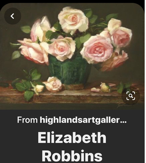
I’m also beginning and online painting class. There’s a lot of that going on these days. I love to collect others painters techniques. I like the work and style of painter and instructor Elizabeth Robbins. My interest is not to paint like her, but I love to learn the process and thinking of artist whose painting styles I admire. She paints lots of still life florals with very soft edges and lots of pretty soft colors. Below, I show you an example of her painting and include a link to her instruction site she host with a landscape painter friend, where you can see more of her work – Inspired to Paint.
Elizabeth Robins Oil Painting
We’re even planning to schedule a portfolio review of my work. That should be interesting. I’ll let you know what she says – maybe!! I sincerely wish you a healthy and happy new year. Winifred
Roses are beautiful but complex to paint. It’s been a few months now, that I focused on painting roses. I started by painting single roses which I enjoy, but I also wanted to paint rose bouquets and to paint roses abstractly without a visual reference. This required that I understand the flower structure and be able to visualize the petals/flowers and lighting as the flower is turned.
I love the vintage tray the vase is sitting on. I purchase most of my still life elements at Goodwill or at Poulsbo Antiques. On this one occasion, I walked into Goodwill and immediately spotted this tray – actually a removable table top. You can’t see much of the tray in this painting, but it really is beautiful. It was $175.00. I had no place to use it as a table and it was far too expensive to use as an occasional still life prop – so I walked away – reluctantly. The next time I was there it was $75.00. “WOW”, I thought, but I still walked away. The next time, I was there it was $15.00!!! This item had been in the floor so long that the cashier further reduced it to $11.00. We all love a good deal!! Hope you enjoy this painting. Next week I will post a very different style of painting – for me, and painted completely from imagination – no roses involved.
Impressionistic Peach Roses with Fruit 12×16 Oil Painting on Panel by Winifred
I place a high value on taking chances. In fact, I don’t really believe taking chances is a risk, I believe the risk occurs if you don’t. If I choose a safe path, one I believe will keep me from “messing up my painting, for sure this will inhibit my growth. I’m thinking now about thoughts which went through my mind with these two paintings – both of which presented me with opportunities to “mess up” – but I took a chance anyway.
I don’t find it particularly difficult “to paint what I see” from a reference photo or from a still life I set up. For the most part, however, my interest is not realistic paintings – except portraits. I’m interested in “interpreting” or abstracting away from realistic visual references. This is much more interesting and exciting for me.
I find this more challenging because it means, I have to “make up things that aren’t there”. I have to eliminate part of the content which is there. I have to create elements, colors, textures which are not present. I have to make up brushstrokes which alter the surface of my reference. I might “mess up” – I often think as I commence some of my more abstracted or elaborate processes! This thought regularly enters my mind and I have to pause to “talk” to my mind about it. “You can’t mess up” – I tell my mind. In fact, I tell my mind that imagining/abstracting new content – new ways to express the elements being observed “ is its only job” – and the only way to build new skills, confidence and creativity – no matter the outcome!
I want to have ideas – receive ideas but to try not to tightly control the process expression. By doing this with each painting – even in small steps, I know my creativity and confidence grows. I believe both of the above paintings are examples of being a bit “out of control”. It doesn’t even matter whether they’re good paintings or not. The only thing that really matters to me is that I tried something new which caused some discomfort and I did it anyway. I hope to continue this practice throughout this new year.
I think the saying is – “feel the fear and do it anyway! 2020!!
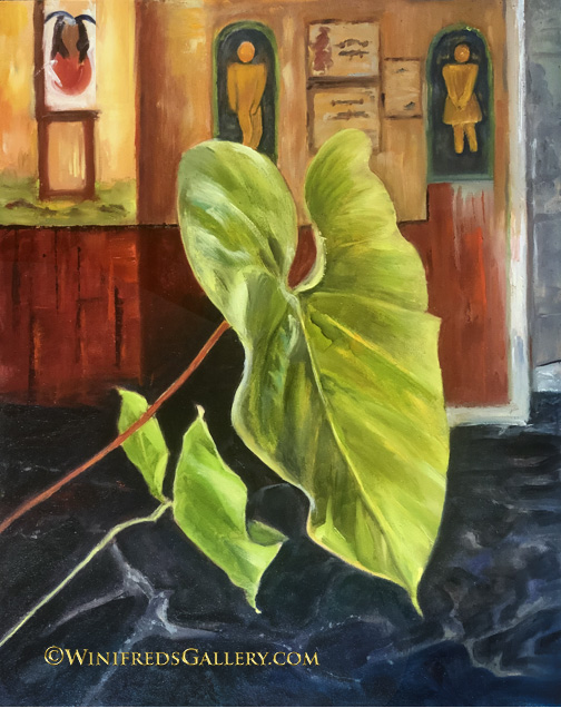
‘Stopping for a Margarita” 16×20 Oil Painting on Panel by Winifred Whitfield
I admit, this is not an image reflective of the Holidays. I thought I would have time to paint a holiday image – but I didn’t.
My painting reference is a photo I took in a Mexican restaurant in Ajijic, Mexico. I was struck by the foliage, that large leaf lit by a streak of sunlight. The chairs and tables were actually very colorful. There was a beautiful mural on the wall. Other than the mural, however, the walls were off white.
I wish you the merry and healthy holiday season, and get some rest, 2020 promises to challenge our PEACE! Winifred
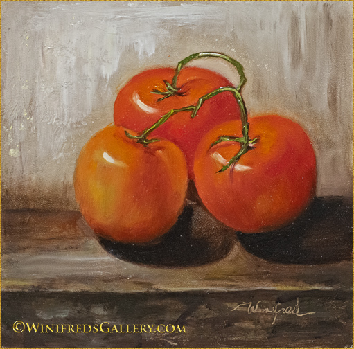
HAPPY NEW YEAR!! I’ll make new strides in 2019. No playing it safe – such as with my tomatoes. Painting this was not easy for sure. Each color and tonal variation had to be mixed separately. Oil paints don’t easily blend together and you can see the color variations are many. However, though tedious, I purchased 3 tomatoes and had them to look at. Basically, I painted what I saw – realism.
Just imagine, however, you set up a still life, below, but you chose to completely alter the color, textures and even some content – more abstract, more impressionistic. This makes the painting even more complex though giving one the opportunity to stretch the imagination, completely personalizing the style mood, color texture all. I’m will do more if this, attempt to stretch my capability with each and every painting. I hope you will enjoy.
12×16 still life oil painting with oranges by Winifred
There will be times when I work very seriously, but I also believe in play. Below, you can see play!! Grapes, pear and a shadow. This was fun. Thank you for sharing my painting journey and hope you will continue into the future. Wishing you and your family the best in 2019. Winifred
The common denominator in my paintings this week is primarily foliage. For sure it is not painting style!! That’s fun for me, painting one way and then another as well as experimenting. I will feature 4 paintings in this post – though I may delete one or more as time goes on.
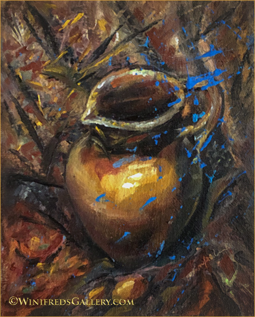
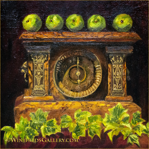
The Old Burl Clock by Winifred – 12×12 Oil Painting
Ever since I can remember this clock has been in my Godmother’s home. Finally she gave it to me. I consider it a treasure. It doesn’t work. There is no glass front and the numbers are worn off. It does have hands. I decided to paint it. I put it off for a long time because of the ornamentation but alas, it was “time”. I wanted to increase it’s creativity and the very moment I had that thought – limes and ivy popped into mind – so here it is!
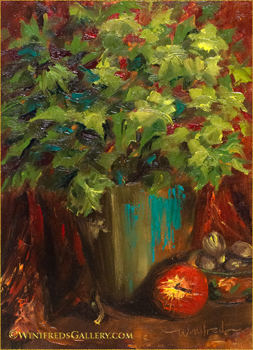
Foliage and Brass Oil Painting by Winifred
The Geranium: This summer I purchased a 4 inch deep purple and fuchsia Geranium, which I really enjoyed. I wanted to have it again next year and looked up how I might over winter it. It’s easy – just bring in inside, cut it back a bit and place it in a sunny window. It’s thriving. It has no flowers at this time but it’s very green and happy. I brought it into my studio and along with a few other items, this is the resulting painting. It wasn’t important to me for it to become identifiable as a Geranium – only foliage and color.
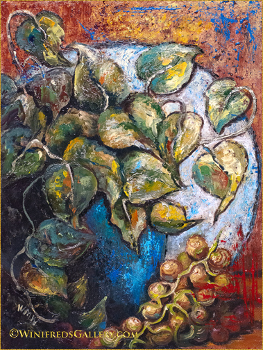
Foliage and Vines Oil Painting by Winifred
The painting above is an experiment. It’s important for me to not be “safe” in painting all the time. So the bazaar and even the failures come with the process. Sometimes I view them as interesting – other times – just plain weird!!
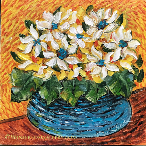
Tiny White Flowers by Winifred
Tiny White Flowers: I really don’t cherish looking at one of my paintings and thinking of it as “sweet” or “cute” and that’s what we have here. I’m not sure how that happened. I didn’t think of it as such before I added the white flowers but it needed something. I enjoyed the Van Gogh like brush strokes throughout as well as the color and impasto effect and design. There is nothing wrong with it technically, in fact there’s a lot great about it. I’m the only real problem and I am sure there is someone for whom this painting will be just right. ENJOY YOUR HOLIDAYS! I will have much more to show you in the NEW YEAR!!!
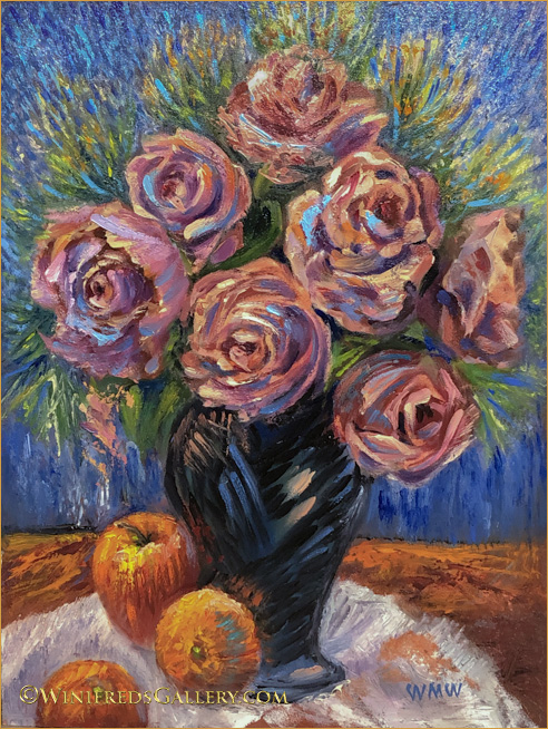
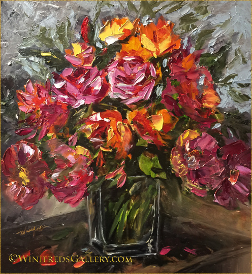
Colorful Bouquet Still Life Oil Painting by Winifred
Colorful Bouquet Still Life 11×12 x in Gessoed Panel
I painted this bouquet a few months ago but have never posted it anywhere. Do you think there is such a thing as too much color! I did and planed never to share it. Combining both the color and the paint texture, this painting has the appearance of candy. It is super saturated and shiny. It’s a lot to take in. It would have been perfect to have posted it on Valentine’s Day. But we’re not too far off and we are upon yet another holiday to celebrate. So, whether I love it or not – here it is. Hope you’ve enjoyed both holidays this week – and also this very colorful painting.