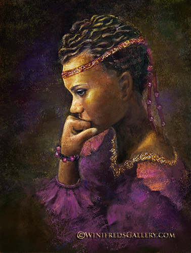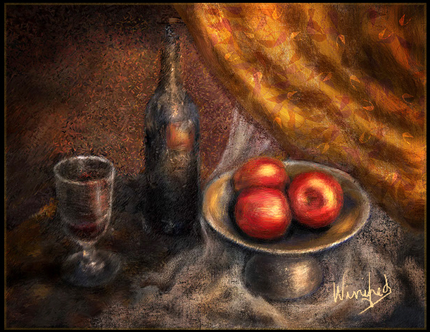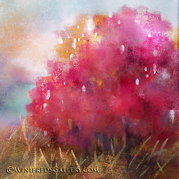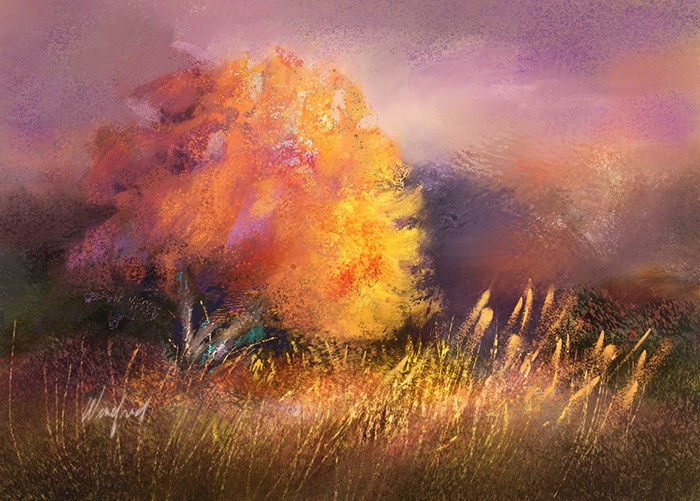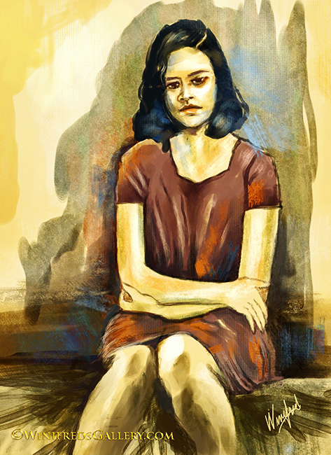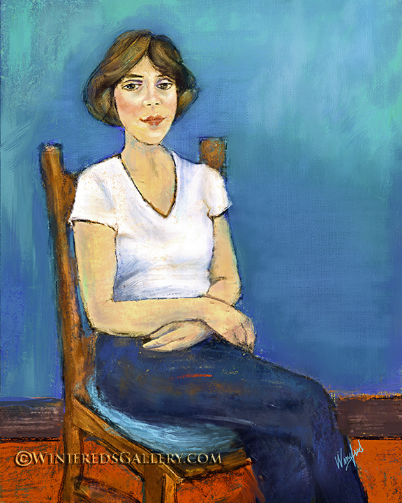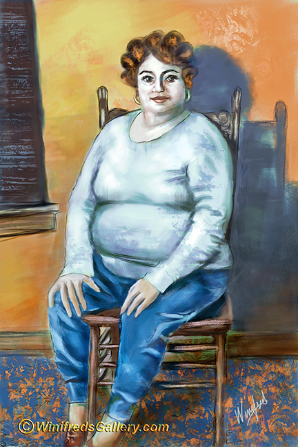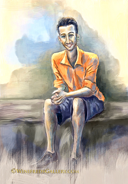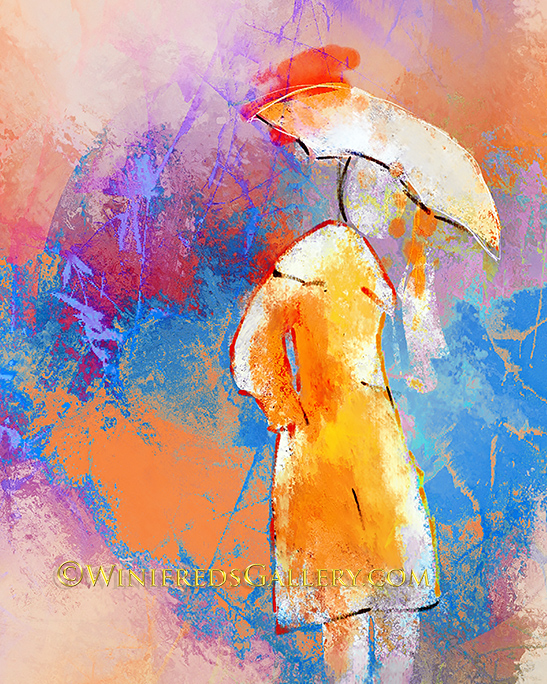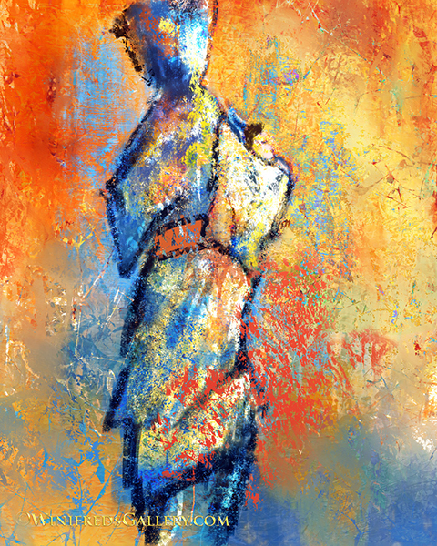
About Winifred Whitfield

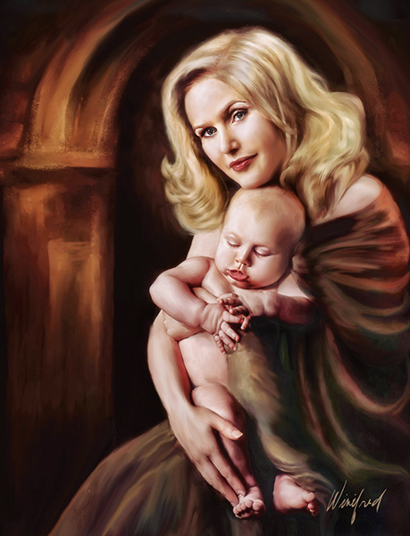
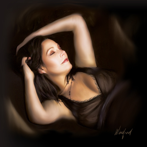
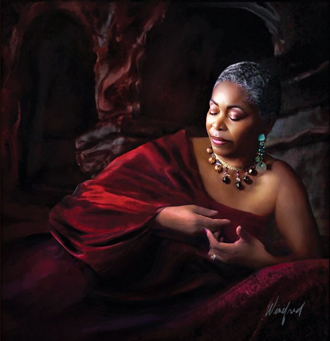
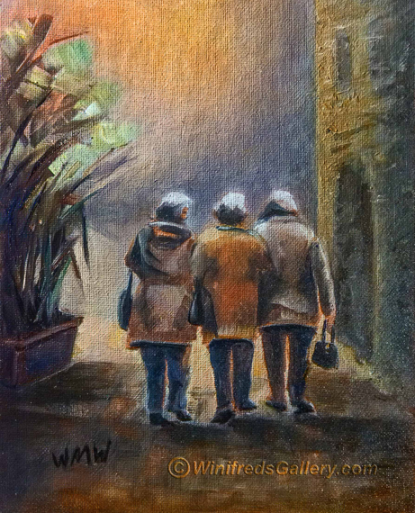
I'm an oil painter and a digital painter. Portrait painting is my speciality. I love painting still lifes as well. I'm also a professional portrait photographer.

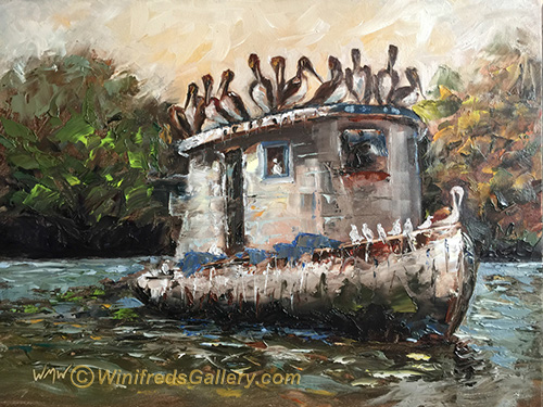
Dirty Birds – Oil Painting

Dirty Birds – 12×9 oil on gessoed board.
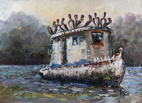
Dirty Birds by Winifred

  There is always a challenge in painting. There were so many decisions with respect to design, values, color and chroma. I still see changes I will likely make. There were many elements in the photo reference which I ultimately eliminated for design and simplicity sake.  The photo which inspired this painting was taken in Guatemala by photographers Daphne and Art Carlye who often work summers with Rotary International.  There were lovely palm trees in the background which ultimately I ignored.

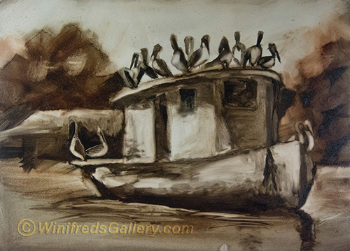
Below – initial tonal sketch 
Below – INITIAL PAINTING – Too much detail – No place to focus. No place to rest ones eyes – though there are some aspects of this image I like. In my initial painting I found my eyes darting all over the place – not a good sign.  Everything is foreground and everything was the same levels of saturation and contrast. I know better than to do that. I scraped the paint off the background and made changes to design and expression.  
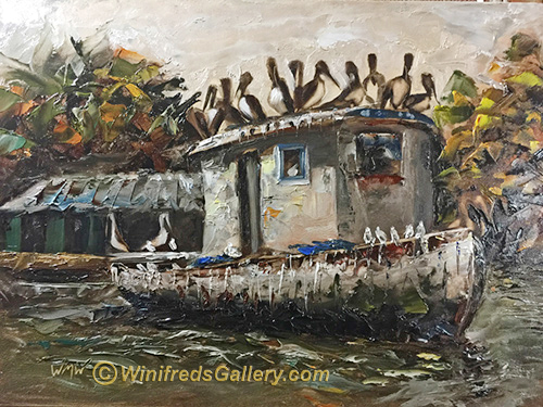
Below: This version is not too bad and I rather like it but I decided to push the background  back even more by simplifying  it –  and muting the colors, thus arriving at the final version at the top of the page. I may have made a mistake in that regard – but, I share my mistakes with you as well.  
What do you think? Which image do you prefer and why?
Related Images:

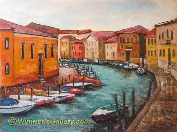
Canal through Murano Italy

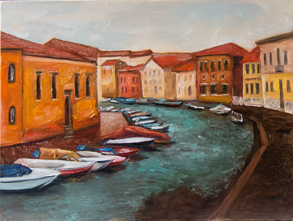
“Canal in Murano” (9 x12 inch oil painting on gesso board)

Murano Italy is home of some of the most amazing glass factories in the WORLD!!! It is where Venetian glass was created. In this painting, I’ve attempted to capture a canal running through Murano. However, I find that I’ve buried myself in details. Particularly – so many pilings!! I deliberated but thought I had to add them.

I was afraid that if I didn’t do so, the boats would drift aimlessly into the canal, bumping into each other and float away – what a mess that would be.  

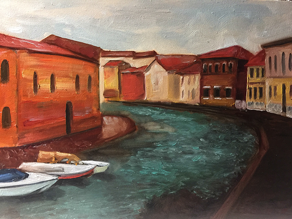
Before Pilings

I’m discovering I like bold blocks of color without lots of fuss.

Starting to add boats

  As you can tell, the above painting phase is not developed, as it could have been, but you can see that it reflects a different possibility from the finished painting which is filled with boats and pilings.

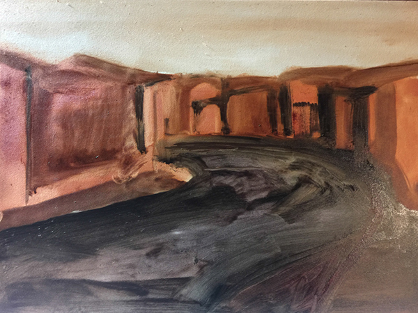
Below, a quick value sketch. Notice, no value for boats!! I love this kind of loose abstraction.

Value Sketch

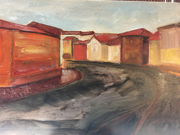
Below – Adding Initial Color (I love this kind of looseness).

adding initial color

I hope you enjoy seeing how my paintings evolve.  Notice, I didn’t show you the reference photo. I did this on purpose. It is to prevent you from looking back and forth comparing my painting to the photo. However, it is not intended to be compared. This is simply my interpretation – though for sure the photo contained lots of boats and pilings! 

You may think my images are out of order but that the way I chose to present them – it’s the way my mind works. Thank you for visiting my blog and please subscribe if you have not.  Thanks, Winifred

Before Pilings

Related Images:

Three Friends Walking – Traditional Oil Painting

This has been a fun and challenging week of Painting.  I have painted so much that I’ve gone through a couple tubes of oil paint at this point – but that’s what it will take. 

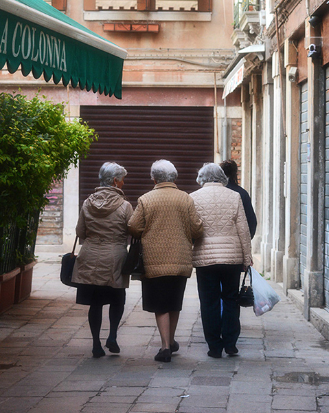
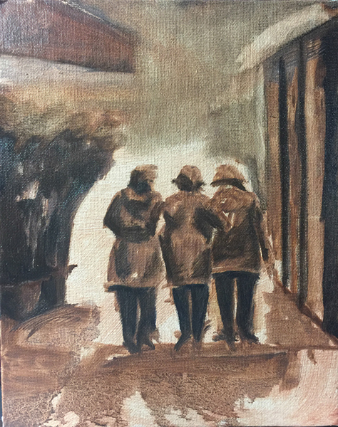
I took photos prolifically, while in Italy.  I thought it adorable when I saw these three ladies walking. Actually, there was a fourth, as you can see in the reference photo, but I found her distracting. I also found the wall/garage door, in front of them distracting also.  I knew I would have to to develop a more interesting and creative environment.  In my first attempt to do this, as you can see in the tonal sketch at the bottom, I painted a wall of square columns – somewhat replicating the right side of the photo.  That didn’t work. Ideally, the design of the painting would be determined in the initial sketch phase – certainly by the time the tonal sketch is done – but sometimes, I just haven’t figured it out – and keep going. This is not the best approach.

“Three Friends Walking”
Ultimately I decided on a textured side of a building and a curved doorway.  I went with that idea. Still, what to put in front of them.  I didn’t know for the longest.  I rather enjoyed the ethereal look of “space”.  Finally, I envisioned it as an open landscape – leaving it largely to your imagination.  I could play with interesting color for a sky and create just a hint of a horizon line.  I would allow the painting  to maintain these few and simple elements – resting on Interesting light, shadow and color. I’m making baby steps with my oil painting and so long as I do, I hope to progress.

Reference Photo ( hemmed in by their environment)

Tonal Value Sketch –  a great way to see what doesn’t work!

Thank you for visiting my Blog!  Another post will be coming  quickly – colorful buildings, boats and a canal in Murano, Italy – many many boats!!  I never painted so many boats before!  Winifred

Related Images:

Italian Laundry Painting

Oil Painting – Laundry in Italy

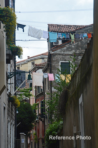
Im not sure why we’re so fascinated with the many long cords laundry pinned to them we see in Italy. I love this visual also.  In fact, on any given street, if I saw hanging laundry, I photographed it.  It’s kind of like joyful colorful flags waving in the wind.  This is my first attempt to paint from such a photo.  The process was interesting.  

Laundry in Italy

Below you see the photo which inspired the painting.

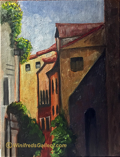
The image below is in image of an earlier stage of the painting.  I like it quite a lot – perhaps even better than the finished painting with the laundry. I enjoy the strong shapes and  simple blocks of color. No Fuss. In the future, I just might create this as the painting.  At this point, I’m happy to have it as a digital file.

Related Images:

Portrait Paintings – Italy

The Shop Keeper – Oils – Italy

I decided I was ready to try painting portraits with oils. Color mixing and blending edges has improved tremendously.  Both task are important to portrait painting. “The Shop Keeper is my most recent painting.  

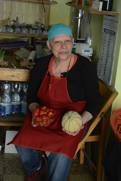
This lady was so lovely and so willing to pose to display to the camera some of her goods.  I ate some of the fresh pick fruit from the fields. OMG!! So yummy!! The photo has been substantially reinterpreted. 

Reference Image for Painting Above


Weary

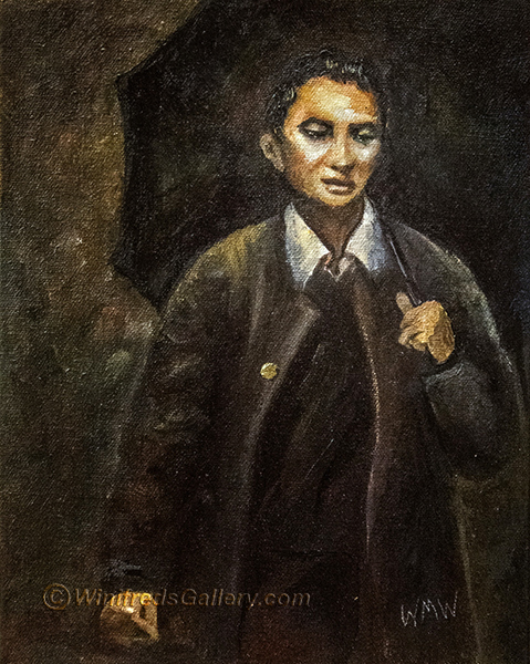
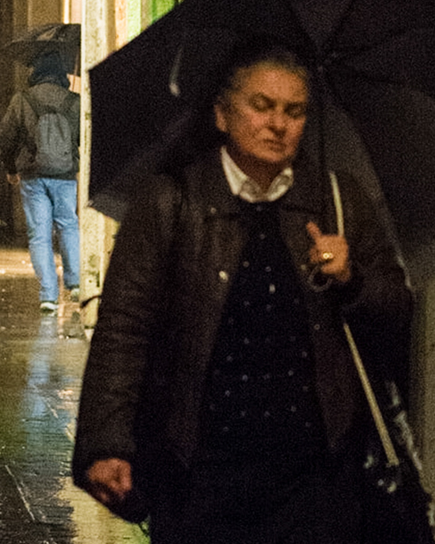
This portrait I also enjoy. It’s from my “Venice at Night” series which I photographed in the rain.  This portrait, I feel. I think she is very tired. It is the emotional content of this photo which inspired the painting.
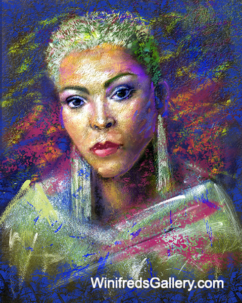
Unfortunately, I have not been able to capture the painting in the photo of the painting. I am not pleased with it’s appearance.

In the distant past, artist, almost exclusively, mixed all of their colors from very few pigments.  For both of these paintings, like artist from the past, I used only black, white, yellow and red pigments to mix the other colors you see.  I’ve learned quite a bit about mixing pigments by doing this. I’ve not been able, however to get a decent blue, which I read would occur when mixing Ivory black with Titanium White. I’ve gotten a mixture a little warmer than grey but not exactly what I was after.   No doubt it is my paint and the quality of my pigments.  Of course, I could just use one of the  several blues I own – but I just didn’t choose to. It’s been a great exercise.

Reference Image for Painting Above


Related Images:

Silver Coffee Pot

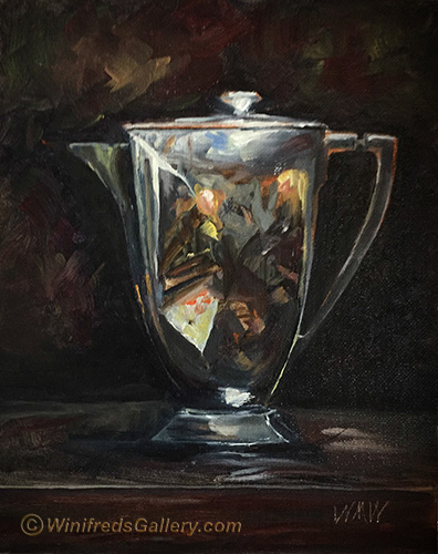
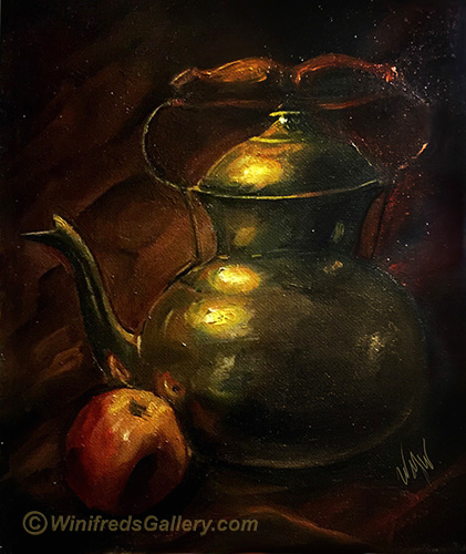
The Silver Coffee Pot –  8×10 Oil on Canvas


I love the abstract reflections which occur in metal. People think there is a special way of painting reflective metal surfaces.  There is really no secret to it.  If you simply paint what you see. Paint accurately the colors and tones you see.  In the end it will appear as the metal you’re painting.  No secret at all.

Related Images:

Painting with Traditional Oils – Creating Still Life Paintings

Traditional Oil Still Life Paintings  

The Beginning!! You can watch me progress. I created these paintings during the past 3 weeks.  Really, oils out of tubes!!!  Some paintings have turned out better than others – no surprise!!  The first painting which you see was my first oil painting.  I  actually destroyed the canvas but kept this photo of it. Fortunately, I photograph various stages of a paintings development. This was a very early stage of  the oil painting.  I kept painting and painting until ultimately I ruined it. It was not worth the time to try to recover it – I just threw it out.  I’m glad I had such an early lesson on the detriment of overworking a painting.  

Above – My first oil painting 

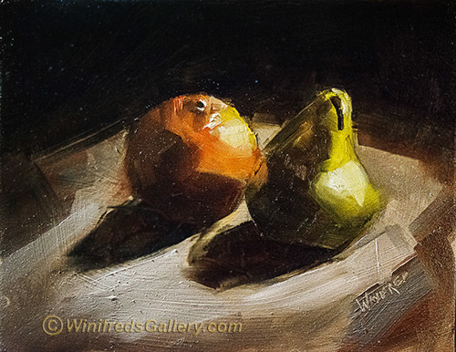
Lighting is  one of the most important aspect of creating a still life,  Having a few fun items to paint is important as well. Almost anything can be interesting if well lit. I have used both daylight and artificial light as a source in my still life paintings.

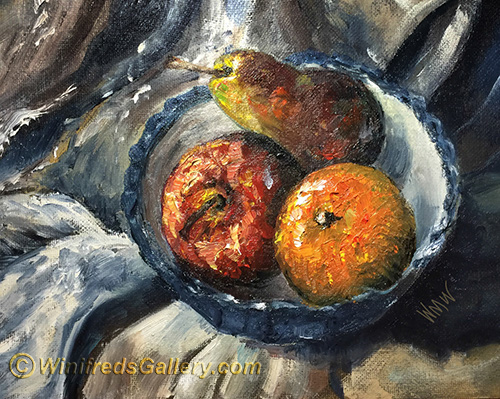
Orange and Pear Simple Still Life

  I used daylight for the above painting of the orange and the pea abover.

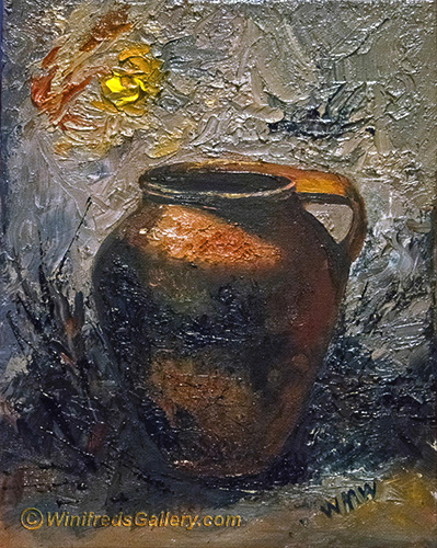
I continue to enjoy lots of texture in my paintings, which I create allowing my brush to “dance” as I paint. Pretty fun.  Most of these paintings are 8×10.

 I paint almost everyday – stoping for a day only when I burnout,  before proceeding again.  

Above, Brass tea pot.  I will certainly create more.


Related Images:

Seasons Greetings from Winifred

Hello Fellow Artist!

happy-holidays

Your art and creativity, makes the world a more beautiful and joyful place to live. I wish you a wonderful season of peace and reflection and the greatest of health and happiness in the New Year.  

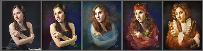
Expand your creativity and your skills in 2017 by learning or increasing your ability to do freehand painting.  You’ve been thinking about doing so, but the idea of not having those photo pixels is a bit scary. You don’t have to give them up all at once.  You can start gradually by freehand painting only parts of the portrait – the hair or dress, for example.  You can practice altering a subjects appearance. With practice, you will gradually develop the confidence to paint a sketch or a trace of a photo or paint from imagination.  You will develop a painting style of your own.  

ww-creative-portraits

Above – Tutorial “Portrait Basics and Beyond”

 I enjoy allowing myself to be inspired by a variety of artist,and to create paintings in their style. but eventually, I simply return to my style of expression.  For instance, recently, I created several Alice Neel inspired portraits.  She uses a great deal of outlining in her paintings.  I practiced including this characteristic in several paintings. Personally however, I tend not to outline at all and ultimately I  returned to my personal style of painting.  You may also want to practice abstract portraits, images which are very expressive, free of features and detail, allowing for interpretation.  This is quite fun to do.  

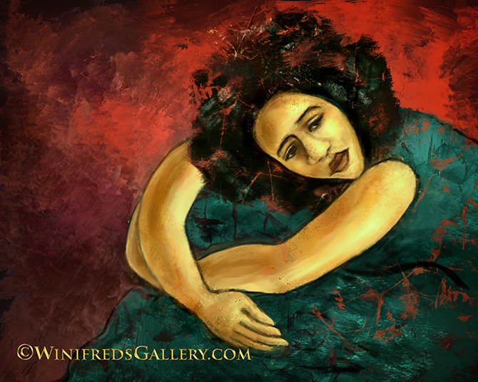
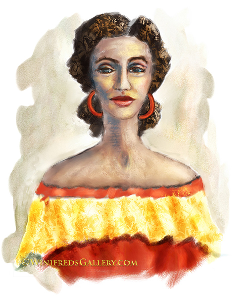
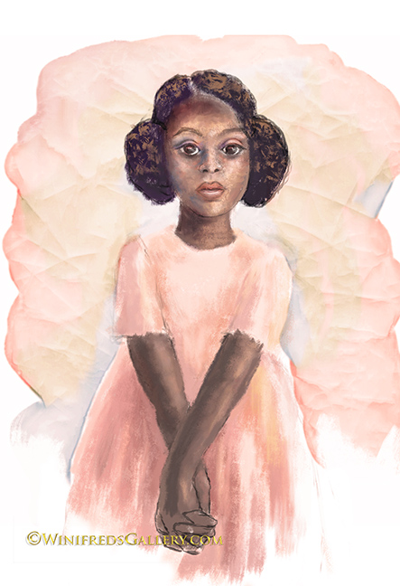
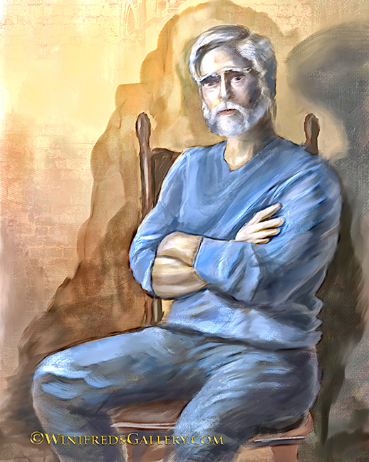
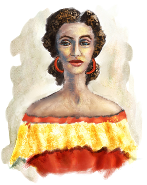
 Developing freehand painting skills, in addition to skills you’ve already developed, will allow you to create even more creative images for your friends, family or clients.  Below are several freehand digital paintings I recently completed.

Please visit my store for Tutorials and Workshops which can assist you along your journey of creativity.  There are great sales on tutorials. Contact me if you want to purchase 3 or more for greater discounts. Workshops will be tailored  to your personal needs. 

winifred-whitfield-freehand-02 winifred-whitfield-freehand-03 winifred-whitfield-freehand-04
winifred-whitfield-freehand-06 winifred-whitfield-freehand-07

winifred-whitfield-freehand-08c


winifred-whitfield-freehand-09 winifred-whitfield-freehand-10

winifred-freehand-abstract

winifred-freehand-abstract-20`


Related Images:

Painter 2017 – New Release

Interactive Gradient Tool/Express Paint

Painter 2017 is pretty great! Honestly!  I have to admit that the introduction of  Audio Technology was pretty wild when introduced in Painter 2016, and I used it not one time this past year!  I have not falling in love with Particle Brushes introduced in 2015 but they have formed the bases of some pretty great, more advanced technology – Dynamic Speckles Brushes, for example, so I cannot complain.

This new release, however, is just plain wonderful  and introduces so many new tools. It will change the way you work and support your many creative endeavors. You’re definitely going to want to explore it.  I would also suggest a “tour guide”.  Painter 2017 offers some amazing new features but they are complex on the front end. I will demonstrate some of these features over the next weeks and months. The new Palette Drawers are “to die for”!!

Also, there is a course being taught by Skip Allen at Digital Art Academy which will teach  Painter 2017 New Features “in order”.  I suggest that you take a look.  Our emphasis will be different, so there is no overlap.  The larger your pile of information, the better. Register NOW!

Did  I start at the beginning? Of course not. I start here by introducing you to my favorite – NEW FEATURE – at lease one of them. I hope you enjoy this 3 part tutorial series where I demonstrate the new Interactive Gradient Tool  used in combination with Express Paint.

Related Images:

Digital Pastel Painting from Observation

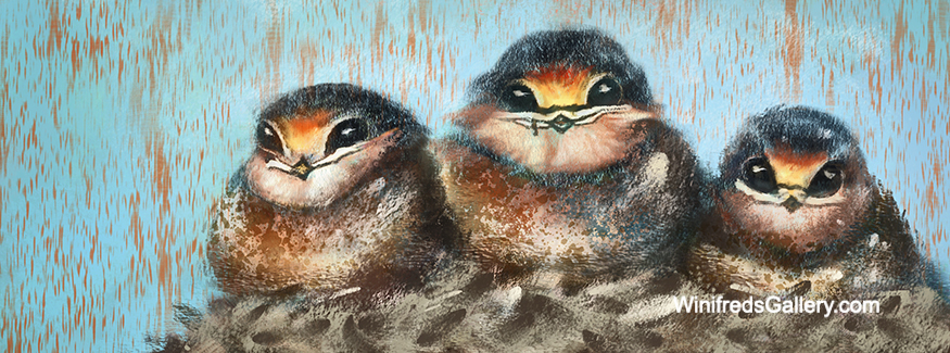
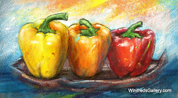
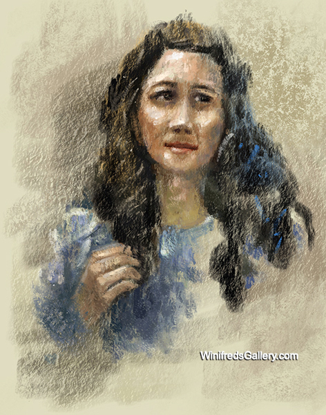
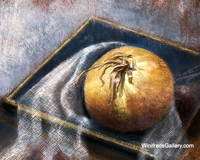
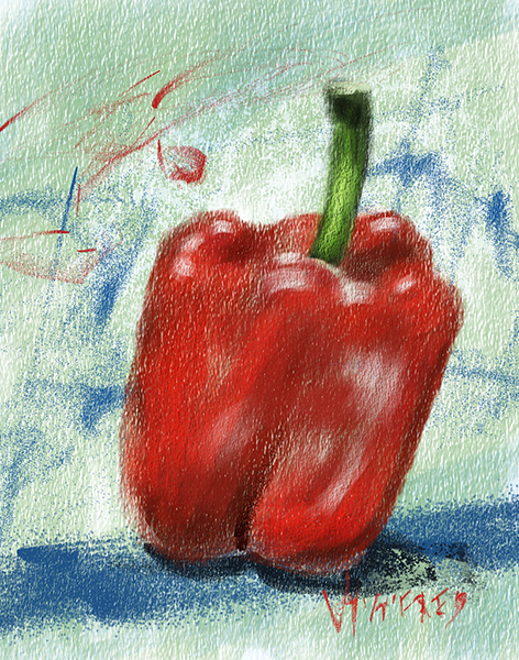
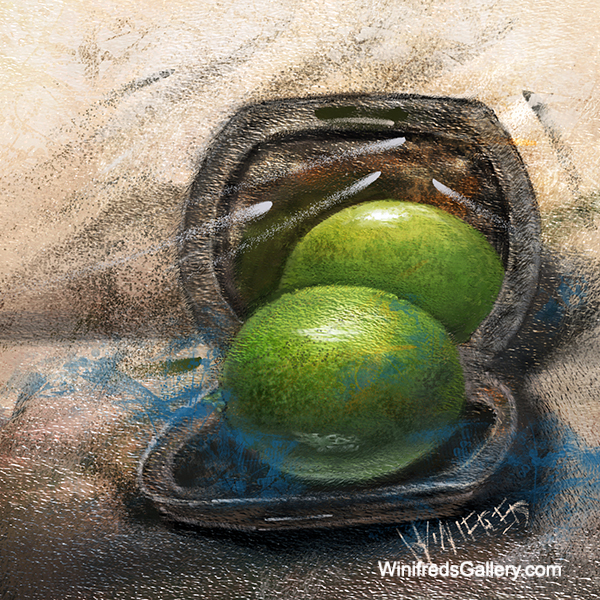
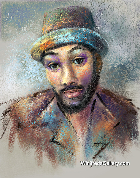
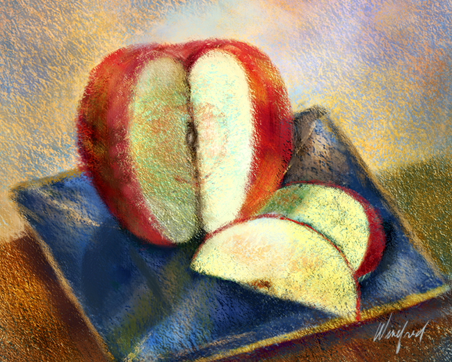
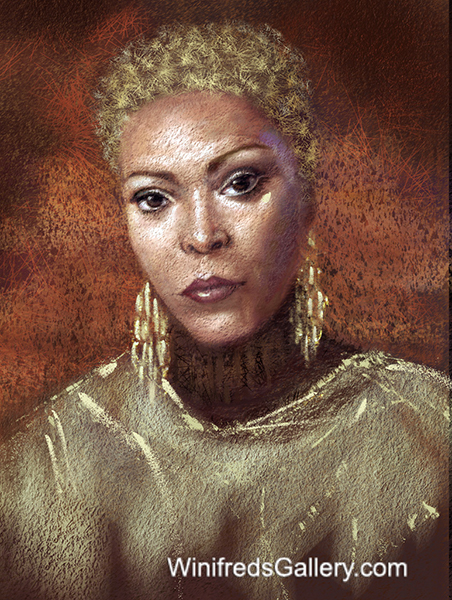
I’ve been enjoying painting digitally emulating traditional pastels. You’ve seem some of this work before. This time the subject matter is pretty wide. I painted baby birds, then fruits and veggies placed on a table next to my computer before transitioning to portraits using photo visual reference, even self portrait. Its been fun for sure. Below are some of the images I created.


Winifred Pastel sml_15
Winifred Pastel sml_02 Winifred Pastel sml_03
Winifred Pastel sml_05
Winifred Pastel sml_06 Winifred Pastel sml_08 Winifred Pastel sml_09 Winifred Pastel sml_12 Winifred Pastel sml_14


Winifred Pastel sml_11

Winifred Pastel sml_16

Winifred Pastel sml_17

Related Images: