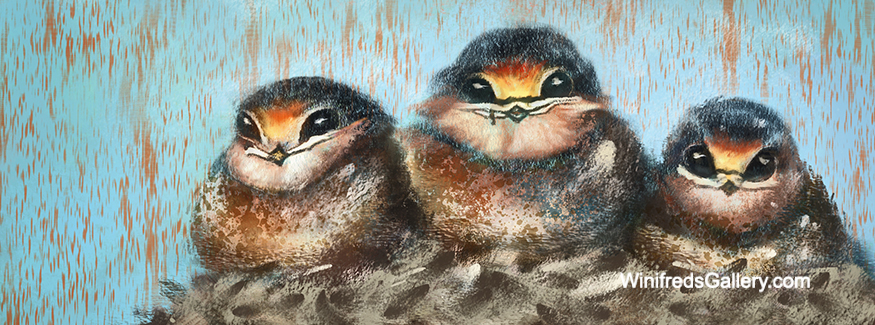
Dirty Birds – 12×9 oil on gessoed board.
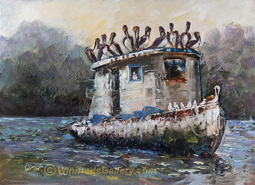
Dirty Birds by Winifred
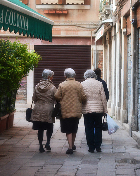
There is always a challenge in painting. There were so many decisions with respect to design, values, color and chroma. I still see changes I will likely make. There were many elements in the photo reference which I ultimately eliminated for design and simplicity sake. The photo which inspired this painting was taken in Guatemala by photographers Daphne and Art Carlye who often work summers with Rotary International. There were lovely palm trees in the background which ultimately I ignored.
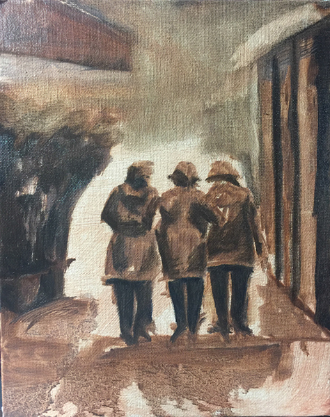
Below – initial tonal sketch
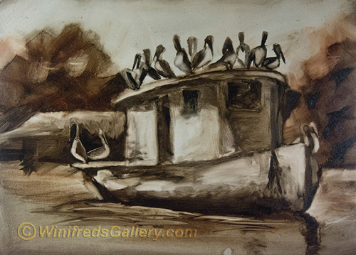
Below – INITIAL PAINTING – Too much detail – No place to focus. No place to rest ones eyes – though there are some aspects of this image I like. In my initial painting I found my eyes darting all over the place – not a good sign. Everything is foreground and everything was the same levels of saturation and contrast. I know better than to do that. I scraped the paint off the background and made changes to design and expression.
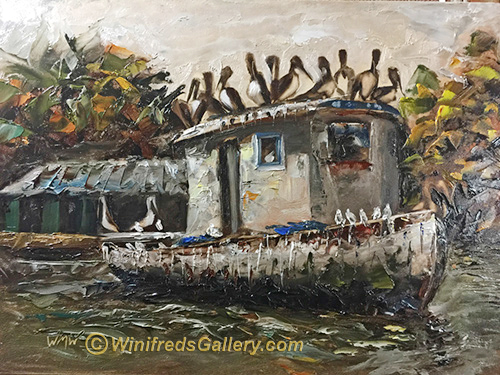
Below: This version is not too bad and I rather like it but I decided to push the background back even more by simplifying it – and muting the colors, thus arriving at the final version at the top of the page. I may have made a mistake in that regard – but, I share my mistakes with you as well.
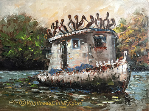
What do you think? Which image do you prefer and why?
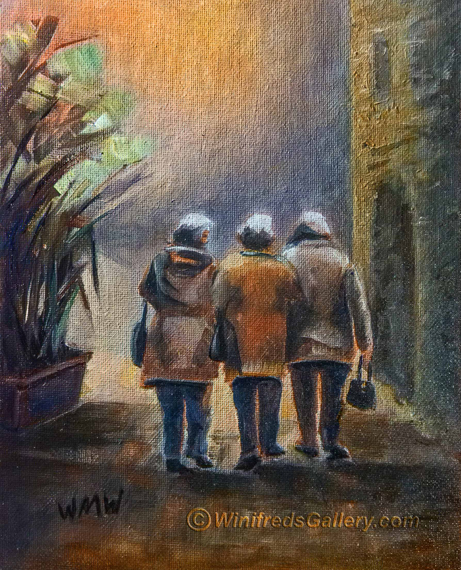 “Three Friends Walking”